如何創建 Marimekko 圖表
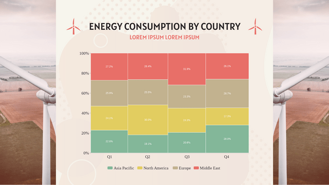
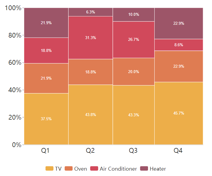
Marimekko chart is shown as a rectangular chart. Both directions represent 100% respectively. It is usually used to show the overview of data by dividing them into different segments and bars.
When To Use Marimekko Chart
As mentioned above, Marimekko is commonly used to showing the overview of data, especially for the market. The relationship between the company and customers are clearly shown by the Marimekko chart , so that we can find the opportunities in the chart by observing the segments and bars.
On the other hand, as it shows the overview of data, it is not easy for us to compare specific categories amount them. Therefore, it is important for us to choose the type of chart for different purpose.
How To Create A Marimekko Chart
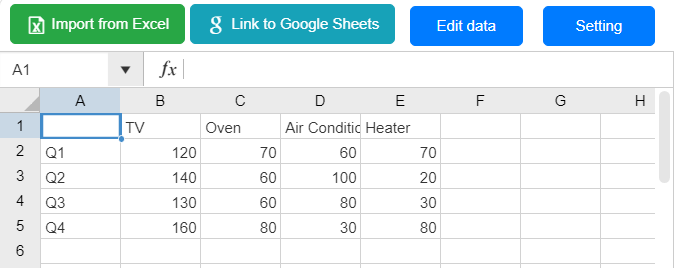
Edit Data
點擊Panel-Chart下的“ Edit data ”,我們可以打開圖表的電子表格。
您還可以選擇從 Excel 導入或與 Google Sheet 鏈接。
自定義顏色
數據的顏色和條形邊框在面板圖表下都是可變的。
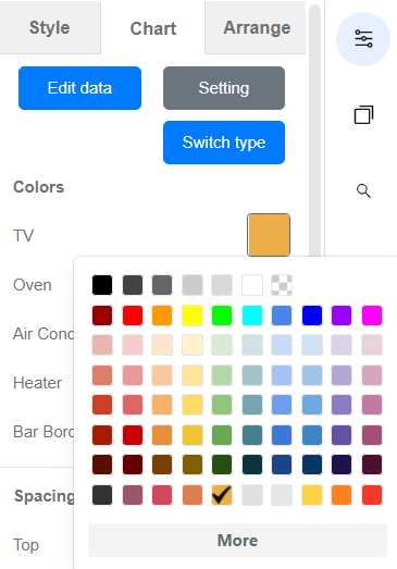
我們還可以自定義面板下圖表的其他部分,包括X和Y軸、標題等。
圖表的方向
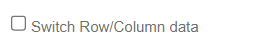
在面板圖表的底部,有一個名為“切換行/列數據”的選項。
我們可以點擊它來改變X軸和Y軸的位置,以不同的方向顯示圖表。
Marimekko 圖表模板