


How to Create a Double Doughnut Chart?
Donut charts can be used to display different data points, totalling 100%. They are also best used to compare just a few categories at a time and their relationship to the whole. While a double donut chart is exactly what it sounds like to have a comparison of two set of data at once. Here is a video to instruct you how convenient is it to create a double donut chart with online visual paradigm.
Instruction as below;
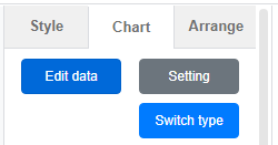
- Click on the chart option on your left panel and drag out the donut chart

- Position it on your canvas
- Click “Edit Data” on your right panel
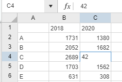
- Type in your own data to the data sheet
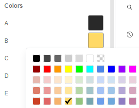
- Change your chart styling such as (color/font/font size)
- Double check if your data is correct and it’s ready-to-go
Noted: For simple data amendment you can always drag on the pie boundaries in between to amend the data for your desire values.
Would you like to create your own double donut chart for presentation and business report? Click here to try out now!!!
This post is also available in Deutsche, Español, فارسی, Français, English, Bahasa Indonesia, 日本語, Polski, Portuguese, Ру́сский, Việt Nam, 简体中文 and 繁體中文.
