Sankey Diagram: How to Edit the Weight of Links?

Sankey Diagram: How to Edit the Weight of Links?

Sankey diagrams are a cool way to visualize the flow of stuff (like energy, water, or money) through a system. They use arrows of different sizes to show how much stuff is moving from one place to another. Think of it like a map that shows how things move around! The great thing about Sankey diagrams is that they make it really easy to see what's going on in a system. You can quickly identify the biggest sources and sinks of stuff, and see how different parts of the system are connected. This…continue reading →
Sankey Diagram: How to Edit Link Comment

Sankey Diagram: How to Edit Link Comment

A Sankey diagram is a type of diagram that visualizes the flow of data or material through a system. It uses nodes and links to show the movement of resources, and the width of the links represents the quantity of flow. Sankey diagrams are great for analyzing and understanding complex systems, such as energy usage, water management, or financial transactions. What are Links in a Sankey diagram? Links in a Sankey diagram are the connections between nodes. They represent the flow of data or material between the nodes, and their width represents the…continue reading →
Sankey Diagram: How to Change the Tooltips of Links?

Sankey Diagram: How to Change the Tooltips of Links?

A Sankey diagram is a type of flow diagram that is used to depict the flow of data or materials through a system. It is composed of nodes, which represent the different sources and destinations, and links, which represent the flows between them. The thickness of the links represents the quantity of data or material flowing from one node to another. This value is commonly referred to as the weight or flow strength of the link. Visual Paradigm Online's Sankey diagram maker provides a user-friendly interface for creating Sankey diagrams with ease. As…continue reading →
How To Create A Sankey Diagram

How To Create A Sankey Diagram

What Is A Sankey Diagram Sankey diagram is a type of data visualization that shows the flow of data or information through a system. It uses a series of arrows or lines of varying widths to represent the amount of data flowing from one point to another. Sankey diagram is usually used to show different data flow. For example, U.S. Energy Information Administration (EIA) use Sankey Diagram to show the production and consumption of energy in the annual report. How To Create A Sankey Diagram https://www.youtube.com/watch?v=IYmxx0R4MTk&width=854&height=480 Create a Sankey Diagram Awesome Sankey Diagram…continue reading →
How To Create A Column Chart

How To Create A Column Chart

What Is A Column Chart A bar chart is a type of chart or graph that displays categorical data as rectangular columns. It is a data visualization in which the height of the columns is proportional to the values they represent. Column charts are also known as vertical bar charts as they are closed in presentation. The column chart can be evolved into other charts, such as grouped column charts, stacked column charts, floating column charts, etc. When To Use Column Chart A column chart can not only record the data, but also…continue reading →
How to Create a Double Doughnut Chart?

How to Create a Double Doughnut Chart?

Donut charts can be used to display different data points, totalling 100%. They are also best used to compare just a few categories at a time and their relationship to the whole. While a double donut chart is exactly what it sounds like to have a comparison of two set of data at once. Here is a video to instruct you how convenient is it to create a double donut chart with online visual paradigm. Instruction as below; Click on the chart option on your left panel and drag out the donut chart…continue reading →
How To Create A Stacked Bar Chart

How To Create A Stacked Bar Chart

What Is A Stacked Bar Chart Data visualization helps us to present the numerical composition data in a clearer way. We may already know what bar chart is. It can be evolved into other charts, including stacked bar chart, the chart we are going to talk about today. Unlike charts that show different categories of data column by column, they are placed in one column and divided by different colors. When To Use Stacked Bar Chart Since all the data are placed in one column, the stacked bar chart facilitates the comparison of…continue reading →
How to Create a 100% Stacked Area Chart?

How to Create a 100% Stacked Area Chart?

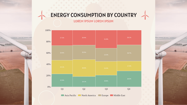
Stacked area table is best for illustrating the relationships between the different parts and helps show how each category contributes to the cumulative total. In this video, you can see how to create a 100% stacked area chart in VP Online. Here is the steps to create your chart; Click charts and select the 100% stacked area chart on the left panel Click chart panel then select "edit data" Edit the data sheet as you desire Customise the chart's style such as color tone and font Would you like to create your own…continue reading →
How to create a variwide chart?

How to create a variwide chart?

Variwide charts can also be used to display the second dimension in a bar chart. Each data point, in addition to its value, is given a weight that determines the width of the bar chart. In this video, you can see how to create a variwide chart in VP Online. The steps are as follow; Click chart and select the variwide chart Click edit data in the chart panel Replace the template data to your own data Upon completion you can edit the (style/color/font) of your chart Now you can start creating your…continue reading →
How to create a OHLC chart?

How to create a OHLC chart?

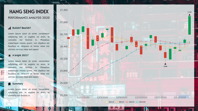
OHLC charts are bar charts that show the open, high, low and close prices for each period. They are used in indicating the four most important data points for each period. In this video, you can see how to create OHLC chart in VP Online. The steps are as follow; Click chart and select the OHLC chart Drag the chart into your canva Select edit data from the chart panel Replace the data template with your own data Upon completion you can edit you chart style (color/font/font size) Would you like to creation…continue reading →