


Define the Max value in a Radar chart
An In-Depth Guide to Editing Radar Charts
Radar charts are a powerful visualization tool that allows you to display data in a circular format, making it easy to compare multiple variables at once. When working with radar charts, it’s important to have control over various aspects of the chart, such as the maximum value for each discipline. In this article, we will explore how to edit radar charts and specifically focus on specifying the maximum value using the format panel chart.
Understanding Radar Charts
Before we dive into editing radar charts, let’s briefly understand what they are. A radar chart, also known as a spider chart or a star chart, consists of a series of equi-angular spokes, each representing a different variable. These variables are plotted on the spokes, and their values are represented by the distance from the center of the chart. By connecting these data points, we create a polygon shape that provides a visual comparison between the variables.

Accessing the Format Panel Chart
To begin editing a radar chart, we need to access the format panel chart. The format panel chart is a feature available in most charting software or applications that allows you to customize various aspects of the chart’s appearance and behavior. Here’s how you can access it:
1. Open your radar chart in the charting software of your choice.
2. Look for an option or tab that refers to \”Format\” or \”Formatting.\” This option is typically located in the menu or toolbar at the top of the application window.
3. Click on the \”Format\” or \”Formatting\” option to open the format panel chart.
Specifying the Maximum Value for Each Discipline
Once you have accessed the format panel chart, you can proceed to specify the maximum value for each discipline in your radar chart. The maximum value determines the outermost point on each spoke and helps establish the scale for the chart. Here’s how you can do it:
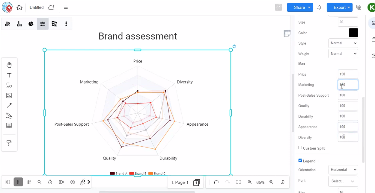
1. Locate the section in the format panel chart that pertains to the maximum value. It may be labeled as \”Max,\” \”Scale,\” or something similar.
2. Within this section, you will typically find an input field or slider that allows you to set the maximum value.
3. Enter the desired maximum value for the first discipline. This value will define the outermost point on the corresponding spoke.
4. Repeat the above step for each discipline, entering the respective maximum values.
It’s important to note that the maximum value should be chosen carefully to ensure that the chart accurately represents the data. Setting it too high may result in a chart that exaggerates differences, while setting it too low may compress the data and make it difficult to discern variations between variables.
Radar charts provide a unique and visually compelling way to present data. By accessing the format panel chart and specifying the maximum value for each discipline, you can exert control over the scale and appearance of your radar chart. Remember to consider additional factors such as labeling, data scaling, and data order to create a clear and meaningful visualization. With these editing techniques, you can effectively communicate insights and comparisons derived from your data using radar charts. Create a chart easily with Visual Paradigm Online. In this video, you can see how to define the Max value in the Radar chart in VP Online.
This post is also available in Deutsche, Español, فارسی, Français, English, Bahasa Indonesia, 日本語, Polski, Portuguese, Ру́сский, Việt Nam, 简体中文 and 繁體中文.
