


How To Create A Marimekko Chart
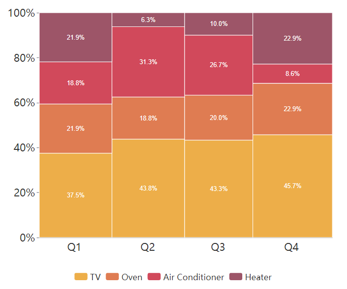
What Is A Marimekko Chart
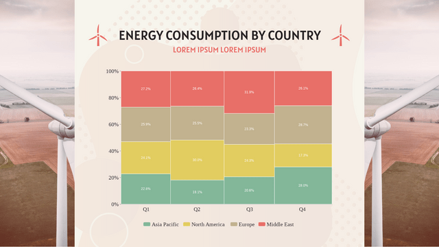
Marimekko chart is shown as a rectangular chart. Both directions represent 100% respectively. It is usually used to show the overview of data by dividing them into different segments and bars.
When To Use Marimekko Chart
As mentioned above, Marimekko is commonly used to showing the overview of data, especially for the market. The relationship between the company and customers are clearly shown by the Marimekko chart , so that we can find the opportunities in the chart by observing the segments and bars.
On the other hand, as it shows the overview of data, it is not easy for us to compare specific categories amount them. Therefore, it is important for us to choose the type of chart for different purpose.
How To Create A Marimekko Chart
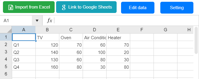
Edit Data
Click “Edit data” under Panel-Chart, we can open the spreadsheet of the chart.
You can also choose to import from Excel or link with Google Sheet.
Customize The Color
Color of the data and also the bar border are changeable under Panel-Chart.
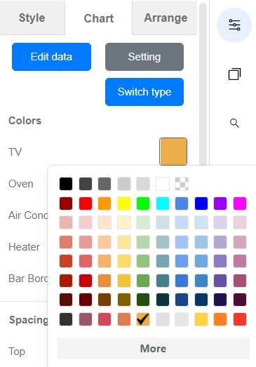
We can also customize other parts of the chart under the panel, including the X and Y axis, title, etc.
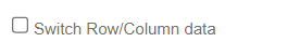
Direction of the Chart
At the bottom of the Panel-Chart, there is a choice called “Switch Row/Column data”.
We can click it to change to exchange the location of X-axis and the Y-axis, and show the chart in a different direction.
Marimekko Chart Template

This post is also available in Deutsche, Español, فارسی, Français, English, Bahasa Indonesia, 日本語, Polski, Portuguese, Ру́сский, Việt Nam, 简体中文 and 繁體中文.
