


How To Create A Pyramid Chart
What Is A Pyramid Chart
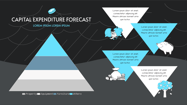
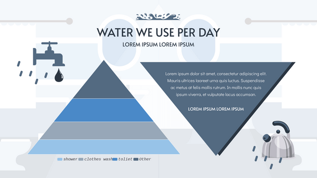
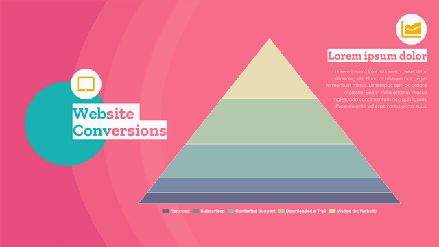
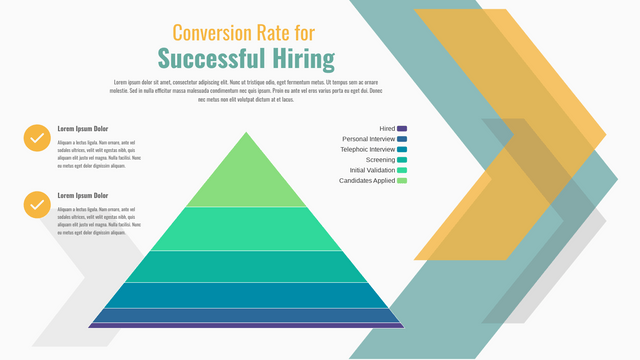
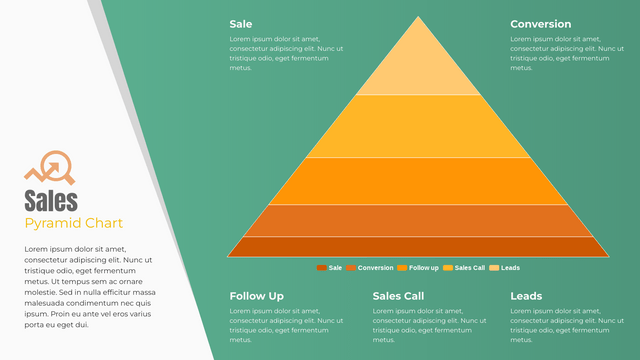
A pyramid chart, as its name implies, has the same shape as a pyramid. This chart is easy to understand and consists of horizontal sections of different heights, representing different quantities and percentages. Other than the value, it can be used to show the flow or steps.
When To Use Pyramid Chart
Pyramid charts fit the data that is arranged in a flow or levels and can be shown in a horizontal structure, onw of the common example we can find in our daily life is the food pyramid and the pyramid of 5 stages of self-esteem. It is also a good way to visualize the data for people to understand and remember.
How To Create A Pyramid Chart
Edit Data
When creating the chart, we can edit the data of the chart by customizing the spreadsheet of it.
We can also import the data from Excel or link the data to Google Sheet.
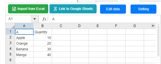
When we point to different sections, we can see the percentage of the data for the sections.
Customize the Chart
We can edit the color of the sections under Panel-Chart.
There are more settings under the panel, such as the label and title.
Edit the style of the chart to fit your design!
Templates Of A Pyramid Chart

This post is also available in Deutsche, Español, فارسی, Français, English, Bahasa Indonesia, 日本語, Polski, Portuguese, Ру́сский, Việt Nam, 简体中文 and 繁體中文.
