


A Scatter Chart Tutorial: A Quick Guide
Introduction
In the realm of data analysis and visualization, scatter charts serve as invaluable tools for uncovering relationships between variables. In our particular case, we’ve generated a scatter chart that explores the intriguing connection between arm length and height among a group of Grade 11 students. This visual representation of data, comprised of eight individual data points, allows us to delve into the dynamics between these two attributes. By studying the patterns within the scatter chart, we can begin to make predictions about arm length based on height and height based on arm length. This analysis not only sheds light on the physical characteristics of these students but also demonstrates the power of scatter charts in elucidating correlations.
What is a Scatter Chart
A scatter chart, also known as a scatter plot or scatter graph, is a type of data visualization used to display the relationship between two variables. Each point on the chart represents a single data point, and the position of the point is determined by the values of the two variables. Scatter charts are useful for identifying patterns, trends, and correlations in data. Below, I’ll provide a comprehensive explanation of scatter charts and examples to illustrate their use.
Components of a Scatter Chart:
- X-Axis: The horizontal axis represents one of the variables being analyzed.
- Y-Axis: The vertical axis represents the other variable being analyzed.
- Data Points: Each data point on the chart represents a single observation or data pair, with one value for the x-axis variable and another for the y-axis variable.
- Title: A title at the top of the chart provides context and information about what the chart represents.
- Axis Labels: Labels on the x-axis and y-axis provide information about the units or categories of the variables.
- Legend: If multiple datasets are displayed on the same chart, a legend may be used to differentiate them.
Examples of Scatter Charts:
Scatter charts exhibit various correlation patterns, each reflecting the connection between X and Y values. To illustrate these patterns, let’s provide examples for each:
- Strong Positive Correlation:
- Definition: The value of Y increases as the value of X increases.
- Example: In a study of the number of hours spent studying and exam scores, as the number of hours spent studying (X) increases, the exam scores (Y) also increase. This indicates a strong positive correlation.
- Strong Negative Correlation:
- Definition: The value of Y decreases as the value of X increases.
- Example: In a study of the amount of rainfall and the number of hours people spend outdoors, as the amount of rainfall (X) increases, the number of hours spent outdoors (Y) decreases. This demonstrates a strong negative correlation.
- Weak Positive Correlation:
- Definition: The value of Y increases slightly as the value of X increases.
- Example: Analyzing the age of individuals and their annual income, you might find that as age (X) increases, income (Y) increases slightly. This indicates a weak positive correlation.
- Weak Negative Correlation:
- Definition: The value of Y decreases slightly as the value of X increases.
- Example: Studying the amount of time spent commuting to work and energy levels, you might notice that as commute time (X) increases slightly, energy levels (Y) decrease slightly. This suggests a weak negative correlation.
- Complex Correlation:
- Definition: The value of Y seems to be related to the value of X, but the relationship is not easily determined.
- Example: In an analysis of advertising spending and product sales, the relationship between the two may appear complex, with fluctuations and no clear direction.
- No Correlation:
- Definition: There is no demonstrated connection between the two variables.
- Example: If you examine shoe size and IQ scores, you may find that there is no significant relationship between them. In this case, there is no correlation.
Understanding these correlation patterns is essential for interpreting scatter charts and drawing meaningful conclusions from data. Correlation analysis helps in making predictions, understanding cause-and-effect relationships, and identifying trends in various fields such as economics, social sciences, and natural sciences.
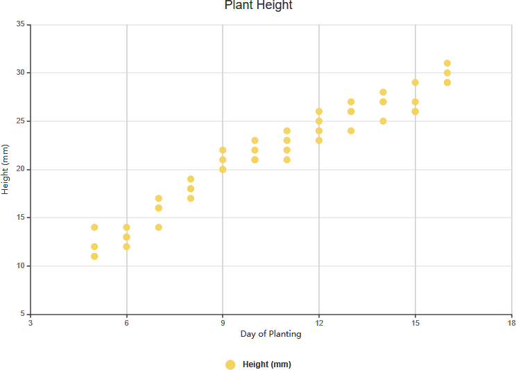
Strong Positive Correlation
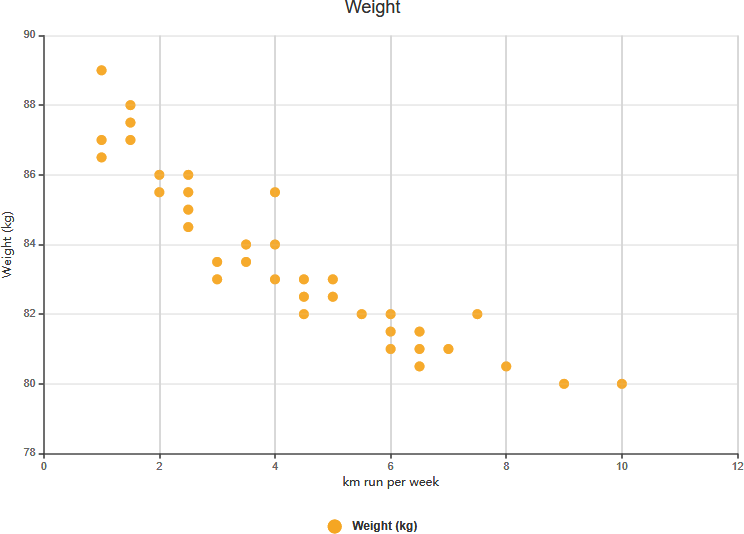
Strong Negative Correlation
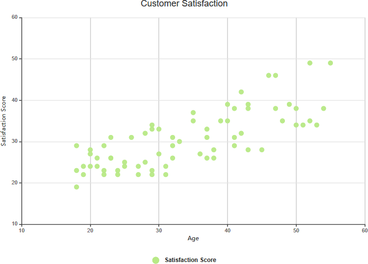
Weak Positive Correlation
Complex Correlation
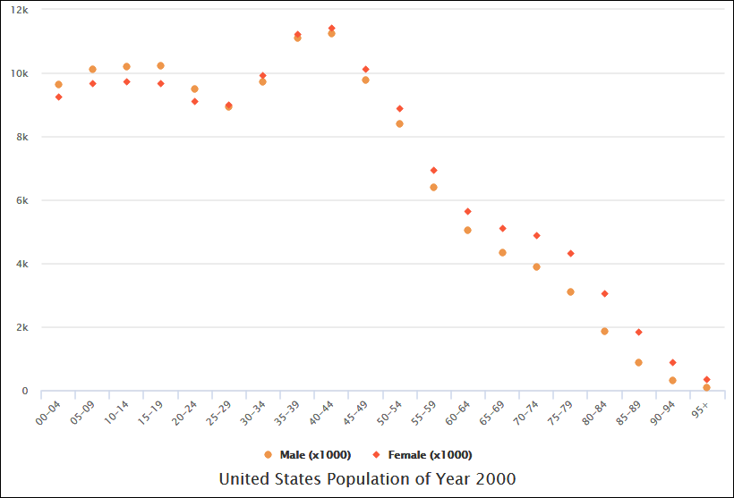
No Correlation
Scatter Chart Example: Arm Length vs. Grade 11
The scatter plot above illustrates data on the height and arm length of eight Grade 11 students. By examining the relationship between a student’s height and arm length, we can discern a trend. This trend allows us to estimate a student’s arm length based on their given height, and vice versa. In this particular chart, a positive correlation between arm length and height is evident.
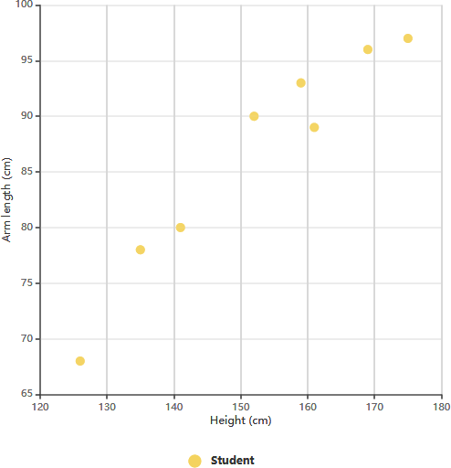
After establishing the correlation between these variables, we can make predictions about the behavior of the dependent variable using the measurements of the independent variable. This chart proves particularly valuable when one of the variables is easy to measure while the other is not. For instance, if a Grade 11 student has a height of 148 cm, we can estimate that their arm length is approximately 84 cm.
Conclusion
In this scatter chart , we’ve explored the fundamentals of scatter charts and their essential role in data visualization and analysis. Scatter charts provide a powerful means to depict relationships between variables and uncover patterns within data. Let’s recap some key takeaways from this tutorial:
- Scatter Charts Defined: Scatter charts, also known as scatter plots or scatter graphs, display data points on a two-dimensional plane, with each point representing a unique observation or data pair.
- Variables and Axes: Scatter charts typically consist of two axes: the X-axis and the Y-axis. These axes represent the variables under study, making it possible to visualize how changes in one variable relate to changes in another.
- Correlation Patterns: Scatter charts help us identify different correlation patterns between variables. These patterns can be categorized as strong positive correlation, strong negative correlation, weak positive correlation, weak negative correlation, complex correlation, or no correlation.
- Real-World Examples: Throughout the tutorial, we provided real-world examples to illustrate each of these correlation patterns. From studying student height and arm length to analyzing the relationship between study hours and exam scores, we saw how scatter charts can be applied across various domains.
- Predictive Power: Scatter charts allow us to make predictions about one variable based on the other, providing valuable insights for decision-making and understanding causal relationships.
- Complex Data: Scatter charts are versatile tools that can handle complex data, including situations where the relationship between variables is not straightforward.
- Data Interpretation: The ability to interpret scatter charts is crucial for researchers, analysts, and anyone seeking to draw meaningful conclusions from data.
- Practical Applications: Scatter charts find applications in fields as diverse as economics, social sciences, natural sciences, engineering, and more. They help in identifying trends, correlations, and outliers within datasets.
By mastering the art of creating, analyzing, and interpreting scatter charts, you equip yourself with a valuable skill for data-driven decision-making. Whether you’re a student, a researcher, or a professional, scatter charts are a valuable tool in your data analysis toolkit, offering insights that can drive informed choices and deeper understanding in your chosen field.
This post is also available in Deutsche, Español, فارسی, Français, English, Bahasa Indonesia, 日本語, Polski, Portuguese, Ру́сский, Việt Nam, 简体中文 and 繁體中文.
