How to use a stock photo as background?
In Fliplify, you can change the design background freely. You are allowed to change backgrounds with different colors, textures, or images. You can even upload your images as the design background too. It is easy for you to change the design background with a few clicks. This is a tutorial to guide you on how to use a stock photo as a design background. You can watch the attached tutorial video or read the guide below. Here are the easy steps for changing the background with a selected photo.
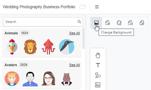
1. To begin with, you can first click on the photo icon on the left-hand side of the canvas. It is a shortcut for you can go to the background changing function with a click.

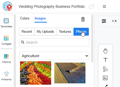
2. After clicking the photo icon, the window will be automatically switched to the background changing palette. You can change the background now by clicking the palette on the left-hand side. With this background changing function, you can change your background in different colors or an image. You can even upload an image from the device for the background too. If you want to change the background with the stock images from our site, you can simply click on the “photos” button.

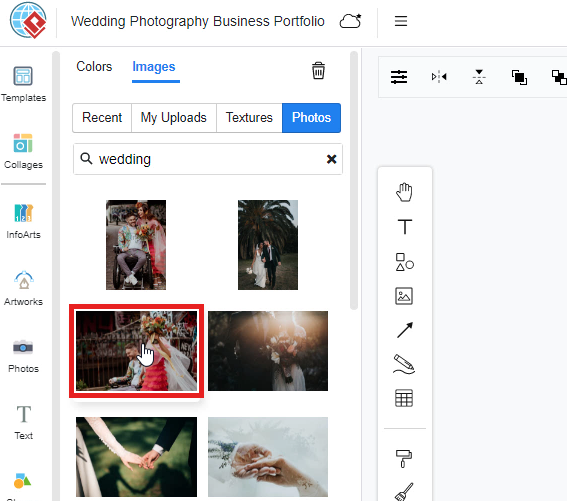
3. Then, you can now search for an image for background by typing the keywords on the searching bar. For example, if you want to find an image as the background for a wedding party, you can simply type “wedding” in the searching bar. The search results of images will then appear below the search bar. And you can now choose a wedding image that you like and click on the image. Finally, the design background will be automatically change based on your choice of image.

5 Tips for Choosing the Background for Your Flipbook
- Consider Your Content’s Tone and Theme: Choose a background that complements the overall tone and theme of your flipbook. For a professional look, opt for subtle colors or textures that enhance readability without overpowering the content. For creative or artistic projects, vibrant patterns or images can add visual interest and align with the theme.
- Opt for Contrast and Readability: Ensure that the background you select provides sufficient contrast with your text and images. A busy or dark background can make content difficult to read, so choose backgrounds that enhance legibility. Light or neutral backgrounds are often ideal for text-heavy flipbooks, while contrasting colors or patterns can work well for more visual content.
- Use Consistent Styling: Maintain consistency in background style throughout your flipbook to create a cohesive look. Whether you choose a solid color, a subtle pattern, or a photo, using the same style or complementary designs across pages helps maintain visual harmony and professionalism.
- Match the Background to Your Brand: If your flipbook is part of a branding effort, select a background that reflects your brand’s colors and style. Consistent use of brand colors, logos, or patterns reinforces brand identity and enhances the overall impact of your flipbook.
- Keep User Experience in Mind: Choose backgrounds that enhance rather than distract from the user experience. Avoid overly complex patterns or images that can divert attention away from the main content. A clean, well-chosen background should support your flipbook’s content, making it engaging and easy to navigate.
This post is also available in Deutsche, Español, فارسی, Français, English, Bahasa Indonesia, 日本語, Polski, Portuguese, Ру́сский, Việt Nam, 简体中文 and 繁體中文.


