How To Create A Doughnut Chart
What Is A Doughnut Chart
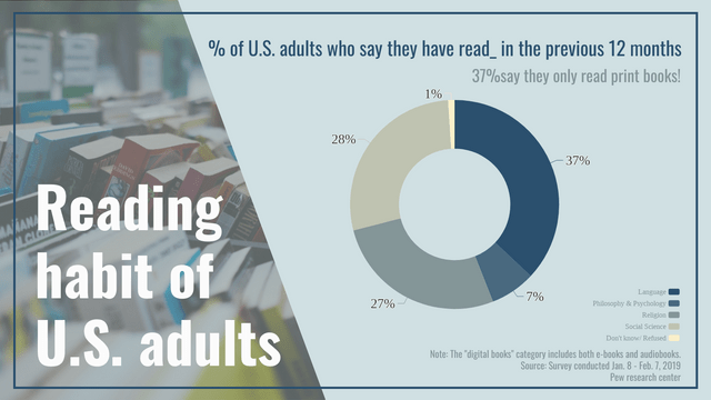
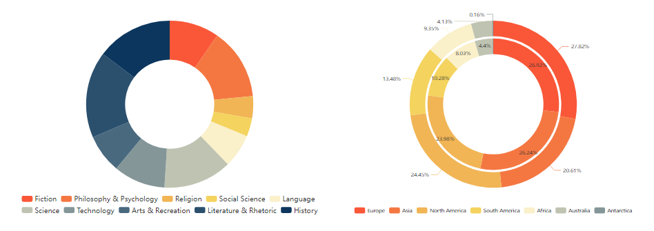
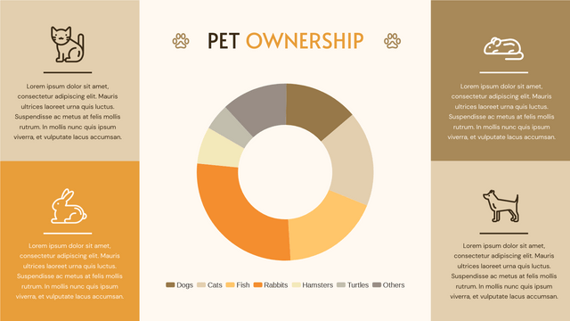
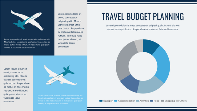
Doughnut chart shows the amount of the data by the percentage of the parts, which is very close to a pie chart. Moreover, we can add more rings on the chart to fit our needs if there are more than one series of data, such as a double doughnut chart.
When To Use Doughnut Chart
As doughnut chart is used to present the relationship between the part and the whole, it is commonly used when we want to compare the percentages of different parts, and also the case that all data are included in the same group.
Here are some tips when we design to use doughnut or not:
- None of the data is 0 or any negative value
- Number of categories is not so much
- Preventing using similar colors
How To Create A Doughnut Chart
Edit Data
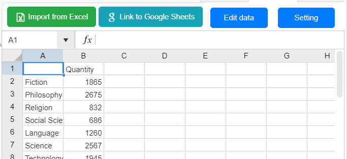
Click the “Edit Data” under the Panel-Chart to customize the data of the doughnut chart.
We can also import data from Excel or link the chart with Google Sheet if needed.
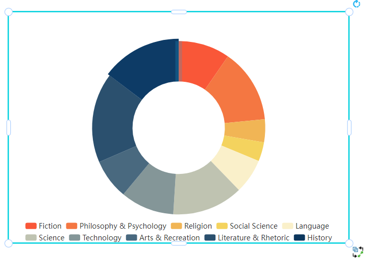
We can also drag and drop the sector in the chart to change its value.
Customize The Chart
We can change the color of the sectors under Panel-Chart, border color is also changeable.
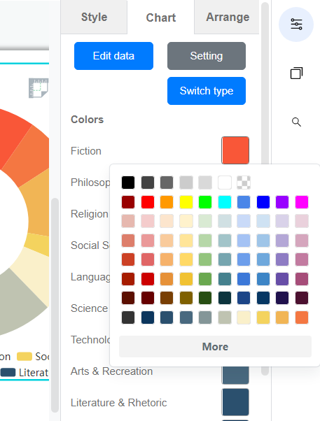
Moreover, we can customize the legend, label, title and other elements of the chart in the same panel.
Doughnut Chart Templates



This post is also available in Deutsche, Español, فارسی, Français, English, Bahasa Indonesia, 日本語, Polski, Portuguese, Ру́сский, Việt Nam, 简体中文 and 繁體中文.


