


How To Create A Rose Chart
What Is A Rose Chart
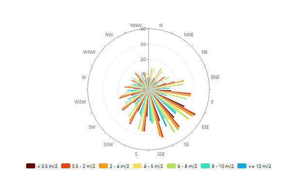
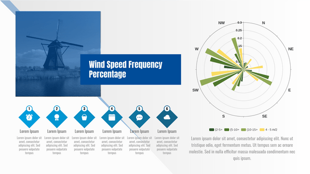
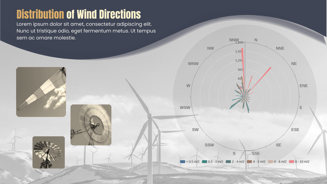
Rose chart shows data in 360 degrees with a shape of a compass. Is is commonly divided into 8 to 16 parts to show geography data. With different size and colors, we can see the difference between data clearly without calculating each part of them.
When To Use Rose Chart
As amount and direction can be shown in the chart clearly, rose chart is commonly used in data analysis of geography fieldwork. However, there is an important when reading rose chart that the outer segment does not represent a larger value even its size is larger.
How To Create A Rose Chart
Edit Data
By Edit Data under Panel-Chart, we can edit the data on the spreadsheet to customize the chart.
We can also choose to change the data by importing from Excel or linking to Google Sheet.
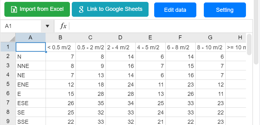
We can also edit the value by drag and drop the sectors of the chart directly.
Customize the Chart
Color of the sector can be changed under Panel-Chart respectively.
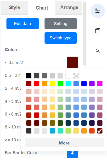
Other parts of the chart, including the split line, legend, and axis, can be change under the same panel.
Rose Chart Templates
This post is also available in Deutsche, Español, فارسی, Français, English, Bahasa Indonesia, 日本語, Polski, Portuguese, Ру́сский, Việt Nam, 简体中文 and 繁體中文.
