Tips for creating eye-catching infographic
More and more people are using an infographic to present complex information graphically in recent years. So, How to create a good infographic that can grab people’s attention? Read this article and learn the important tips for designing an eye-catching infographic! You can follow the below steps that help you to turn data into visual presentations effectively, here are the tips:
1. Write a catchy title
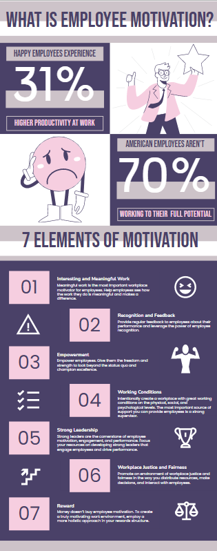
Adding an attractive title can clearly tell the reader what is the theme of the infographic, that can grab the reader’s attention at the first sight. Creating a short and precise title could let people understand what your infographic is talking about. The readers can get hooked if you create an effective headline. For example, you can write the title between 8-12 words in length in order to keep the title short and clear. You may take a look at the example title below as your reference.
7 Elements Of Employee Motivation Infographic

2. Understand your purpose
Before creating your infographic, you have to understand what is your purpose of the infographic. You could make an outline of the infographic first to draft the ideas of what messages are you going to tell the audience through your infographic. You may have to think of what specific data that is important to present to the readers. So, understanding your audience takes an important part in creating your infographic.
3. Keep the text short
Readers might not be interested in reading long texts as they might feel bored and dull in reading too many words. Therefore, for the content of the infographic, you have to be sure that the texts are concise and catchy. You are suggested to show the information in a visualized way, rather than writing it. Keeping the text easy-to-read is essential to avoid the readers getting confused and overwhelmed.
4. Choose the right color palette
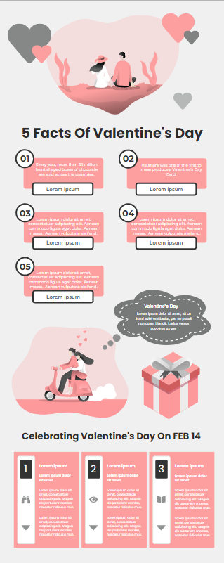
Color choice is important for infographic design, the colors you have chosen for designing your infographic have to be corporate well with the theme of the infographic. For example, if you are creating a valentines day infographic, you may consider to use bright or peachy colors like red, white, or pink. Instead of using dark shades colors, using romantic colors might be better in giving a vibe of romance and love for your infographic. You may take a look at the below infographic examples for Valentine’s Day.
5 Facts Of Valentine’s Day Infographic

5. Choose the right fonts
Choosing the appropriate typographic is also important in converting a certain mood or feeling for your infographic. With the use of decorative fonts, your infographic will look bold and fun. You have to be aware of the total number of fonts that you have chosen also. Limit the fonts numbers in two or three could be better to make your infographic easy- to-read and not overwhelming. It could make your infographic looks professional too.
6. With good use of images
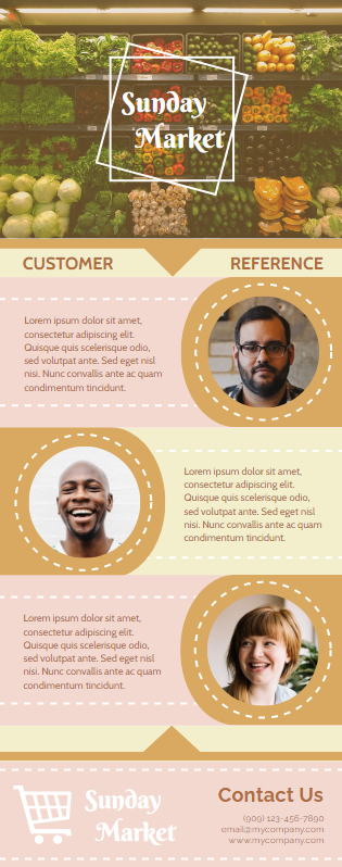
Using a good image could help to convert the information effectively. The images that you chose carry an important message. You may consider to put attractive and accurate images that could let the readers understand the text with the use of the images easily. And with the use of the images, it could make your description of the text looks realistic. Here is an infographic example that shows good use of images.
Infographic Of Customer References

7. Create a clear layout
Creating a clear layout could help the audience to read the infographic easily, it can provide a good flow of texts for reading. People read text from left to right mostly, you could organize your texts from left to right/ up to down directions. It could be even better if you could present your infographic as a visual story.
This post is also available in Deutsche, Español, فارسی, Français, English, Bahasa Indonesia, 日本語, Polski, Portuguese, Ру́сский, Việt Nam, 简体中文 and 繁體中文.


