


Create a 100% Stacked Bar Chart
A 100% stacked column chart is an Excel chart type, it is useful for showing the change in proportion over time. This video will show you how to create a 100% Stacked Bar Chart in the Visual Paradigm Online.
What is 100% Stacked Bar Chart?
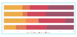
The 100% Stacked Bar Chart is an Excel chart type designed to show the relative percentages of multiple data series using stacked bars, where the sum (cumulative) of each stacked bar always equals 100%. Like a pie chart, a 100% stacked bar chart shows the relationship of the parts to the whole. However, unlike a pie chart, a 100% stacked bar chart can show the change in proportion over time, as shown in the graph above, where the market share of a product changes from year to year.
Like all stacked bar charts, the first data series (right next to the axes) is easy to compare visually, but subsequent data series are more difficult to compare because they are not aligned with a common element.

100% Stacked Bar Chart Advantages & Disadvantages
Advantages
Ability to show changes in parts over time versus the whole.
Multiple categories and data series in a compact space.
Disadvantages
Difficult to compare all but the first series.
Stacked bars are normalized to 100%, so the dimensionality of absolute values is lost.
Visually complex as the number of categories or series increases.
How to create a 100% Stacked Bar Chart
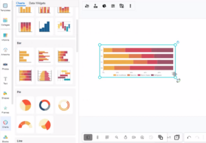
- In VP Online, you can create a 100% stacked bar chart by selecting the Charts tool, then drag out the 100% stacked bar chart into your design.
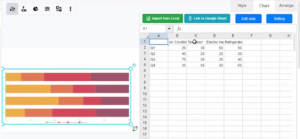
- You can go to Format Panel, Chart, and Edit data, to alter the data of the chart in a spreadsheet. Easily edit your data in an intuitive spreadsheet editor. Visual Paradigm Online makes it simple to enter your information and turn it into a stunning chart.
- Besides the spreadsheet chart editor, you can also alter the chart data by directly dragging & drop the bars in the chart.
- You can change the chart style in the Format panel. Visual Paradigm Online supports a rich set of style options for all chart types. You can easily customize your chart to match your company’s brand colors and fonts or choose the color that matches your topic. Customize everything, from the fonts and colors to the position of titles and legends in a few clicks.
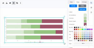
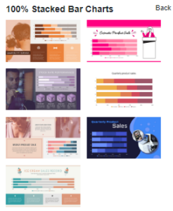
Chart Templates
Visual Paradigm Online free chart maker features a wide range of professional chart templates. You just need to select a template to get started, and then enter your data to get instant results. Try to choose a beautiful template that you want, and easily create your own 100% Stacked Bar Chart.
This post is also available in Deutsche, Español, فارسی, Français, English, Bahasa Indonesia, 日本語, Polski, Portuguese, Ру́сский, Việt Nam, 简体中文 and 繁體中文.
