


Create a Histogram
A histogram is an approximate representation of the distribution of numerical data. To construct a histogram, the first step is to “bin” (or “bucket”) the range of values—that is, divide the entire range of values into a series of intervals—and then count how many values fall into each interval. This video will show you how to create a Histogram in Visual Paradigm Online.
What is a Histogram?
Histograms give a rough sense of the density of the underlying distribution of the data, and often for density estimation: estimating the probability density function of the underlying variable. The total area of a histogram used for probability density is always normalized to 1. If the length of the intervals on the x-axis are all 1, then a histogram is identical to a relative frequency plot.
A histogram can be thought of as a simplistic kernel density estimation, which uses a kernel to smooth frequencies over the bins. This yields a smoother probability density function, which will in general more accurately reflect the distribution of the underlying variable. The density estimate could be plotted as an alternative to the histogram and is usually drawn as a curve rather than a set of boxes.

A histogram Advantages & Disadvantages
Advantages of Histogram:
- It is one of the most popular and commonly used devices for charting continuous frequency distribution. A single glance at a histogram gives us some idea about the shape and spread of the data.
- A histogram may be used for the graphic location of the value of Mode.
- An advantage of histogram over pie charts is that a histogram can represent a large number of bars representing different class intervals.
- We can use a histogram in order to draw a frequency polygon.
Disadvantages of Histogram:
- A histogram cannot be used to represent discrete frequency distributions. It can only be used to represent continuous frequency distributions.
- A disadvantage of a histogram compared to a boxplot is that a boxplot gives us extra information such as the median, upper quartile and lower quartile of the data.
- Histograms cannot be used to compare two different data sets.
- While the mode can be calculated using a histogram, the mean and the median cannot be calculated using a histogram.
How to create a Histogram?
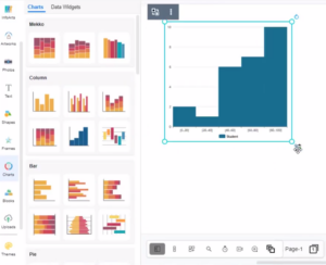
- In VP Online, you can create a histogram by selecting the Charts tool, then drag out the histogram into your design.
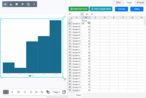
- You can go to Format Panel_ Chart_ Edit data_ to alter the data of the chart in a spreadsheet. Easily edit your data in an intuitive spreadsheet editor. Visual Paradigm Online makes it simple to enter your information and turn it into a stunning chart.
- You can change the chart style in the Format panel. The color of the columns and borders can be adjusted under the Colors section of the format panel. Visual Paradigm Online supports a rich set of style options for all chart types. You can easily customize your chart to match your company’s brand colors and fonts or choose the color that matches your topic. Customize everything, from the fonts and colors to the position of titles and legends in a few clicks.
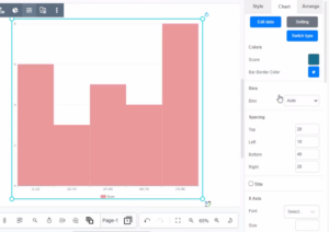
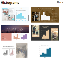
Chart Templates
Visual Paradigm Online free chart maker features a wide range of professional chart templates. You just need to select a template to get started, and then enter your data to get instant results. Try to choose a beautiful template that you want, and easily create your own histogram.
This post is also available in Deutsche, Español, فارسی, Français, English, Bahasa Indonesia, 日本語, Polski, Portuguese, Ру́сский, Việt Nam, 简体中文 and 繁體中文.
