


How to Adjust the Split Line of a Chart
Always match your presentation flow by adjusting every detail of your chart including the split line color and types. Create charts easily with Visual Paradigm Online. In this video, you can see how to adjust the split line of a chart in VP Online.
The step is as follow:
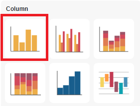
- Select your chart on the canvas
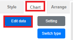
- Click on the “chart” tab in the right side panel
- Untick the “split line” option if you would like to have a plain chart
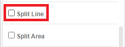
- Otherwise, keep the “split line” option on
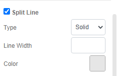
- Reselect the “split line” types from the dropbox

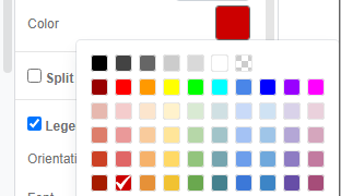
- Reselect the “split line” color to match the chart bar
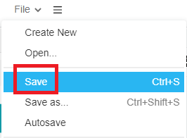
- Make sure to save the chart when you are satisfied with the appearance
This post is also available in Deutsche, Español, فارسی, Français, English, Bahasa Indonesia, 日本語, Polski, Portuguese, Ру́сский, Việt Nam, 简体中文 and 繁體中文.
