


How to Change Data Series of a Chart
Comprehensive Guide to Editing Charts in Your Documents
Charts are an essential tool for visualizing data and conveying information effectively. Whether you’re creating a presentation, a report, or an analysis, knowing how to edit charts can greatly enhance the visual impact and clarity of your documents. Create charts easily with Visual Paradigm Online. In this video, you can see how to create a butterfly chart in VP Online.
The steps is as follow:
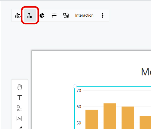
- Click on the “left top” panel to bring up the series and data dialogue
- Click on the series tab to change the color of the chart

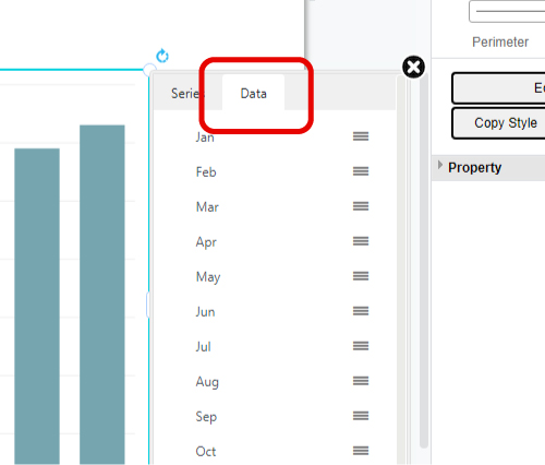
- View the data tabs by clicking “data” in the dialogue
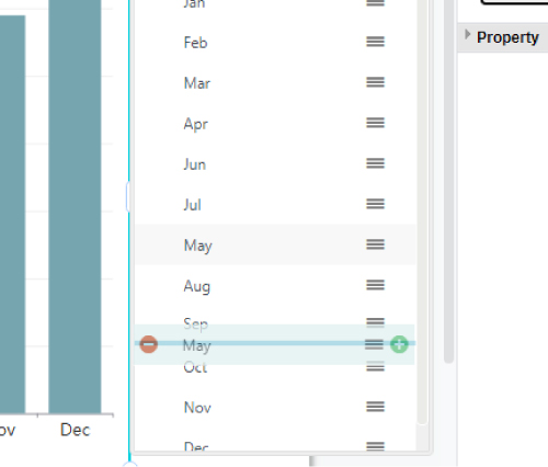
- Alter the order of data display by dragging and dropping the data tabs
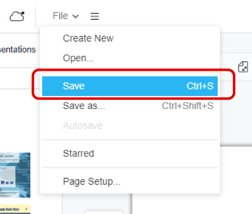
- Make sure to click save after editing
Editing charts allows you to refine the visual representation of your data, making it easier for your audience to understand and interpret. By following the steps outlined in this comprehensive guide, you now have the knowledge and tools to edit chart series and data effectively. Whether you’re changing colors, rearranging series order, adding or removing data points, or adjusting the data range, these techniques will enable you to create visually appealing and informative charts for your documents.
This post is also available in Deutsche, Español, فارسی, Français, English, Bahasa Indonesia, 日本語, Polski, Portuguese, Ру́сский, Việt Nam, 简体中文 and 繁體中文.
