


How to create a 100% stacked column chart?
The 100% cumulative bar chart is a type of Excel chart intended to display the relative percentages of multiple data series in a cumulative bar, where the sum (cumulative) of the cumulative bars always equals 100%. A bar chart stacked at 100% can show the ratio of part to total, for a period of time. Create charts easily with Visual Paradigm Online. In this video, you can see how to create a column and line chart in VP Online.
The steps is as follow:
- Click on charts panel on the left and select 100% stacked column chart

- Drag the chart into your canvas and adjust the size
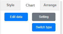
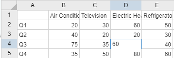
- Click on chart panel on “your right” and select edit data
- Replace the old data with your own data
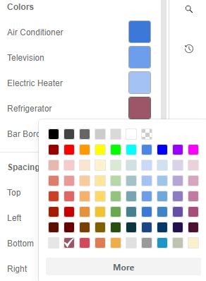
- Edit your chart style in cluding the chart color and font
- Finalise your chart and save
Looking for some 100% stacked column chart sample? Click visual paradigm online!!!

(Annual Worldwide Car Sales (2017-2020) | 100% Stacked Column Chart)
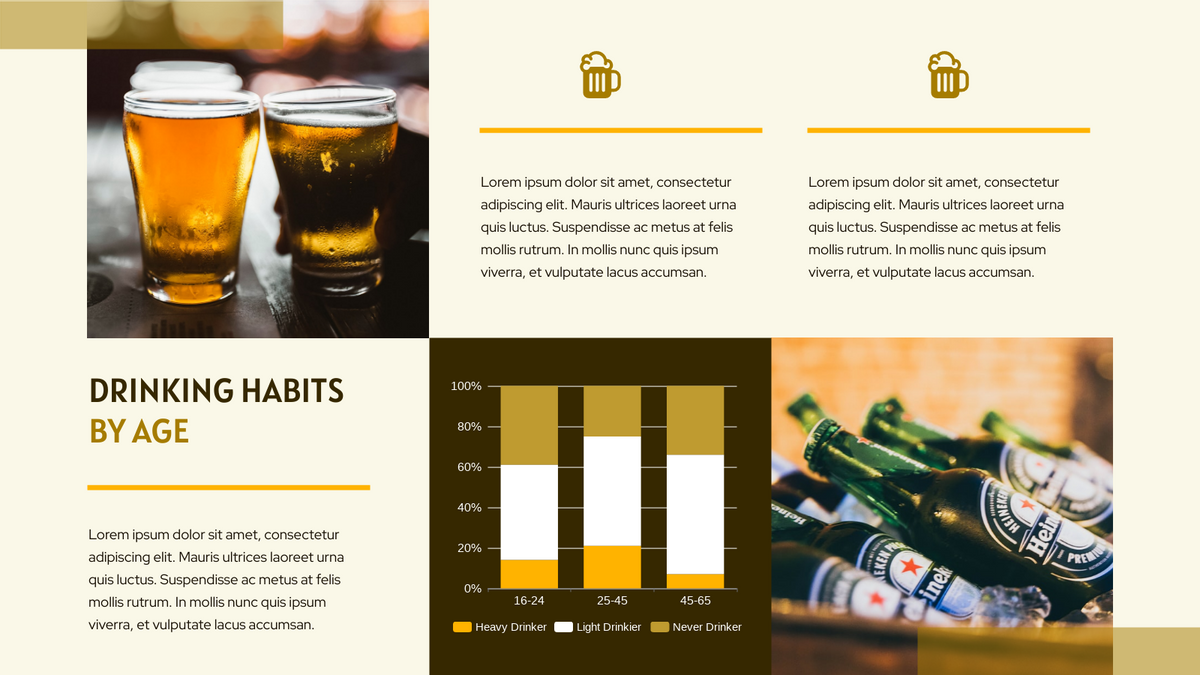
(Drinking Habits By Age | 100% Stacked Column Chart)

(Student Choice | 100% Stacked Column Chart)
This post is also available in Deutsche, Español, فارسی, Français, English, Bahasa Indonesia, 日本語, Polski, Portuguese, Ру́сский, Việt Nam, 简体中文 and 繁體中文.
