


How to create a 100% stacked radial chart?
The 100% stacked bar chart is an Excel chart type designed to show the relative proportions of multiple data sets by stacking bars where the sum (cumulative) of each stacked bar is always 100%. In this video, you will learn to create 100% stacked bar chart in just few steps!!! Would you also like to try out other chart now? Click online visual paradigm!
The steps to create chart are as follow;
- Click “Chart” and select “100% stacked radial chart”

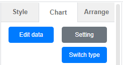
- After dragging to canva you can click “edit data” from right panel
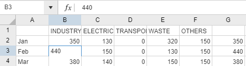
- Replace the template data with your own
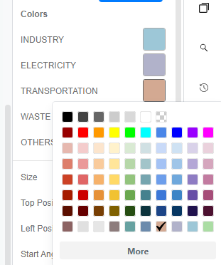
- Edit the chart styling (color/font/font size)
Would you like to create your own 100% stacked radial chart? Click here! Or you can try out the below sample as well.
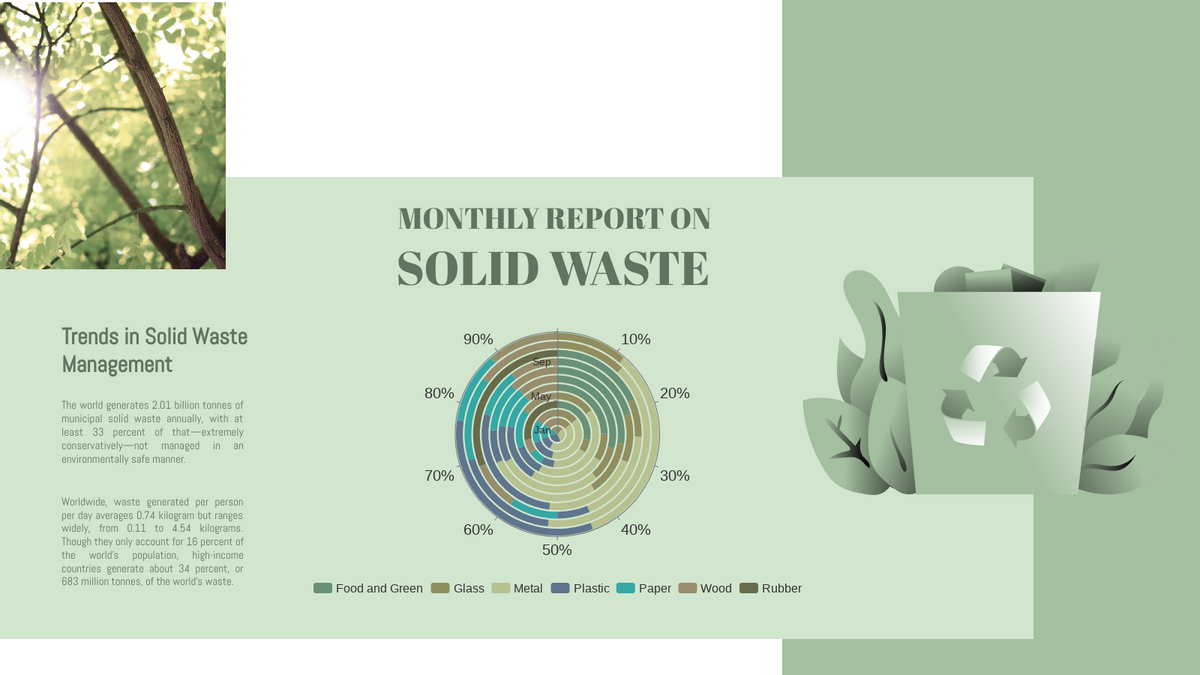
Solid Waste Management 100% Stacked Radial Chart

Food Disposal Rate 100% Stacked Radial Chart
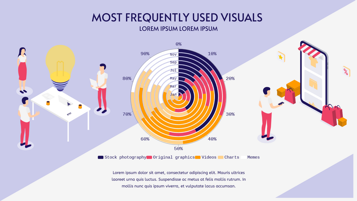
Most Frequently Used Visuals 100% Stacked Radial Chart
This post is also available in Deutsche, Español, فارسی, Français, English, Bahasa Indonesia, 日本語, Polski, Portuguese, Ру́сский, Việt Nam, 简体中文 and 繁體中文.
