


How to create a butterfly chart?
A butterfly chart is a type of bar chart used to compare two sets of data simultaneously. This type of chart represents the data as two horizontal bars with the same x-axis in the middle, which is useful when comparing two sets of data for comparison purposes. Create charts easily with Visual Paradigm Online. In this video, you can see how to create a butterfly chart in VP Online.
The steps is as follow:
- Click on charts panel on the left and select butterfly chart

- Click on chart panel on “your right” and select edit data
- Replace the old data with your own data
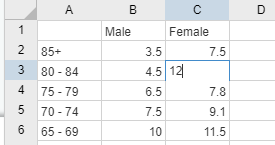
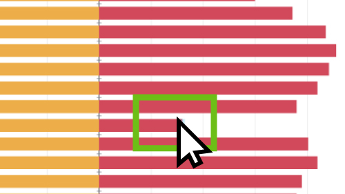
- You can also drag on the data bar to adjust the data
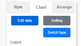
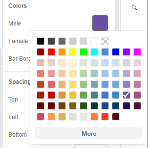
- Edit your chart style in cluding the chart color and font
- Finalise your chart and save
Looking for some 100% stacked column chart sample? Click visual paradigm online!!!

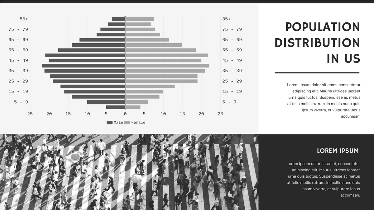
Population Distribution In US Butterfly Chart
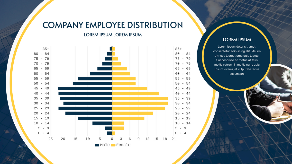
Company Employee Distribution Butterfly Chart
This post is also available in Deutsche, Español, فارسی, Français, English, Bahasa Indonesia, 日本語, Polski, Portuguese, Ру́сский, Việt Nam, 简体中文 and 繁體中文.
