


How to Create a Curved Line Chart
The formal expression used to describe a linear graph is linear whether it passes through the origin or not, and the relationship between the two variables is called linear. Similarly, the relationship shown by a curve graph is called non-linear. A curved line chart will indicate change. In this video, you can see how to create a curved line chart in VP Online.
The steps is as follow:
- Click on charts panel on the left and select curved line chart

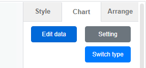
- Click on chart panel on “your right” and select edit data
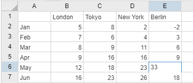
- Replace the old data with your own data
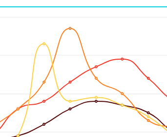
- Adjust the curved line as you need
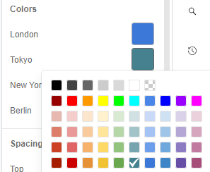
- Edit your chart style in cluding the chart color and font
Looking for some curved line chart sample? Click visual paradigm online!!!
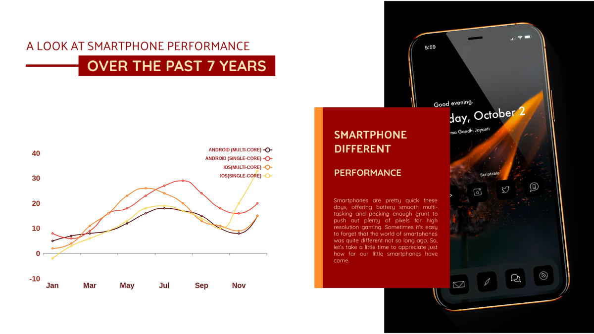
Smartphone Performance Curved Line Chart
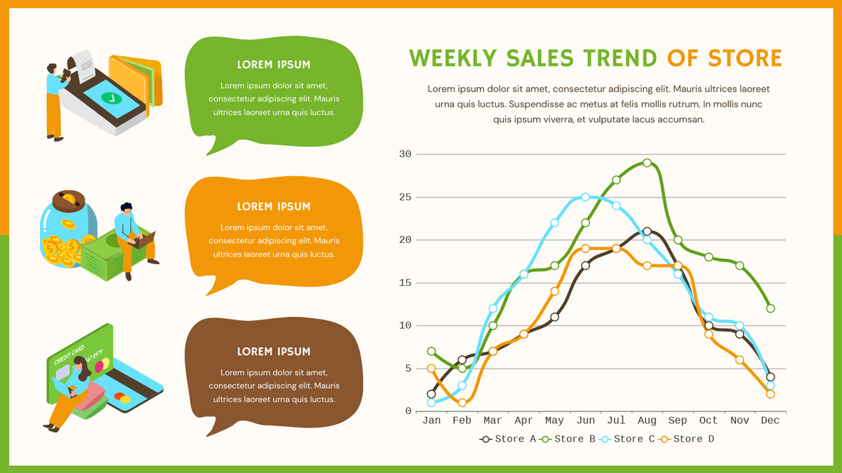
Weekly Sales Trend Of Store Curved Line Chart.
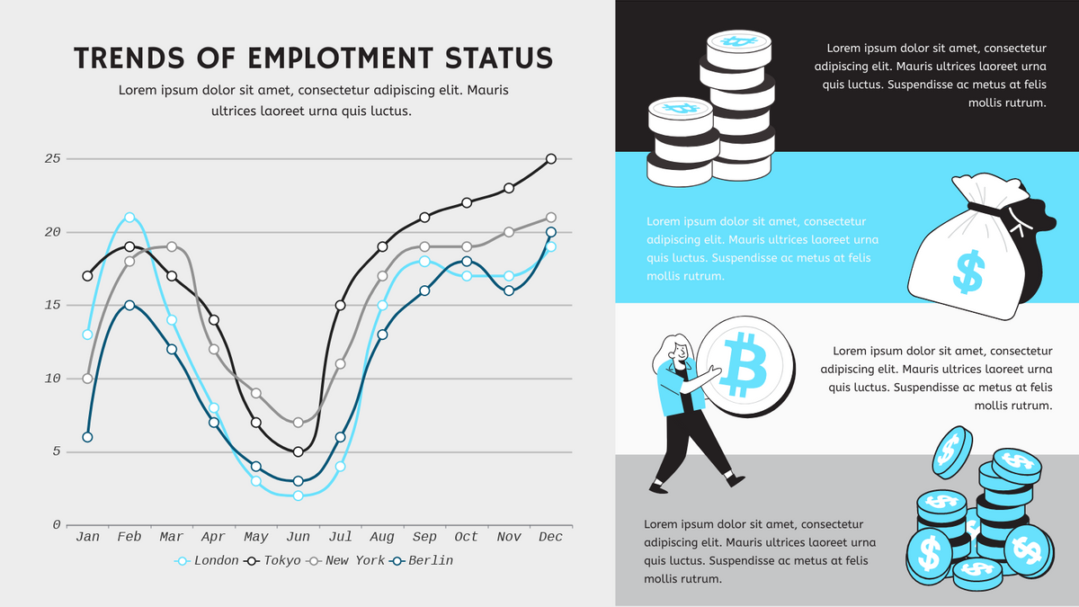
Trends Of Employment Status Curved Line Chart
This post is also available in Deutsche, Español, فارسی, Français, English, Bahasa Indonesia, 日本語, Polski, Portuguese, Ру́сский, Việt Nam, 简体中文 and 繁體中文.
