


How To Create A Difference Chart
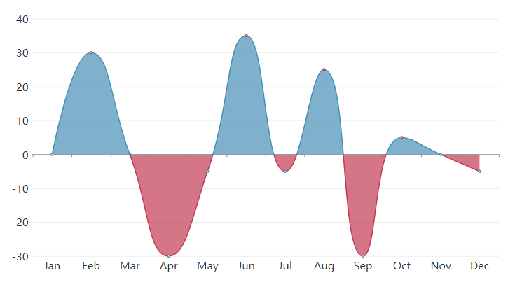
What Is A Difference Chart
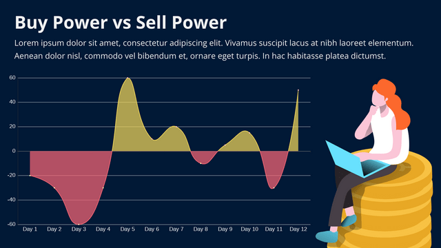
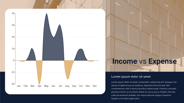
Unlike the other chart showing the data directly, difference chart show the difference between 2 groups of data. It is divided in to 2 side, the positive side and the negative side. By finding the difference the value of the 2 sides, we get the data to shown in this chart.
When To Use Difference Chart
As it shows the difference instead of the data, difference chart is not suitable for recording. It is more suitable when doing analysis as the data shown is already a result of calculation. Just like reading the result of comparison of different data group, people can clearly find the advantages or disadvantages based on different elements.
How To Create A Difference Chart
Edit Data
Go to Panel-Chart, click “Edit data” to open the table.
You can also choose to import data from Excel or link to Google Sheet.
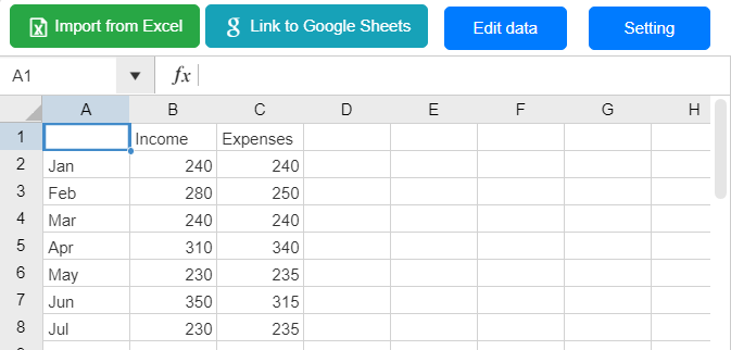
Although the chart shows the data between 2 groups of data, we do not need to calculate the difference by ourselves. We only need to list the 2 groups of data on the table, we can then see the calculation result on the chart.
As the data shown in the chart is the difference of 2 data, we cannot directly move the drag and drop the curve on the chart as we are not sure whether one of the data or both of them are changed. Th only way to edit the value id to edit the data on the table.
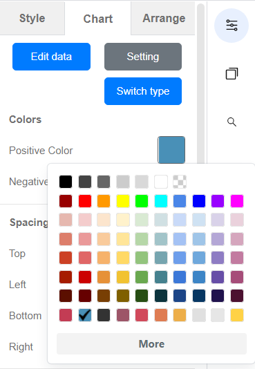
Customize The Color
We can change the color of the positive and negative side of the chart.
Moreover, the X-axis and Y-axis, split line and the split area are also customizable, such as the font, font color, style of line, etc.
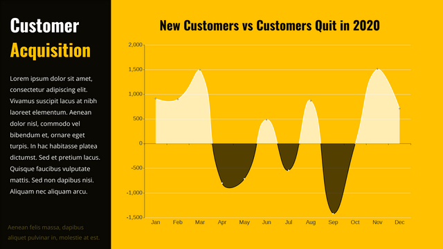
Difference Chart Template
This post is also available in Deutsche, Español, فارسی, Français, English, Bahasa Indonesia, 日本語, Polski, Portuguese, Ру́сский, Việt Nam, 简体中文 and 繁體中文.
