


How to Create a Grouped Column Chart?
The grouped bar chart is an extension of the bar chart, plotting values for levels of two categorical variables instead of just one. Create charts easily with Visual Paradigm Online. In this video, you can see how to create a grouped column chart in VP Online.
The steps is as follow:
- Click on charts panel on the left and select grouped column chart

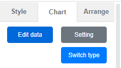
- Click on chart panel on “your right” and select edit data
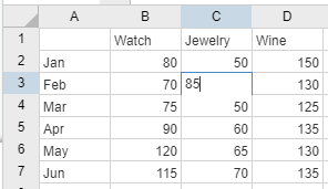
- Replace the old data with your own data
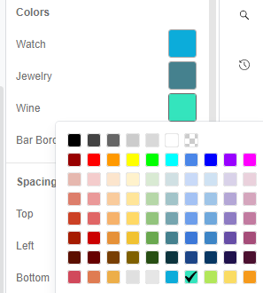
- Edit your chart style in cluding the chart color and font
Looking for some grouped column chart sample? Click visual paradigm online!!!
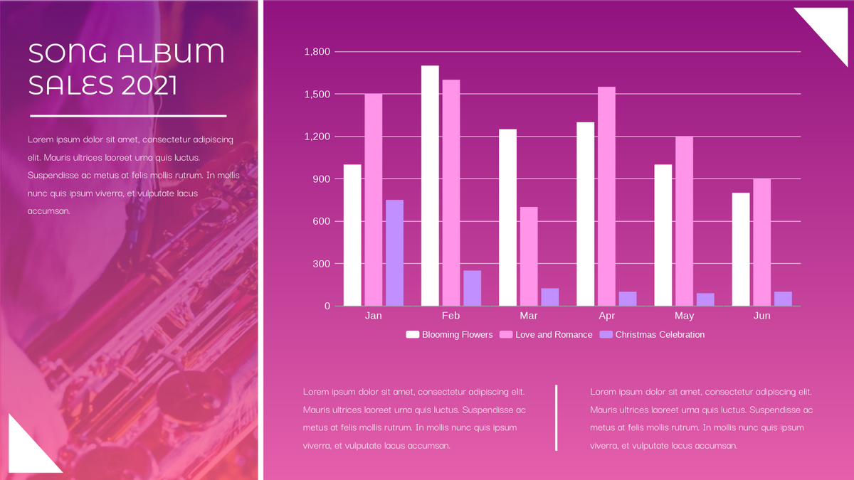
Song Album Sales Grouped Column Chart
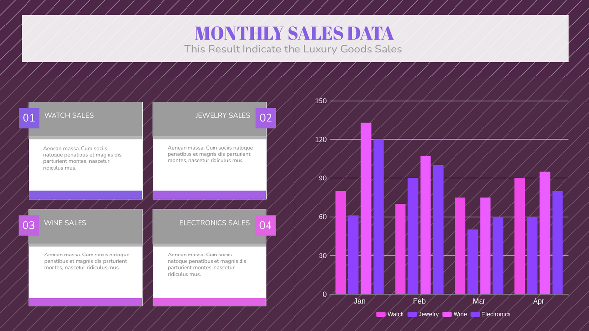
Luxury Goods Sales Grouped Column Chart

Delivery Method Grouped Column Chart
This post is also available in Deutsche, Español, فارسی, Français, English, Bahasa Indonesia, 日本語, Polski, Portuguese, Ру́сский, Việt Nam, 简体中文 and 繁體中文.
