


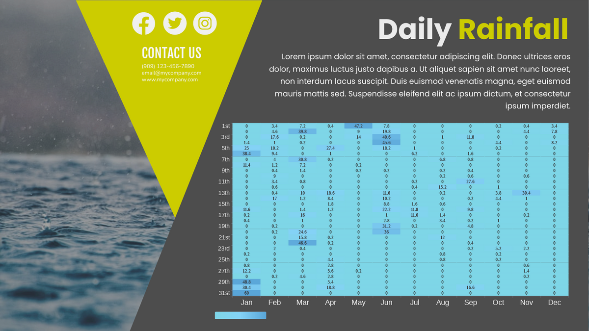
How to create a heatmap?
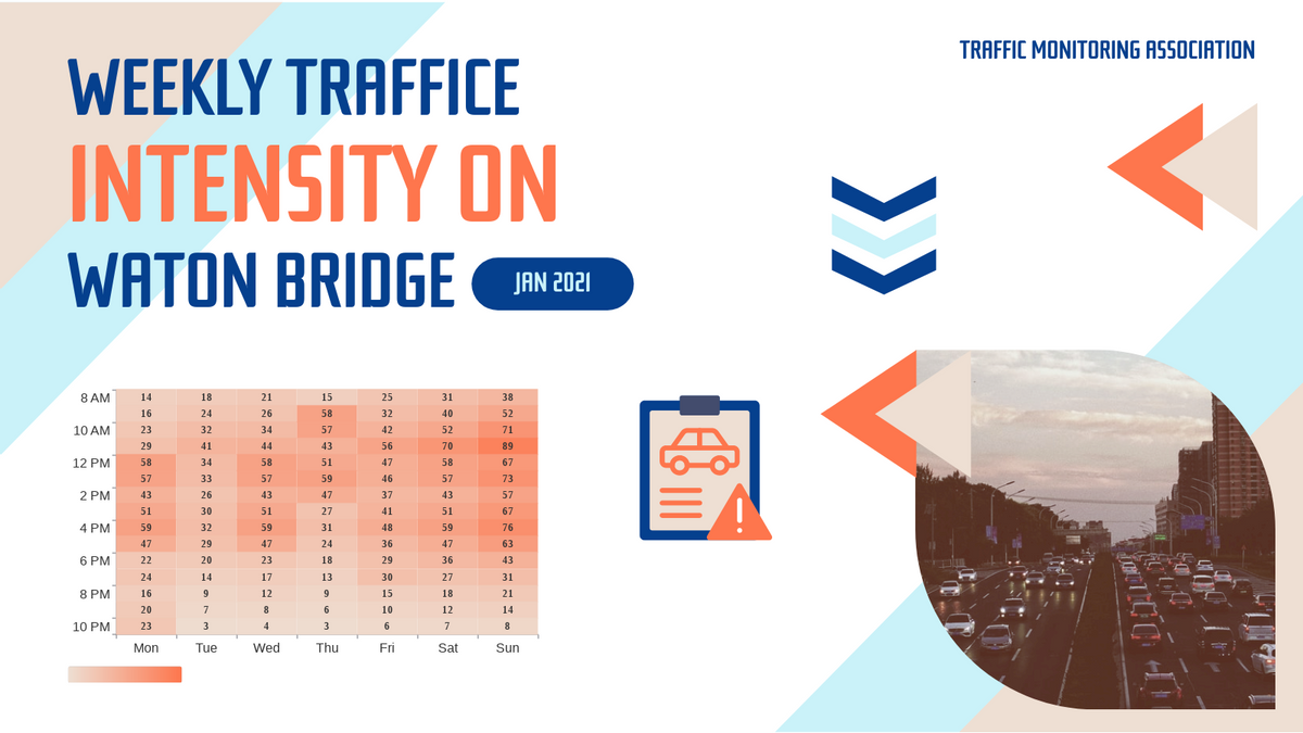
Heat maps are graphical representations of data using colour charts. The main purpose of heat maps is to better visualise the number of locations/events in a dataset and to help guide viewers to the most relevant areas of the data display. In this video, you will understand how to create your own heat map easily.
There steps in creating heat map are as follow;
- Click “Chart” and selection the heat chart from the left panel
- Drag the chart to canva and select “Edit Data” on right panel
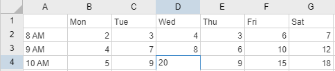
- Replace the template data with your own data
- After inserting data you can edit your chart style

Would your like to create your own heat map now? It is very easy, just click here! Or you can try out any of the samples below.
This post is also available in Deutsche, Español, فارسی, Français, English, Bahasa Indonesia, 日本語, Polski, Portuguese, Ру́сский, Việt Nam, 简体中文 and 繁體中文.
