


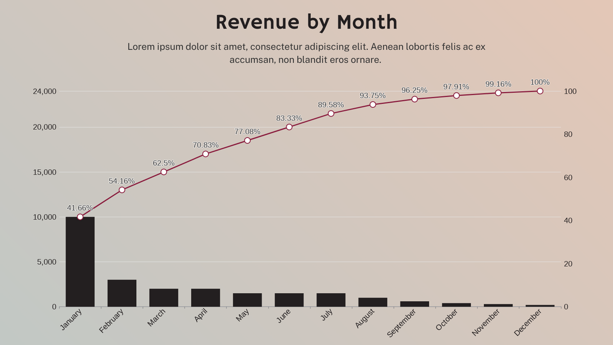
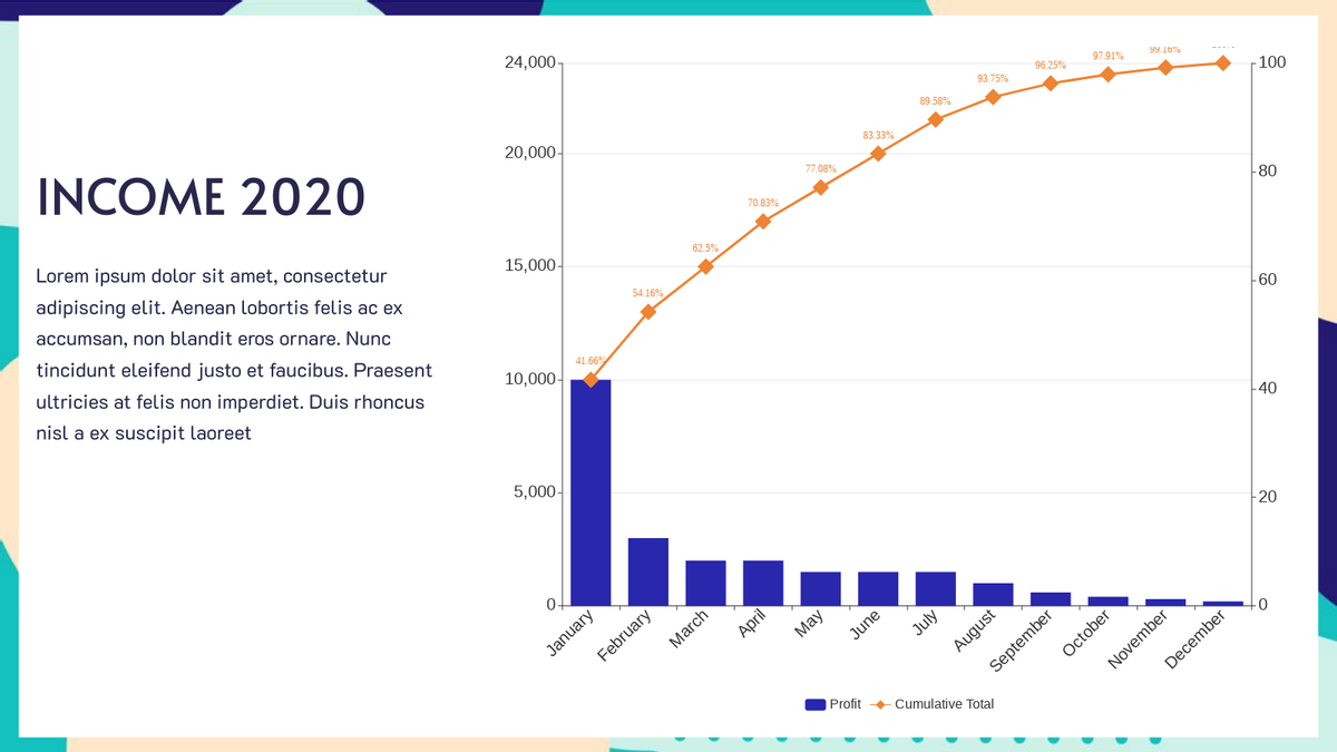
How to Create a Pareto Chart
Pareto charts are often used to identify early areas of focus in process improvement. A Pareto chart is an ordered frequency count of the values of different levels of a categorical or nominal variable. Learn how to create your own pareto chart in the below video!!!
The steps in creating pareto chart:
- Click on charts panel on the left and select pareto chart

- Drag the chart into your canvas and adjust the size
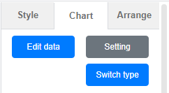
- Click on chart panel on “right” and select edit data
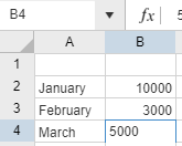
- Replace the old data with your own data
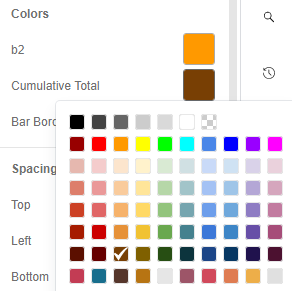
- Edit your chart style in cluding the chart color and font
- Finalise your chart and save
Noted; If you would like to place your chart into your presentation or rmb, you can save as a blank png so easy insertion.
Looking for some pareto chart sample? Click visual paradigm online!!!
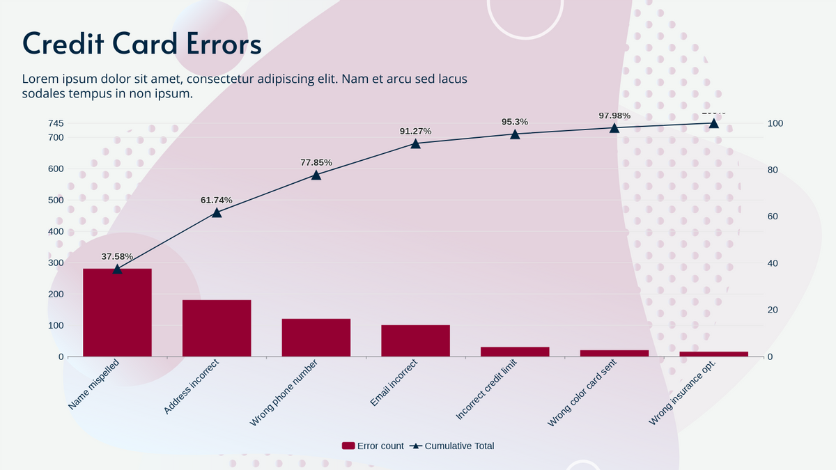
Credit Card Errors Pareto Chart
This post is also available in Deutsche, Español, فارسی, Français, English, Bahasa Indonesia, 日本語, Polski, Portuguese, Ру́сский, Việt Nam, 简体中文 and 繁體中文.
