


How to Create a Pie Chart?
A pie chart (or pie chart) is a circular statistical figure divided into slices to illustrate numerical proportions. In a pie chart, the arc length of each wedge is proportional to the number it represents. Although it is named for its resemblance to a pie that has been cut into slices, there are variations in the way it is presented. Create charts easily with Visual Paradigm Online. In this video, you can see how to create a pie chart in VP Online.
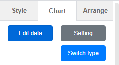
The steps is as follow:
- Click on charts panel on the left and select pie chart

- Click on chart panel on “your right” and select edit data
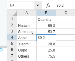
- Replace the old data with your own data
- Adjust your pie chart by dragging the edges
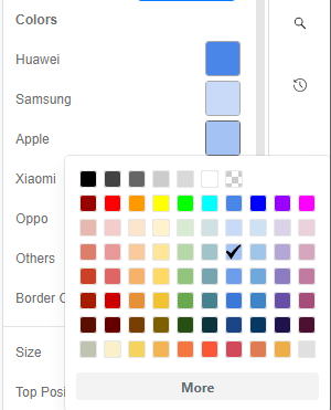
- Edit your chart style in cluding the chart color and font
Looking for some pie chart sample? Click visual paradigm online!!!
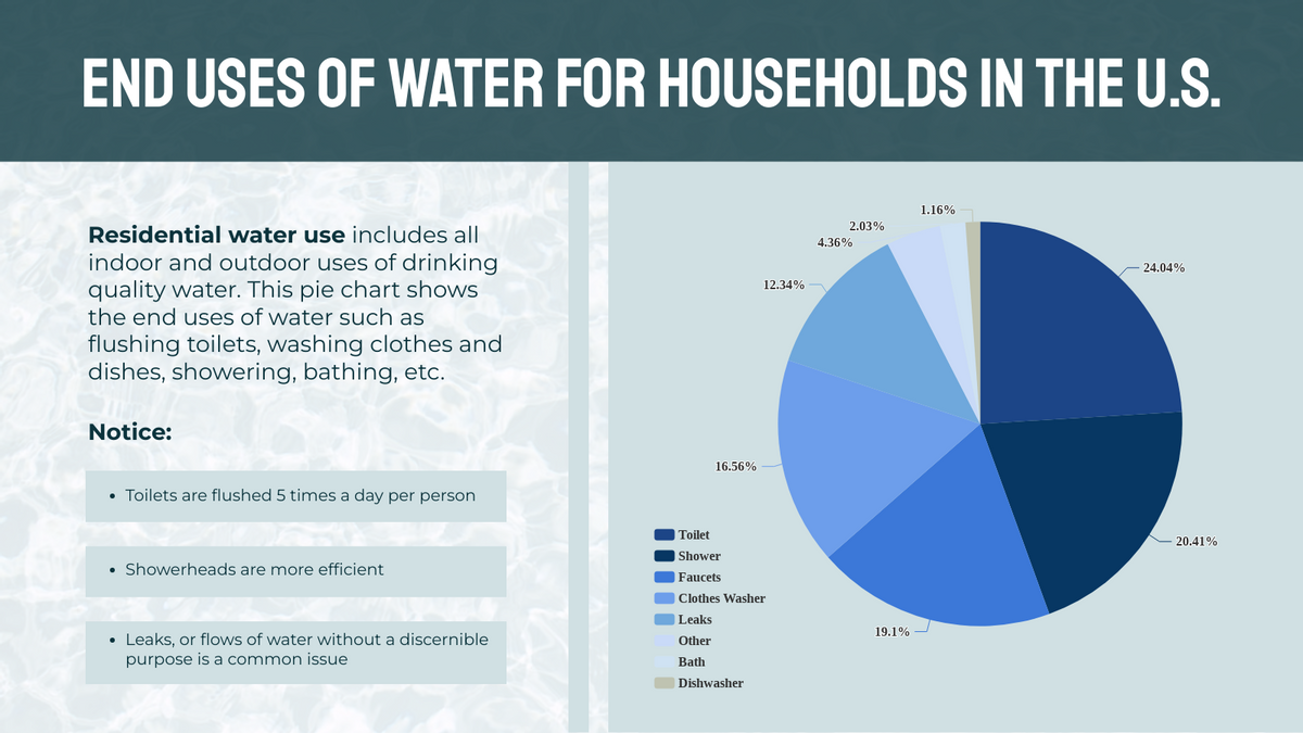
End Uses Of Water For Households In The U.S
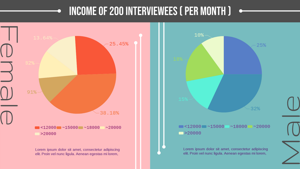
Monthly Income Of Male And Female Pie Chart

This post is also available in Deutsche, Español, فارسی, Français, English, Bahasa Indonesia, 日本語, Polski, Portuguese, Ру́сский, Việt Nam, 简体中文 and 繁體中文.
