


How to Create a Range Spline Area Chart
Range splines are very similar to area plots for data visualization. The main difference between them is that the second graph plots the values of the Y axis one by one, while the first is a type graph of the spline area that plots the values of both Y axes over time – low and high. Create charts easily with Visual Paradigm Online. In this video, you can see how to create a range spline area chart in VP Online.
The steps is as follow:
- Click on charts panel on the left and select pareto chart

- Drag the chart into your canvas and adjust the size
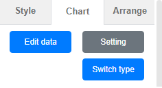
- Click on chart panel on “your right” and select edit data
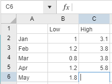
- Replace the old data with your own data
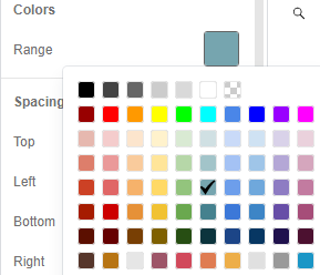
- Edit your chart style in cluding the chart color and font
- Finalise your chart and save
Looking for some pareto chart sample? Click visual paradigm online!!!
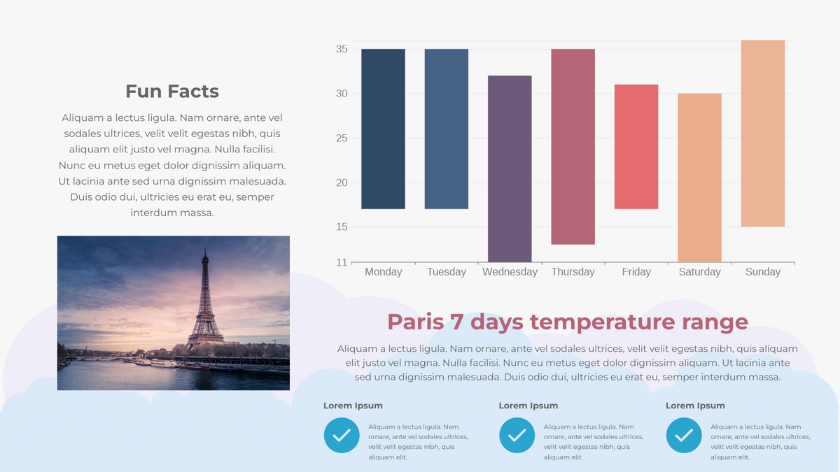
Paris 7 Days Temperature Range Floating Column
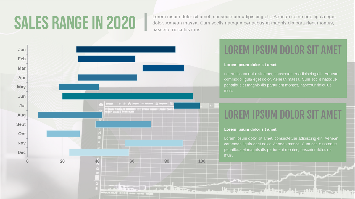
Sales Range in 2020 Floating Bar Chart
This post is also available in Deutsche, Español, فارسی, Français, English, Bahasa Indonesia, 日本語, Polski, Portuguese, Ру́сский, Việt Nam, 简体中文 and 繁體中文.
