


How To Create A Stacked Bar Chart
What Is A Stacked Bar Chart
Data visualization helps us to present the numerical composition data in a clearer way. We may already know what bar chart is. It can be evolved into other charts, including stacked bar chart, the chart we are going to talk about today.
Unlike charts that show different categories of data column by column, they are placed in one column and divided by different colors.
When To Use Stacked Bar Chart
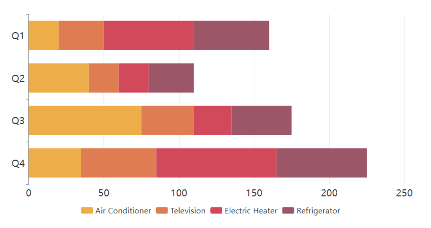
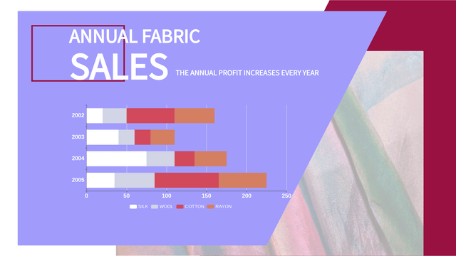
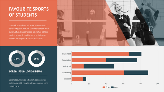
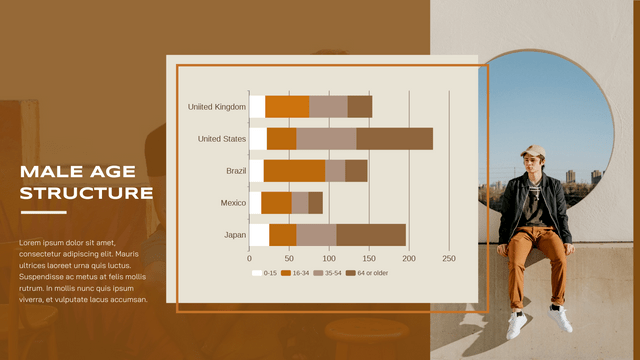
Since all the data are placed in one column, the stacked bar chart facilitates the comparison of totals between the different groups. It can be used to show charts like the sale of different store, population by gender, etc.
When using stacked bar char, it is easy for us to find the total amount, but difficult for us to compare the components of the bar except the first category. It is important for us to choose the type of chart according to the data we have and the purpose of creating the chart.
How To Create A Stacked Bar Chart
Edit The Data
By chart maker of VP Online, we can complete a stacked bar chart conveniently.
After dragging the chart to the editor from the chart library, you can start editing the data by pressing “Edit data” under panel-Chart.
(You can edit the data one by one, or import the existing data from Excel or Google Sheet.)
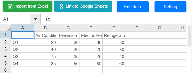
Data are shown in a table.
Take this table as example, Q1 to Q4 represent the 4 bars respectively, while the categories such as air conditioner and television are the component of the data.
(If you want switch the content of X-axis and the Y-axis with the same table, you can click “Switch Row/ Column data” at the bottom of the panel)
![]()
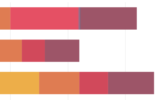
You can also drag and drop the bar directly to edit the amount of different categories.
Customize The Stacked Bar Chart
The bar is consisted in different components, while the colors of each of them are all customizable.
Colors of different components are listed under the panel according to the data of the chart.
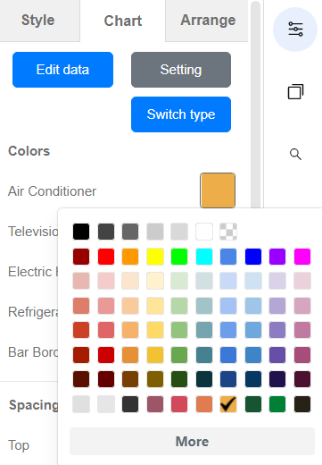
Click them and customize the colors of the chart design.
In addition, you can also customize the elements such as split lines, X-axis, Y-axis, legend, etc. by other options under panel-Chart.
Try to find the best style of your chart!
Stacked Bar Chart Templates


This post is also available in Deutsche, Español, فارسی, Français, English, Bahasa Indonesia, 日本語, Polski, Portuguese, Ру́сский, Việt Nam, 简体中文 and 繁體中文.
