


Using Charts To Improve Your Brochure
A brochure is a common paper document used to introduce detailed information about companies, products, organizations, and even individuals. Sometimes they are also used in advertising. People may read a large number of brochures every day, including many false or useless news. In order to attract their attention, it is important to show some data to make your brochure credible, while adding charts in your brochure is one of the useful ways.
Using Charts In Brochures
A chart is a data visualization method that displays data through different shapes and symbols. Different charts have their own characteristics and can better explain a particular data set. Here are some common uses of charts in brochures:
Summarize The Data
When promoting some products or services, we can show the bought of them so that people can understand that ” many people are willing to trust them”. In this case, using charts to shown these kinds of data will be much better than saying something like ” In January, 80% of users think that our products great, while 85% of them are willing to buy again in February. In February…”
Moreover, the using of chart can also show the changes clearly. By showing the increasing/ decreasing, people can better know whether they want to consume.
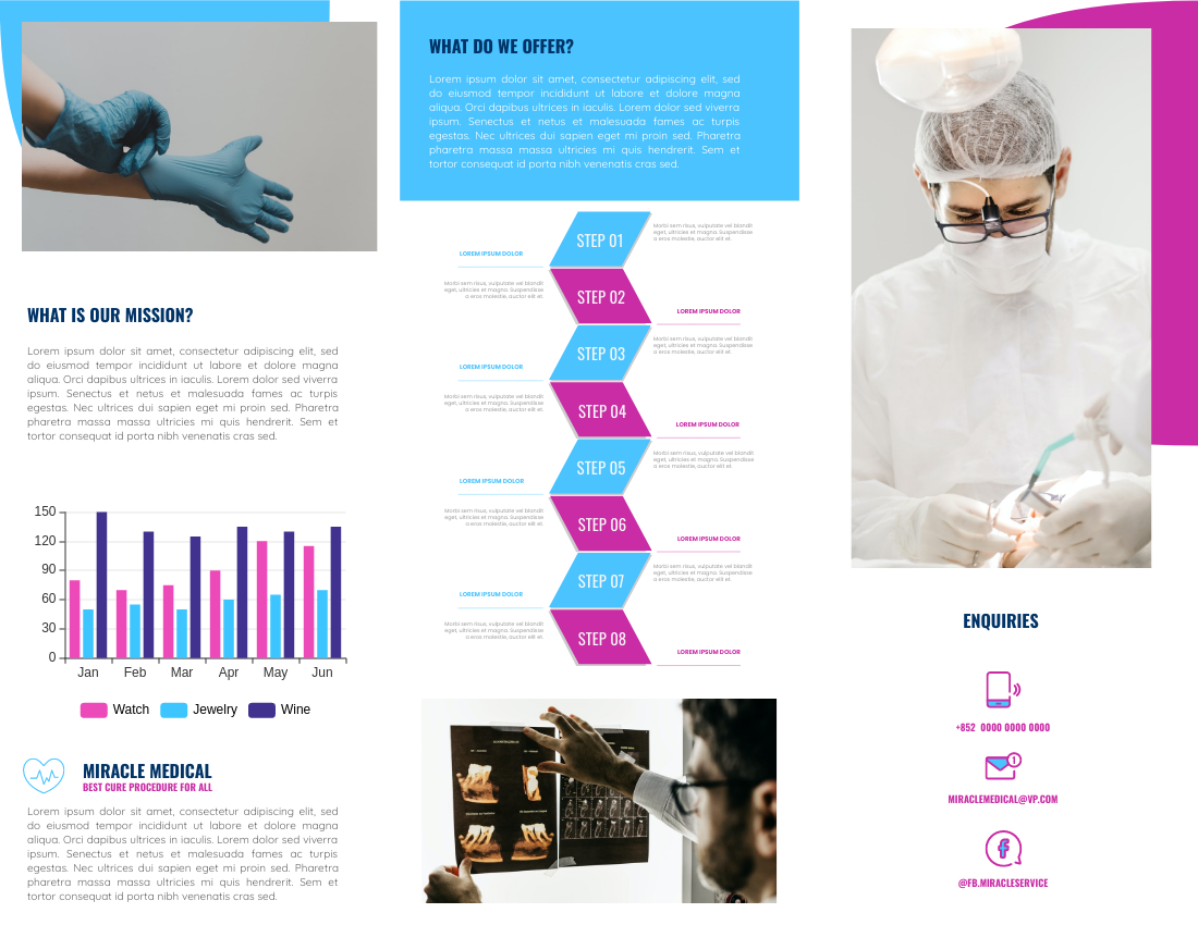
(Medical Service Brochure – Click here to edit.)
Do Comparison
Sometimes if we want to compare data, charts can clearly show their strengths and weaknesses in different aspects. For example, a radar chart is a commonly used chart for displaying quality. When we put several sets of data together, the difference between them will be obvious.
Through a clear comparison, people can choose the one that really fits their needs and make the best choice.
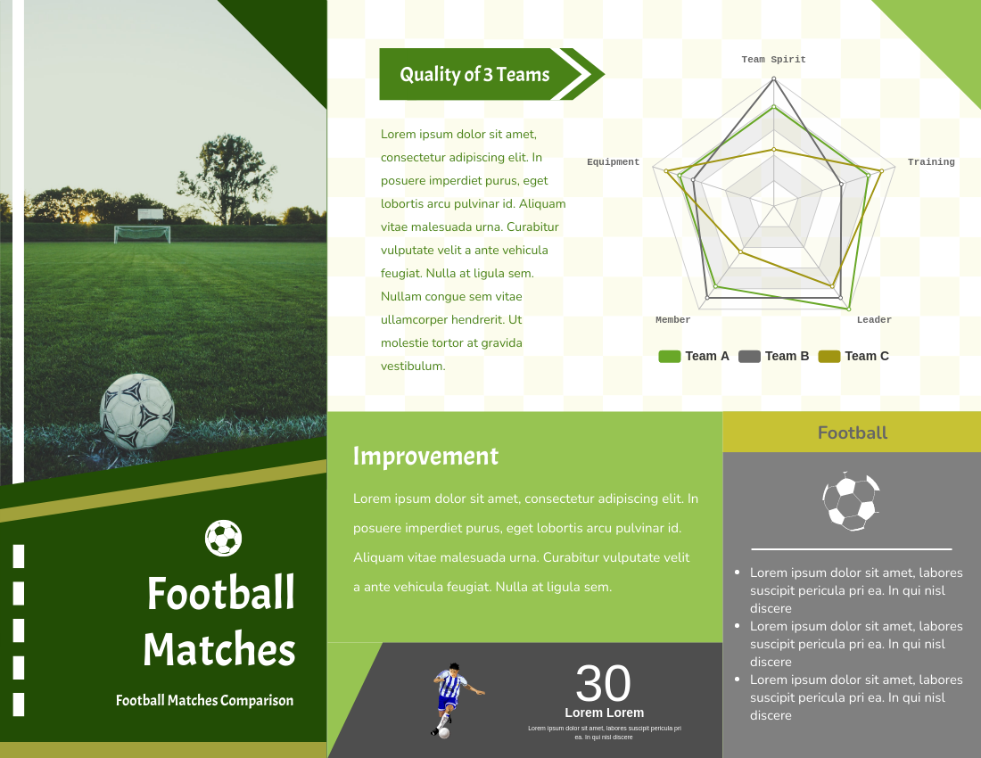
(Football Matches Brochure – Click here to edit.)

(Benefits And Risks Of Investment Brochure – Click here to edit.)
Visualize Your Data
Even though your data is very short or clear, we can still use charts to show them. Chart is not only a set of data, it is also a kind of design elements. With the same colour tone and font, the chart can perfectly match with your design. Being the same set of data, people will be more willing to read a chart instead of words. They can also remember the data in their mind by the symbols and colours more easily.
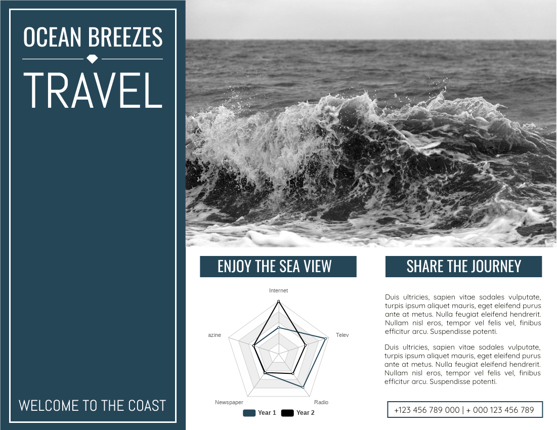
(Ocean Breeze Travel Brochure – Click here to edit.)
How To Create Charts In Your Works
You can find different types of charts in the “InfoCharts” of our library. Choose the one you like and customize them to meet your needs. As mentioned above, the style of the chart can also be customized by changing its color, font, and background to match your design. Start your creation and design awesome and believable brochures with charts!
This post is also available in Deutsche, Español, فارسی, Français, English, Bahasa Indonesia, 日本語, Polski, Portuguese, Ру́сский, Việt Nam, 简体中文 and 繁體中文.
