


10 common poster design techniques
A poster may seem very simple, but it may include a lot of poster design skills. The following introduces you to 10 common poster design techniques, waiting for you to get endless design inspiration and design a unique style poster.
Photo cutting
The photo cutting technique is the technique of overlapping, superimposing, and breaking up text or graphics to increase the layering of the poster, and it can also increase the beauty and interest of the poster. Just like this poster template from VP online, this art fair poster can show a lot of artwork, and those artworks can overlap to a new artwork to make the design increase the layering.
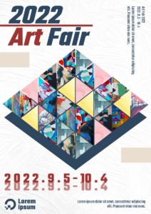
Air Fair Poster
Another poster template: Sporting Goods Big Sale Poster
It has used a lot of sporting photo cutting, make people know that the poster topic, also can make the poster more beautiful.

Sporting Goods Big Sale Poster
Unique perspective
You can use a unique perspective as the theme of the poster, and use a rare perspective to increase the uniqueness of the poster, so that the audience can see things from a new perspective. This is a “Seasons Greetings Christmas Sale Poster” template, it is a Christmas sale poster, but it has not any Christmas element, it has a unique perspective photo and unique content, at the heart of its decoration is “simple but not simple”, designers can bring ordinary “placement” and “stacking” to life.
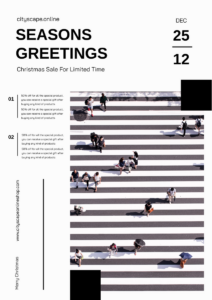
Seasons Greetings Christmas Sale Poster
Text poster
Text-themed posters are also common, but the way the posters are presented is completely different. You can use an English letter or word as the theme; you can also cut the text to enhance the three-dimensional sense; you can also disperse the text and change the text size to create a sense of leisure and freedom. If you want to show a bold style, you can use bold and parallel serifs. If you want to enhance the sense of elegance, you can use italic serifs. You can choose handwritten fonts to express playfulness or fun. If you want to create a greater impact, try typography.
The themes of the following posters are: World Whiskey Day
It uses text and line to create a whiskey and also bring out the topic of world whiskey day. If you want to use the following methods to typeset, you make sure your fonts are clean and simple.
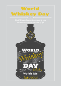
World Whiskey Day Graphic Poster
Remove unnecessary elements
Sometimes less is more. A word or a dramatic image can communicate simple and clear words, and there are so many complicated pictures and photos. Don’t add extra worries and graphics.
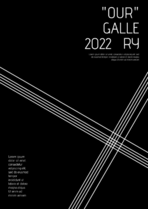
Gallery Poster
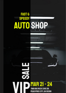
Auto Shop Sale Poster
They all have a word that dominates the audience, lack of color, clean and simple. Simple and elegant is definitely the style we have been yearning for in reality.
Retro Style
Many people prefer retro-style things, whether it’s clothing, restaurant decoration, or poster design. Retro-style posters often choose colors with lower saturation to match the touch of brush lettering or texture. This is a “World Earth Day Summit Poster” template, it has used a retro-style color and illustration to the design.

World Earth Day Summit Poster
Exaggeration
Exaggeration is a design technique that enlarges the audience’s brains as much as possible. By deviating from the conventional methods (such as anthropomorphizing dead objects), it highlights the poster’s thoughts and arouses the audience’s interest. This method is very common in product advertisements or government public propaganda posters. This poster template also has uses exaggeration, it has used a bold colo, highlighting the focus of the picture and creating a very shocking visual effect, also the sharp color and black color are arranged into striking contrast.
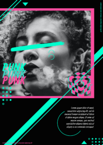
Cypherpunk Poster
Make sure your graphics and text complement each other
Use symmetry, qualitative, and repetitiveness to shape visual balance. Use colors, weights, and graphics that can reflect the combination, but balance does not mean that the graphics and text are completely centered in the poster. Just like this “Mother’s Day Bouquet Special Offer Poster” poster, it has used symmetry illustration to make the poster has a visual balance.
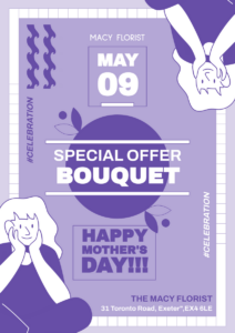
Mother’s Day Bouquet Special Offer Poster
Use photos to make posters to increase the credibility
A beautiful and dramatic picture may convey a message. But the credibility of photos is about the product, and real photos can make viewers feel the quality. In this example, the designer used the real Africa photo design to let people know about the malaria problem, making the poster increase credibility.
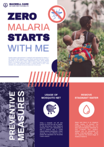
Malaria Preventive Poster
Illustration style
Photography does not always meet your needs, or you do not have enough budget for photography. On the contrary, you can create your own patterns or characters, you can choose to maintain balance or have layers and depth. The illustration is another commonly used design style. It has no specific framework. It can be wild or realistic. If you want to design a poster that breaks the norm, illustrations are a good choice. This is an illustration poster template: International Day Of Tolerance Party Poster
It has a cute party illustration, to show the topic of the international day party.
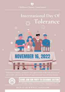
International Day Of Tolerance Party Poster
Series posters
When you create a series of posters, remember that they should look similar except for the images and colors. But they should have no different parts except that series. The posters below are almost the same, but they are slightly different. They are the same store different season’s sale posters.
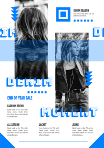
Demin End Of Year Sale Poster
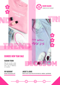
Denim New Trend Sale Poster
This post is also available in Deutsche, Español, فارسی, Français, English, Bahasa Indonesia, 日本語, Polski, Portuguese, Ру́сский, Việt Nam, 简体中文 and 繁體中文.
