


5 Tricks For Creating an Effective Brochure
The most direct way to promote your business or to announcing a new series of new product is to get out there and distribute your brochure. Making a brochure sounds easy but making it to be effective is not as easy as it sounds. What is an effective brochure? An effective brochure will not only display your product’s feature but lead your potential customer to your door! You may think that “hey this is a digital world, why don’t I just do online advertisement?” The thing is that your online advertisement can only reach your current potential audience but printed material can reach further as long as you put your brochure out there, people will who may seemingly not relatable to your service right now can also become a potential customer.
1. Make a Distinctive Statement
To make an impression in a person’s mind, you must be able to draw his attention within 12 seconds! The most effective way is to make a simple statement. It is often that company might though of having some twist in their brochure but in fact it can be confusing.
- Share empathy with client situation
- Think of the words that client want to hear
Do not use any negative statement

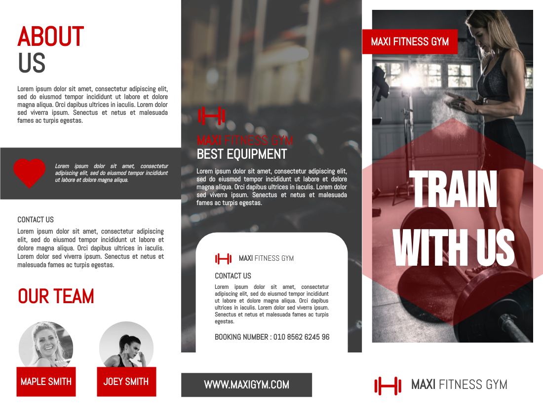
Fitness Gym Intro Brochure – Edit now
2. Arrange Your Content
There are various potential on your brochure as the most specific feature in brochure is being able to have different folds and you may even decide if you would like to have die-cut fold. InfoART has no limitation over the section in brochure fold but it is best to keep it under 5 folds for your readers. Moreover, you should always arrange your brochure content distribution before, otherwise it will bw quite challenging for you to decide the entire outlook and you may even end up putting several important content together in a single page. Taking the below brochure as example, this brochure is selling a product. Therefore, the content is divided into “company identity”, “product feature” and “discount information”. These content needs to be distributed individually in a single page so that it is easy-to-read!
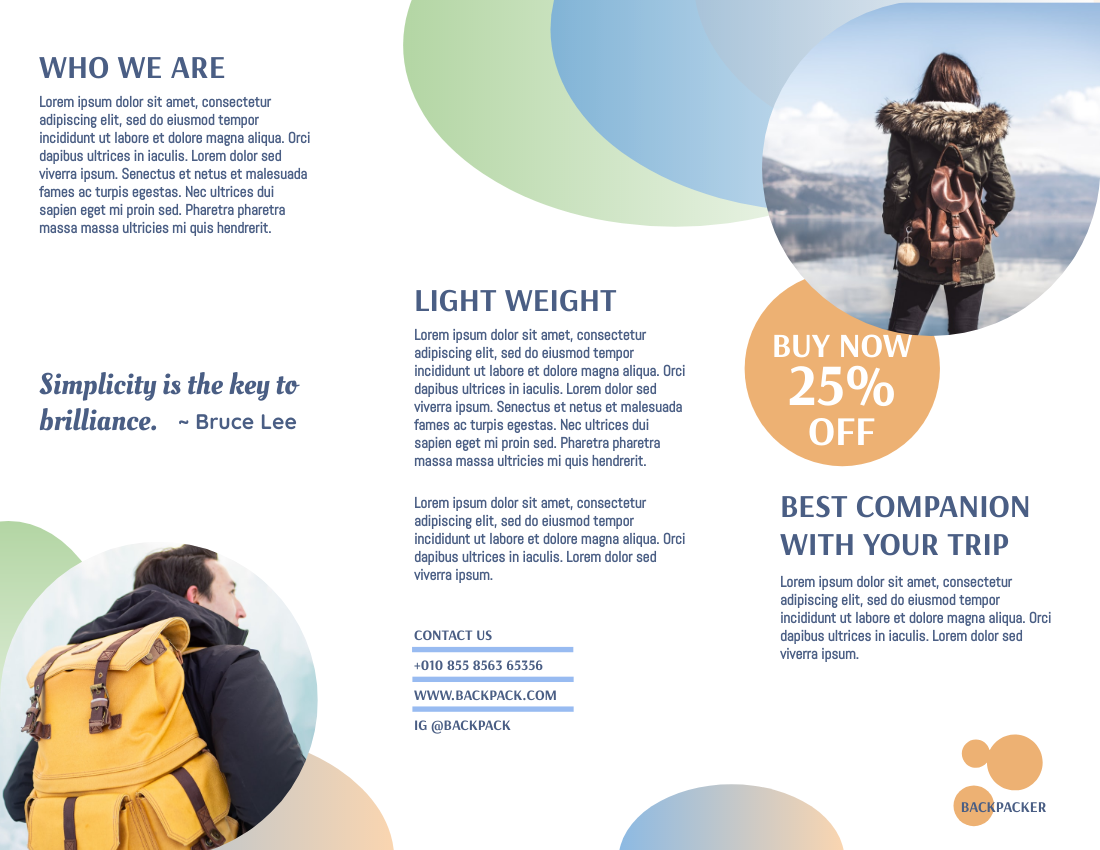
Traveling Backpack Promote Brochure – Edit now
3. No More Than 3 Fonts

The fonts determined the entire readability of your brochure. If you use more than 3 font in on brochure, it might end up looking like a robbery letter. Indeed, no one like to read messy and bouncy text so its best to decide which font to apply on your “heading”, “subheading”, and “body paragraph” before you begin your design. InfoART has already listed out plenty of font pairings for you to chose from. Keeping you workflow neat and simple!
4. Call-to-action is a must
A brochure without call-to-action is like a gun without bullet! That means your intention of increasing sale is never satisfied, hence you must always including a “call-to-action” to lead your recipient back to you. The “call-to-action” can invite your customer to take a stroll to your website or even avail to your discount section. Yet, how to make it look “inviting”?
- Use a bold typographic statements
- Include a discount action
- Install a QR code to make action simple

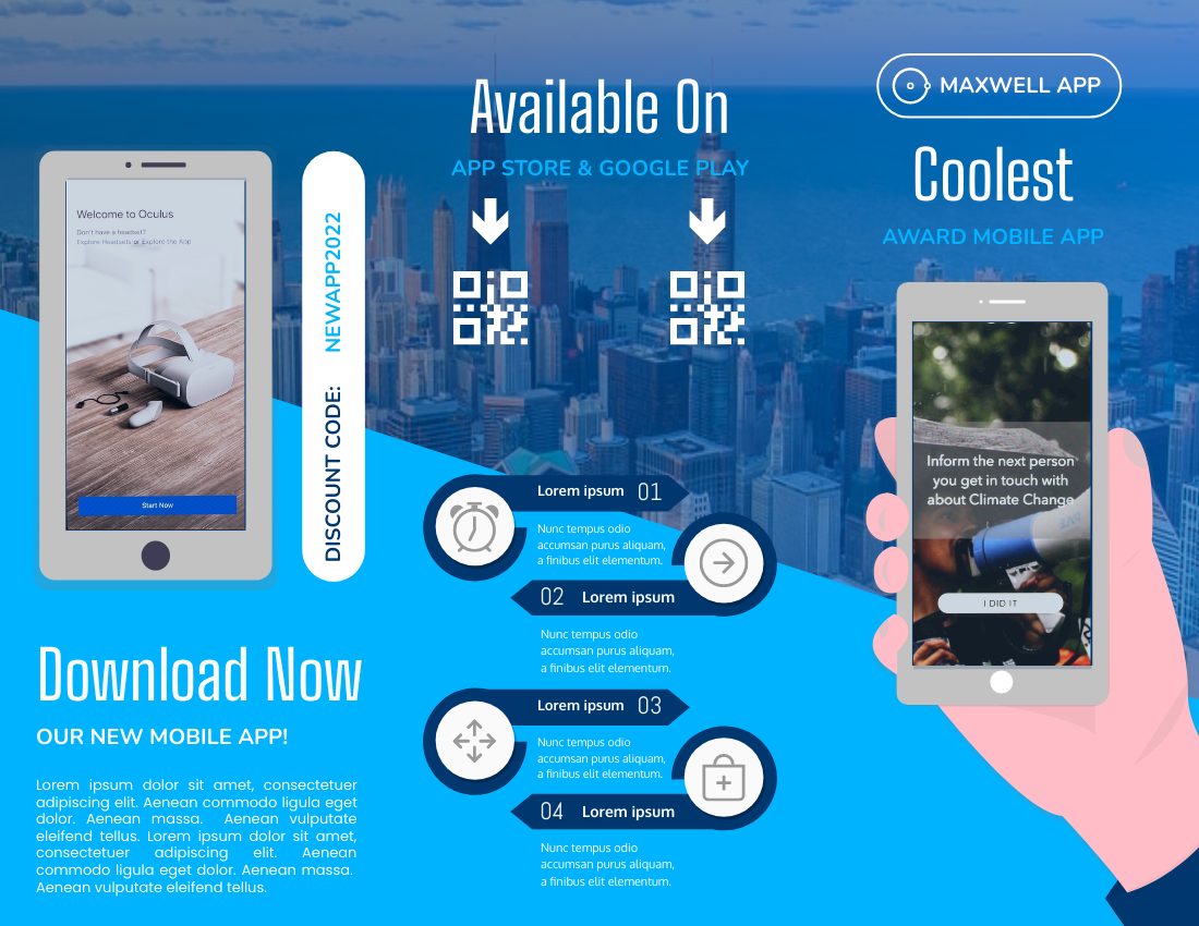
Introducing Mobile APP Brochure – Edit now

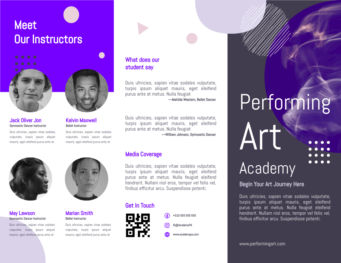
Professional Performing Art Brochure – Edit now
5. Make use of great stock photos
It is understandably that not everyone is a great cameraman but always make sure that you are using a high resolution photo, as no one likes to see a blurry brochure! If you really have trouble in shooting a good shot, you may cheat on using many of the free stock images online. In fact, if you working in InfoART, you will have access to many of our graphic resource. Make sure that you are choosing a “naturally” looking photo that matches the overall color tone of your brochure! For instant, the below sample are mainly using “brown”, “white” and “beige”, hence the stock photo involves wooden and wheat elements.

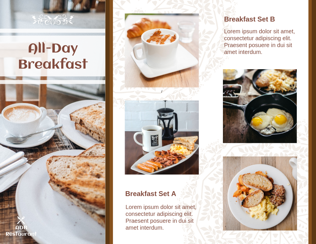
All-Day Breakfast Brochure- Edit now
This post is also available in Deutsche, Español, فارسی, Français, English, Bahasa Indonesia, 日本語, Polski, Portuguese, Ру́сский, Việt Nam, 简体中文 and 繁體中文.
