


7 Tips to help you create a successful and valuable infographic
It is well known that the brain is far more efficient in processing visual information than in processing textual information. This is one of the reasons why the data visualization design is so effective in conveying information; by “viewing” the data, the brain can more easily ingest, synthesize and retain all the information. Data analysis information presented.
However, when designing a large data visualization screen, many people will mistakenly think that putting several data charts together for display means that a large data visualization screen has been completed; unfortunately, the large screen produced in this way Not only is it poorly done, it may actually disrupt your data analysis results.

Even if you did not misunderstand the data during the centralized display, but did not present the data in the most optimized form, it is very unfriendly to your big data screen audience; for example, the audience will not understand the logical relationship before the chart. What kind of story the big screen wants to show, it is impossible to obtain clear data analysis results from the big data screen, and cannot assist them in making effective management decisions. The big data screen produced in this way is counterproductive.
It is not enough to pay attention to the design of the infographic. At the same time, you must also master the narrative ability of data information and finally show it through the form of design. Then how to create a successful and valuable data visualization is a crucial issue and skill.
Next, I summarized some key points of data visualization production to share with you:
1. Choose a chart format that tells the story correctly
There are many forms of charts, and there may be more than one way to display visualized data. But in this case, we generally have to consider the goals to be achieved, what kind of information is being conveyed, the specific goals to be achieved, etc. and choose the most accurate data visualization chart form.
2. Refuse to use unreasonable chart formats
In the process of data visualization, we need to pay attention to the appearance of chart garbage, such as redundant chart copies, unnecessary illustrations, shadows, decorations, etc. The greatest part of data visualization can better help you get rid of heavy data analysis work through design, to enhance and convey the convenience of data analysis results; but be careful not to fall into the misunderstanding of complicated design and refuse to use unreasonable charts Form, choose the right chart, and let it do its job.
3. Make a design that can be quickly understood
After starting to create a large visualization screen, we can consider which simple elements to add, adjust or delete in the details of the chart for the effect of the overall large screen, so as to make the data easier for readers to understand. You may have added a trend line to the line chart, or you may realize that there are too many slices in the pie chart (up to 6) and cut some content; these subtle adjustments are very different and will affect the final big-screen effect has a certain influence.
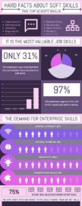
Hard Facts About Soft Skills Infographic
edit this template
4. It is best to start with a zero baseline in a line chart
Although the line chart does not have to start from the zero baselines, if it needs to compare more values, the zero baselines should be included. If relatively small fluctuations in the data are meaningful (for example, in stock market data), the ratio can be truncated instead of starting from a zero baseline to show these differences.
5. Always choose the most effective visualization
Data visualization must be visually consistent so that readers can compare at a glance. This may mean that you should pay attention to the number of types when using stacked bar charts, grouped bar charts, or line charts. No matter what kind of chart you choose, in the end, don’t make readers feel overwhelmed by not being able to compare too many things; in the case like the following figure, an effective and uncomplicated chart was tried to convey the truest data information.
6. Pay attention to the position of the chart
On the big screen, you may need to set up two stacked bar graphs to allow the audience to compare the two, but if they are too far apart to allow the audience to clearly understand the “contrast” relationship between the two, It proves that there is a problem with your large-screen chart settings.
7. Able to tell a continuous story
For example, in the fourth quarter, your company’s sales increased by 30%, which is a very happy thing; but what is more exciting? It is to display on the big screen that you have actually achieved 100% sales growth since the first quarter; the comparison of both makes the joy come more, and the story has continuity from an annual perspective.
These infographics example is from VP Online, which includes different sets of information. This information is concentrated into topics that may be useful for a better understanding of the audience. You can try to use these templates to create your own infographic!
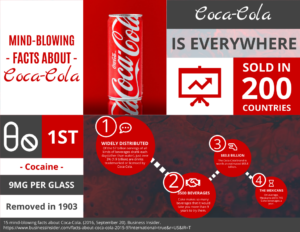
Mind-blowing Facts About Coca-Cola horizontal infographic
Edit this template

Insomnia Facts And Stats Infographic
Edit this template
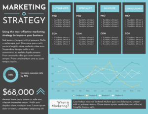
Marketing strategy horizontal Infographic
Edit this template
This post is also available in Deutsche, Español, فارسی, Français, English, Bahasa Indonesia, 日本語, Polski, Portuguese, Ру́сский, Việt Nam, 简体中文 and 繁體中文.
