7 tips to help you design the perfect poster
For promoting products and connecting customers, posters are always the most interesting and practical form of presentation. Many excellent posters not only present information but also can do some interesting things by the way. The poster is a classic, and the poster also meets the needs of many current designs. What issues should be paid attention to if you want to design a good poster? In today’s article, let’s share 7 very practical poster design techniques to help you improve your poster design.
1. Make the poster legible from a distance
When we design, we often emphasize readability. The poster media must do this even more, at least to ensure that the basic content of the poster can be clearly read in a distant place. However, there are not many contents that posters can carry. In general, the text and visual content in the poster must be structured accordingly.
When designing a poster, the text should be constructed into three different levels:
Title: This is the main and largest text element in the poster. It is a supplement to the visual and artistic elements of the entire poster, and it can also be its carrier. When choosing headline text, it is best to choose a readable font or a well-designed headline font.
Details: What is the specific content presented in the poster, when and where it takes place, all need to be shown through details and detailed text descriptions. How to succinctly present information, size, and contrast requires careful control. Usually, the main information other than these headings needs to be controlled in half the size of the main heading to ensure a hierarchical structure and constitute a contrast. In many cases, the size of these auxiliary texts is considered based on their importance.
Retention of terms and conditions: This usually refers to the relatively minor provisions and content in the poster. For users who are interested in exploring, you can check it carefully. Usually, this part of the content will be reduced to a relatively small size, without affecting the main content, and will not Get in the way, but you can see clearly.
2. Enlarge the contrast
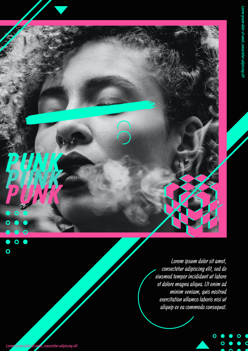
Your poster needs to be clear at a glance, and users will be attracted by a glance. The high contrast between the elements can help you do this. Forget light colors and monotonous color schemes, bold colors and exaggerated fonts are more suitable for poster expression. If you have any experimental design ideas, you can try to use posters to express them, including unique color schemes and font designs. They all have sufficient contrast and have attractive features. Just like this template on Visual Paradigm Online.

Cypherpunk Poster
3. Create posters based on size and location
The poster is finally presented. Will it be placed on the subway station or on the wall of the building?
Where and from what angle will users view it?
What is the aspect ratio of the poster itself?
What are the surrounding things that will affect the visual presentation of the poster?
These factors are actually related to your poster design. Knowing the actual location of the poster can help you better conceive and design. Vision not only occupies a very important position in poster design but also has a close relationship with external factors, requiring designers to design according to local conditions. For example, if your poster needs to be posted on a green wall, the poster must not use green, but a contrasting color that can be seen at a glance.
4. Emphasize the main vision
Whether your poster uses pictures, illustrations, or text, the main vision is the core of the entire poster. It is like a title, and it needs to be clearly identified from far enough away. When designing a poster, you can use compact facial close-ups, very targeted illustrations, or scenes with obvious focus characteristics as the main vision of the poster. After determining the main vision, pay attention to the level of other elements. There must be enough contrast between the text and the picture to ensure that it can be clearly distinguished.
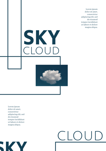
5. Use a lot of white space
The design goal of each poster is very clear. It needs to reach users at certain points. The vast majority of posters hope to attract users to do something, such as promotional posters for concerts and movies. The users who saw the poster turned into consumers. To create a visual focus, to a large extent, you need to rely on reasonable white space. Of course, in the poster design, the control of white space is not limited to highlighting the main vision. Other places should also be paid attention to:
The space between the letters should not be too close, otherwise, the user will not be able to see clearly if it is a little further away.
The line spacing of the text should be dense and dense.
There should be white space on the inner edge of the poster canvas to create a sense of breathing.
White space between different elements is also necessary, such as between text and pictures.
To use white space when creating a visual focus, you need to think about what you want the user to see most.
Try these templates on Visual Paradigm Online:

Nature Observation Event Poster

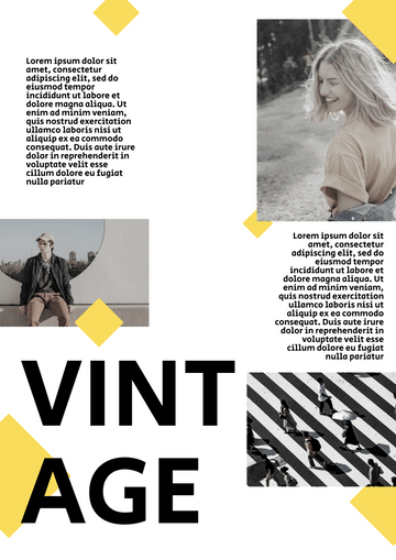
Vintage Clothing Poster
6. Use high-quality typography to create appeal
Most of the tension-rich typography you see is in various posters. The poster itself is a testing ground for various types of typography, and it is also a place where designers are most keen on creativity.
Some posters combine various illustrations with crazy and cool effects.

Music Festival Event Poster
Some posters only use fonts and colors, which can also be very expressive.

Cyber Monday Typography Poster
The point is typography.
The typographic design in the poster and the typographic design in other places actually follow the same principles, and there is also no compatibility with more than a dozen different fonts to express at the same time. However, you can use bolder fonts and use methods that you find more expressive. However, the use of any font and typography needs to fit the requirements and tone of the current project as much as possible, and convey the right emotions. If you often make posters, you will find that it is very active thinking and design exercise for your brain.
7. Enjoy the fun of design
The poster design itself has many interesting places. You will encounter various problems in the design process, solve problems, and experiment with various techniques. You can break the rules at the right time, or even design some crazy things, but in any case, you have to keep a happy mood and explore the mood, only in this way can you create stunning designs. Although designing often encounters all kinds of bad designs, good design is always something that is born out of experimentation, imagination, and creation. Keep your mind and have fun.
This post is also available in Deutsche, Español, فارسی, Français, English, Bahasa Indonesia, 日本語, Polski, Portuguese, Ру́сский, Việt Nam, 简体中文 and 繁體中文.


