


9 Professional skills to create the perfect exclusive invitation
If you want to create your own invitation, you need to consider the color, theme, typesetting, images, event details, etc. of the invitation design, and condense them into a single design. Even if you don’t have any design knowledge, as long as you plan carefully and pay attention to details, you can understand how to make an exclusive invitation letter. Continue reading to explore 9 professional skills to create an unforgettable exclusive invitation.
1. Start by determining the card size
Depending on the type of activity designed and its different settings, the size of the card may also vary. Below is a list of different invitation card sizes, ranging from small squares to narrow rectangles.
2. Understand the color
Color theory is one of the most important aspects of design. It can guide how to match different colors to create a specific tone or mood in the work. Don’t apply colors indiscriminately-if you understand colors, your design will look better. A consistent color combination can link all design elements together and set the tone for the invitation. Color matching does not only represent appearance; it can also determine the nature of the invitation card. For example, the vibrant color scheme goes well with birthday invitations, and the soft color combination is the first choice for wedding invitations. Finding the right color for a design is a hassle, especially if you are not familiar with color theory.
3. Find your visual style
Most of the invitations belong to or come from a unique visual style. These styles affect the overall appearance of the card, including color schemes, illustrations, and fonts. Because there are so many directions to proceed, finding the right style for the invitation card may feel at a loss at first. You can do some extensive research to help yourself narrow down the range of styles suitable for the activity. You can also browse the VP Online website to find current invitation styles and invitation templates.
Try these templates on Visual Paradigm Online:

Boxing Day Party Invitation

Polar Bear Illustration Christmas Party Invitation
4. Use the right font
When making invitations, it is especially important to use high-quality fonts. Just like other design elements, fonts also occupy a considerable place in the composition. Different fonts can evoke different emotions. For example, the handwritten type has an elegant atmosphere, while the sans-serif type has a more easy-going atmosphere.
Typography plays a very important role in communicating the details of the event, so it is important to be loyal to some fonts that can capture the essence of the invitation. In any design, please use three or fewer fonts to make the overall clear and readable. Think of each font used as a different voice, so it is easy to understand how too many voices can make the invitation card too “noisy” and steal the charm of the actual event information. With proper font selection, you can efficiently set up the tone of the invitation letter without frightening readers.
Just like this template on Visual Paradigm Online.
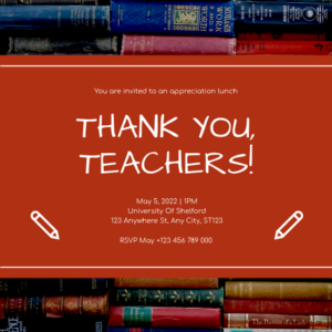
Red Book Photo Teacher’s Day Lunch Invitation
5. Don’t crowd the card layout
When making invitations, it is very important not to crowd the layout with design elements. One of the main concepts of the design is negative space so that the viewer can absorb all aspects of the invitation card without feeling bombarded by information. Don’t be afraid to leave blank space between text or images. Regarding the typesetting, please be sure to leave enough space between the event details. Avoid stacking text on top of each other or squeezing text into a small space; stacking words and sentences in a small space will cause reading difficulties.
Present your information with the Snowman Illustration Christmas Party Invitation and Blue Wedding Invitation templates on Visual Paradigm Online.
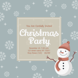
Snowman Illustration Christmas Party Invitation
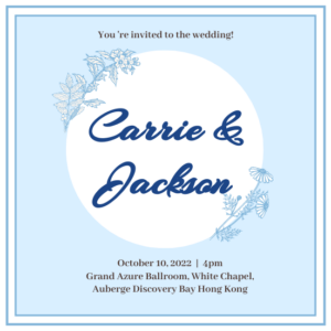
Blue Wedding Invitation
6. Align the text to the center
Proper alignment of text is important for any design. Since most invitation cards do not have long paragraphs, it is best to center the short sentences in the design. Leaning (or aligning) the text to one side may cause an imbalance in the composition.
7. Make sure the details are clear and readable
Invitations need more than just aesthetics. During the design process, don’t forget the original intention of making the invitation card: to inform others of important events. In order to make all the details clear and readable, please make sure to choose a larger font size in place and time. Avoid font styles that are difficult to read, such as multi-circle decorative handwriting styles, or highly compressed fonts. Contrast the colors of the text and the background; print dark ink on a light background, and vice versa.
8. Be consistent
When creating invitations with multiple parts (such as wedding invitations), all objects should have the same theme. Use established colors, fonts, illustrations, photos, and layouts in all designs to maintain a consistent theme.
9. Combine photography
The invitation card does not necessarily need illustrations or hand-drawn elements; you can also add a personalized image, or take this card as an example to add a flat photo. Photography is a great way to make invitations more personal and intimate. If you want to use VP Online to make invitation cards, you can easily search for images from VP Online’s collection, or upload your own photos to the program.
Try these photography invitations templates on Visual Paradigm Online:
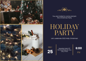
Holiday Party For Christmas Invitation
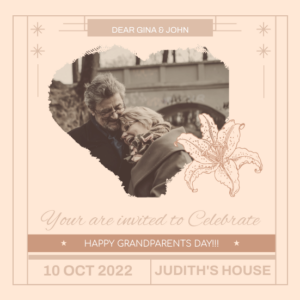
Vintage Grandparent Day Celebration Invitation
This post is also available in Deutsche, Español, فارسی, Français, English, Bahasa Indonesia, 日本語, Polski, Portuguese, Ру́сский, Việt Nam, 简体中文 and 繁體中文.
