


How to create a pictorial chart?
Sometimes, we need to record data for a particular use and sometimes we may need to present the data through graphics. With the design tool in Visual Paradigm Online, you can create various charts freely like bar charts, column charts, pie charts, etc. This chart tool can help you to display any data by using text, symbols, and graphics. You can easily visualize the data that you have collected as graphics. This is a guide for teaching you to create a 360 punch card with Visual Paradigm Online. You can watch the attached video or read the guide below.
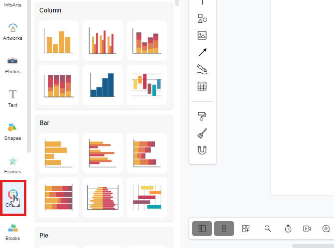
Click on the “Charts” icon
To create a chart on Visual Paradigm Online, you can first click on the “Charts” icon on the left-hand side of the palette bar.
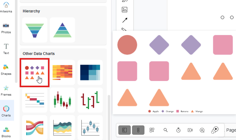
Select a chart
After clicking the “Chart” icon, you are now available to select a chart that you want to create. Take the pictorial chart as an example, if you want to create a pictorial chart, you can just simply drag out the icon of the pictorial chart. Then drop it on the design canvas. An area chart will then appear on your canvas.
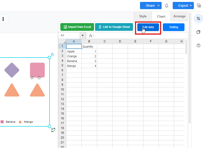
Edit the data of chart
After that, you can now input the data for the chart. You can first click on the “Edit data” button on the right-hand side of the window. A window of data editing will then appear and you can now fill the data on the spreadsheet. You may import the data from Excel or link to Google Sheets too.
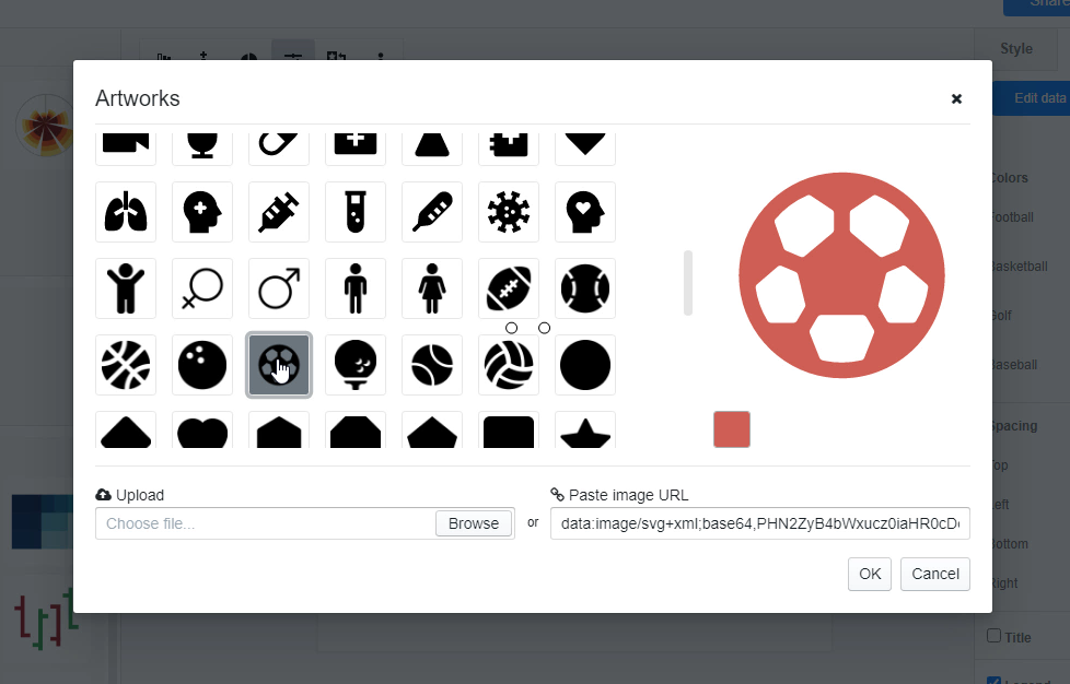
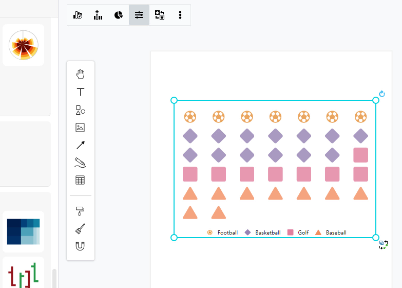
Change the colors and icon of chart
After finishing filling the data of the chart, you can now preview the chart with updated data. For personalization, you can change the color of the pictorial chart freely. Just simply click on the color box and you can change the colors of each area in a fast way. You may even import the Hex or RGB Code for changing the color of the area. You can also change the symbol freely with various icons provided for you. You can simply click on the symbol you like for customization.
This post is also available in Deutsche, Español, فارسی, Français, English, Bahasa Indonesia, 日本語, Polski, Portuguese, Ру́сский, Việt Nam, 简体中文 and 繁體中文.
