


Brochure design: 5 top design tips
Brochures are one of the visual image advertising designs, which can help companies make special instructions for the company’s products to facilitate consumer recognition, thereby arousing public interest and promoting sales. As an important part of print advertising, brochures have been used in various fields of society. If you want to create a brochure, you can try to learn the important skill of designing brochures in the following.
Brochure Design Tips
Pay attention to the positioning of the background-color
The layout design of Beijing brochures generally consists of elements such as text, images, colors, and auxiliary graphics. How to use these elements well requires designers to master certain typographical knowledge. The content of corporate brochures in different industries uses different background colors. For example, state-owned enterprises usually use red, green in the medical and environmental protection industry, blue in the science and technology aviation industry, etc. If you want to do a good job in related publicity, you must do a good job in the positioning and selection of the background color, so that it can better reflect The industry attributes of the enterprise, and do a good job of designing relevant brochures.
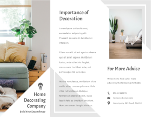
Home Decorating Brochure
Edit this template
A simple design can be very effective and fun. In this brochure, the title is in a simple, clean font like embossed on a white background. It is very clean and modern. Although there is not much contrast, it still conveys the message very well.
Pay attention to the use of blank parts
There are usually blank parts in the brochure design, and the layout of the entire brochure can be enriched through the design and adjustment of related materials. In addition, white space in brochure design and layout is a design technique with substantial meaning. Ingeniously white space can beautify the layout, make the main image more vivid, enhance the sense of spatial hierarchy and rhythm of the layout, visually weaken the space, interface, and tone, expand the field of vision of the entire layout, and reduce the oppression of the face It creates a clean, natural and comfortable reading environment for readers.
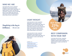
Traveling Backpack Promote Brochure
Edit this template
Maintain color balance
The overall tone of the brochure design must be balanced and avoid excessive colors. This will make the layout of the entire brochure look messy. However, dots, lines, and planes filled with various colors and various geometric figures can be used cleverly to embellish small areas, so that the corporate brochure does not look so monotonous and full of changes. The use of typesetting is interspersed in the text and pictures, so that each page has different typesetting and design, and each page has a fresh feeling when read.
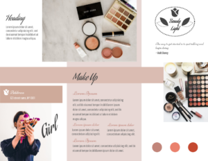
Makeup Tools Brochure
Edit this template
Keep a concise typography style
Compared with other promotional material designs, corporate brochures have more content, usually including company introduction, business scope, case introduction, partners, etc. Therefore, the most important thing in corporate brochure design is a “clear theme and clear structure.” The design of a corporate brochure can have both pictures and texts, and the text can be presented in conjunction with the screen; it can also be represented by a single product, but it must be kept simple. The style is conducive to the readers’ convenience and clear understanding of the company, brand, and product information.
Just like this corporate brochure template on Visual Paradigm Online:
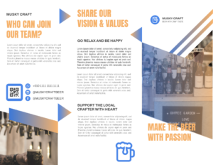
Craft Beer Promotion Brochure
Edit this template
Maintain the high-definition quality of the picture
Generally, corporate brochures must be printed out. At this time, the high-definition quality of the pictures must be ensured, so that high-quality brochures can be obtained. In the design and layout of brochures, pictures and auxiliary graphics are important embellishment elements that enrich the entire picture. Whether it is a real scene of a company’s company site, a group photo of an organization, or a product, images have become the key to the design, and high-quality images are needed to improve the overall design texture.
Common shapes of Brochures

Bi-fold: consists of a single sheet of paper folded in half, resulting in four panels (front cover, back cover, and two inner panels). This creates a simple, compact brochure with a front and back cover and two inside panels for content.
Tri-fold: created by folding a sheet of paper into three equal panels, resulting in six panels (front cover, back cover, and four inner panels). This is a popular format for brochures as it allows for more content to be displayed, with a front cover, back cover, and three inside panels for content.
Gate-fold: created by folding a sheet of paper into three panels, with the two outer panels being folded inward to meet in the middle, resembling a gate. This creates a unique and visually appealing format with a larger front cover and back cover, and a larger central panel for content.
This post is also available in Deutsche, Español, فارسی, Français, English, Bahasa Indonesia, 日本語, Polski, Portuguese, Ру́сский, Việt Nam, 简体中文 and 繁體中文.
