Brochure Design Guide
A brochure is a folded information paper document that can be folded into a template, booklet, or leaflet. A brochure can also be a stack of related materials stuffed in a pocket folder. It is a publicity publication, usually used to promote a company, organization, product or service, and to let potential customers or the public understand its interests.
A brochure is a corporate marketing material used to promote a product or service. It is a mechanism for promoting information about products or services. It is similar to a magazine, but it contains pictures of the products or services that the company is promoting. There are different kinds of booklets based on many factors, such as door-fold booklets, fold booklets, tri-fold booklets, and Z-fold booklets. A brochure can be used in many ways like mail and newspaper. This article will introduce you to a guide to creating a brochure.
1. Brochure sizes
There are four main sizes of brochure, which include: 11 x 25.5, 11 x 17, 8.5 x 14, 8.5 x 11. You can choose the size of the brochure based on the quantity of information you would like to convey in the brochure. The more information you would like to put inside the brochure, the bigger the size of the brochure you may choose for creating a brochure. Choosing a suitable size of brochure based on the quantity of information could prevent the brochure from being too crowded with too many words without empty spaces. So, selecting a suitable size of brochure and considering the amount the texts and images are important for creating a brochure. The texts you would like to convey in the brochure have to be clear and neat so that people could read the texts and understand the images easily.
About the sizes of the brochure, for 11 x 25.5, it is the largest size that can be served as a small catalog. Plenty of images can be put inside the brochure and people could keep in hand. For 11 x 17, it can be served as a brochure for products with descriptions on it. Various texts, images, graphics can be inserted into it. It is mostly used for informative brochures like product promotions with lots of description texts inside. For 8.5 x 11, this is the smallest size of common brochure sizes, it can be used for less informative content. For example, it can be used as event promotion, menus for food shows, etc. There will be fewer texts, graphics, or images that have to be shown inside the brochure. As you do not need additional spaces for putting a large amount of information like texts and images, the smaller size of the brochure is enough. You can take a look at some examples sizes of brochures below.
Professional Performing Art Brochure Edit the template


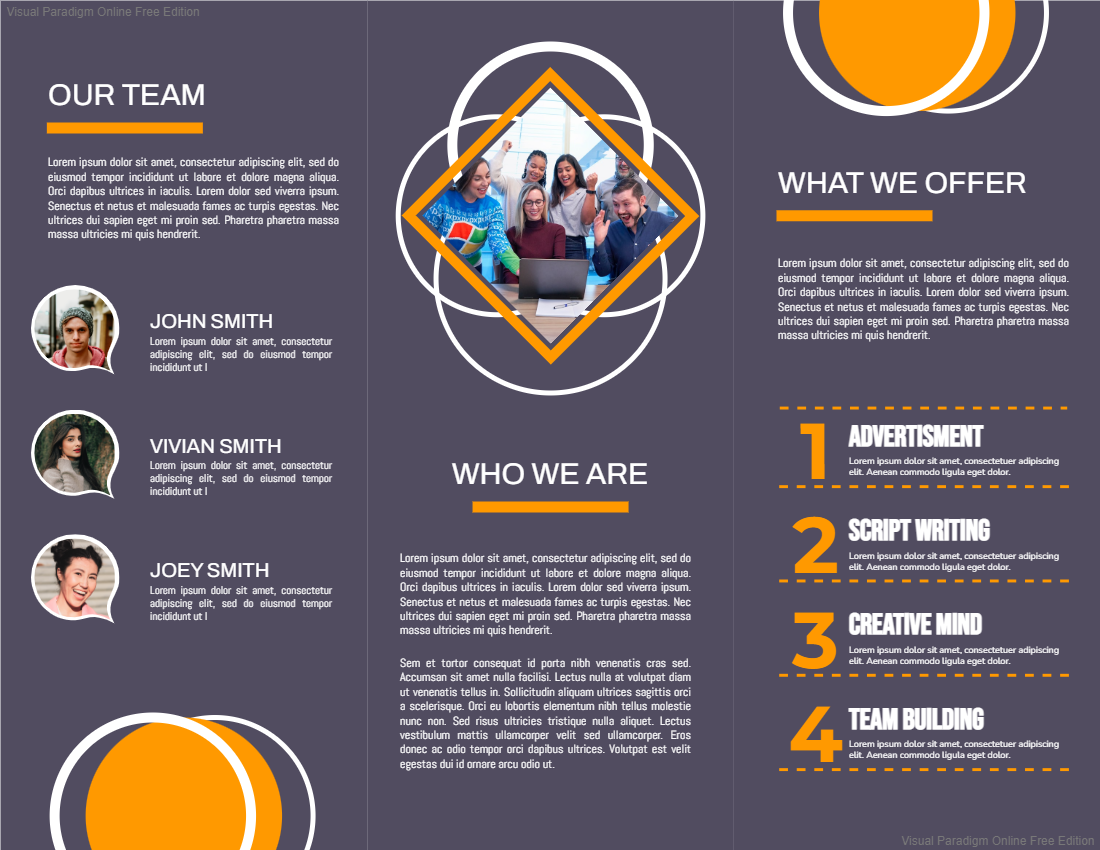
Advertisement Team Brochure Edit the template


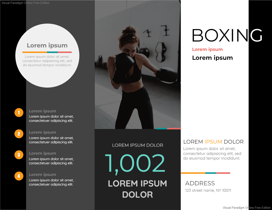
Boxing Brochure Edit the template


2. Brochure printing
You may consider using heavier paperweight for printing out the brochure to make the brochure look “expensive”. Some luxury brands will consider using a heavier weight of paper with textures for brochure printing so that the brochure will look grand which suits that brand. They may consider offering special effects to the brochure like vanishing or die-cut to highlight the important images or texts on the brochure. They have to spend more costs on adding special effects to the paper due to the technical service of paper cutting. The outcome of the brochure can be attractive after adding a special of it. It can enrich the layers of paper. The paper will be more decorative that could attract the customer to take a look at the brochure due to the high attractiveness of paper. Some people may consider adding golden varnish on the paper of the brochure so that it can look shiny, like a wedding brochure. Yet, the costs of printing the brochure will be higher for printing out the brochure.
This post is also available in Deutsche, Español, فارسی, Français, English, Bahasa Indonesia, 日本語, Polski, Portuguese, Ру́сский, Việt Nam, 简体中文 and 繁體中文.


