


Creative Poster Design Ideas For Beginners
What is a poster? Posters can be used for a variety of reasons. Advertisers, promoters, presenters, and other individuals use them to communicate information. Posters are also used to reproduce works of art, particularly well-known pieces. Posters are typically less expensive than original pieces of art. There are different types of posters, including movie posters, travel posters, railway posters, event posters, concert posters, etc. They are mainly used for advertising products. In the world, posters are widely used, they are bold and creative. They can be informative too.
A poster is a form of advertising in the past, they are printed for promoting everywhere from schools, movies, shows, food delivery, etc. A poster is still a popular way for advertisements. This article will introduce various ideas for creating a poster effectively. So, How to make a poster?
1. What is your purpose in designing a poster?
Before creating a poster, you have to ask yourself what is the aim of designing a poster. You have to consider the message you would like to convey through a poster and think of the target audience of seeing the poster. For creating a poster, you have to communicate with people through graphics. For example, if you are a manager of the restaurant and you are going to design a poster for promoting the new menu of food of your restaurant. You have to consider designing a poster that is attractive for new customers. So your target audience is the customers, You have to investigate the interests of customers and create an attractive poster regarding their interest like putting an attractive food image in the poster, or creating fun food illustrations in the poster. Putting food images or illustrations can convey big impacts to the target customers. Here are some examples of poster design.
Cooking Fest Poster Edit the template


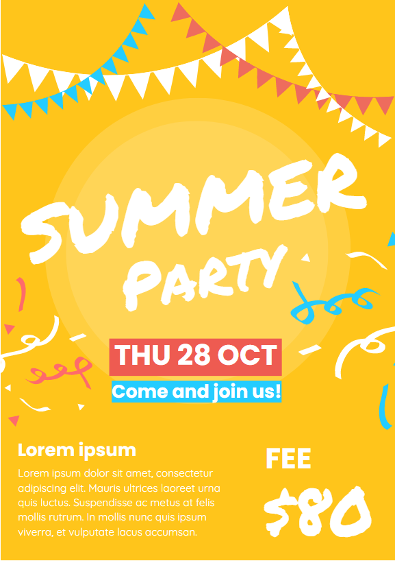
Summer Party Poster Edit the template

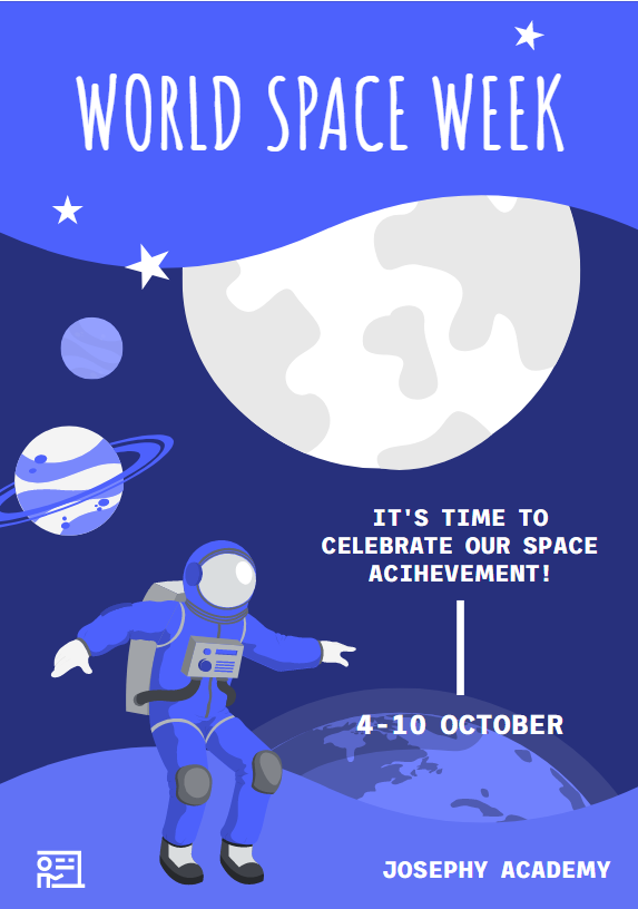
World Space Week Poster Edit the template
2. Choose the color palette of the poster
To make your poster look bold and attractive, you have to think of a combination of colors. A combination of colors is the first thing you have to consider before the start of the poster design. For beginners, you may make use of the basic rule of color theory, which is 60 percent + 30 percent + 10 percent color scheme. The 60 percent colors represent secondary color. Take a living room as an example, 60 percent of the main color is just like the wall of your living room, which is the largest area of your room. 30 percent of colors represent accent color, taking a living room as an example, this could be the home furniture in your room, like sofa and bed. For 10 percent color, it means the decorative accessories in your room. This is the accent color. So, you can make use of a 60-30-10 color scheme for your poster design.
3. Key features of poster design
Poster design is made up of four elements, with title, text, graphics, and space. They are the important elements of making a poster. For title, it is the dominant descriptive indicator of poster content. It has to be attractive and summarize the whole content of the poster. A good title should not be too long for poster design, the texts should exceed two-line texts. A short title could let the audience read it easily. For text, the amount of text should be between 500-800, the texts have to be organized with paragraphs or sections. A subtitle could also be added if you want. For graphics, graphics take the most important part of a poster as people tend to take a look at the graphics first rather than text. The graphics you are going to put inside the poster should be large enough to let the audience see even though they are far away from the poster. Besides, the graphic has to be clear enough with high resolution eg. 300 dpi. For space, you have to make sure that white space is provided for designing a poster. To avoid the information and graphic getting too crowded inside the poster, you have to provide some breathing room like 30 present white space for a poster. This could avoid the readers feeling overwhelmed.
This post is also available in Deutsche, Español, فارسی, Français, English, Bahasa Indonesia, 日本語, Polski, Portuguese, Ру́сский, Việt Nam, 简体中文 and 繁體中文.
