


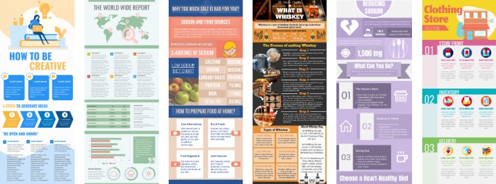
Four ways to make a simple and easy to understand infographic
Infographics refer to the simplification of a large amount of information, data, or knowledge, and are clearly presented as a chart. The knowledge to be conveyed is expressed in the form of diagrams in a simple and charming style, which makes people understand at a glance and makes it easy for readers to want to share it. It is a content marketing method that combines “storytelling” and “visualization”.
Don’t think that piling up text into a chart is equivalent to Infographic! Behind it involves analyzing data, organizing data, and graphic design. Learn more in this article!
Why we display information with Infograhic
Infographics are visual representations of information or data that combine text, images, and design elements to convey complex information in a visually appealing and easily understandable format. Here are some reasons why infographics are often used to display data instead of just text:
- Visual Appeal: Infographics are visually engaging and can capture attention quickly. They use design elements such as colors, fonts, icons, and illustrations to make the information visually appealing and memorable, which can help to better engage the audience and increase the likelihood of the information being retained.
- Simplified Complex Information: Infographics are particularly effective in simplifying complex data or information. By using visual representations, such as charts, graphs, or diagrams, infographics can condense complex data into easily digestible visual elements, making it easier for the audience to understand and interpret the information.
- Improved Comprehension: Infographics can help improve comprehension and understanding of data. By combining text with visual elements, infographics provide a dual-coding approach, where the information is presented both in text and visual form, which can enhance understanding and retention of the data.
- Data Visualization: Infographics can visually represent data in a way that makes patterns, trends, and insights more apparent. Charts, graphs, and other visual representations can make it easier to interpret data and identify key insights or patterns that may not be immediately apparent in text alone.
- Increased Shareability: Infographics are often shared and circulated more frequently than plain text content. They are visually appealing and can be easily shared on social media, websites, and other platforms, making them a popular choice for conveying data in a format that is easy to share and distribute.
Ways make a simple and easy to understand infographic
The picture should match the theme
Just like the content of the text, you need to understand your target audience. When many brands produce content, they aim to make the content popular in all communities, but in the end, the content may be out of focus.
After setting the target audience, you can set indicators for subsequent content, design, and expression. For example, in the following chart that teaches people how to skincare, the female color system and skincare images will be selected. This can appropriately attract relevant audiences.

7 Beauty Tips to Skincare Routine Horizontal Infographic
Edit the template
Highlight a simple and refined center of gravity
Basically, everyone in the online world is a clickbait, and an eye-catching headline is an element that attracts an audience. Infographic itself is not much text, the title should be concise and concise to point out the center of the chart. As a Marketer, the actual operation of the infographic has a certain effect on SEO optimization. Therefore, if the infographic is a picture of a blog article, the picture can also match your target SEO wording and add related picture descriptions.
The goal of making infographics is to make complex content simple and easy to import. If too much information is displayed on a picture, or it is filled with charts and text, it loses the meaning of “simplifying the complex”, and it will also defocus the theme.
Separate the main and subtitles
If the content itself is really difficult to introduce in a few words, you might as well separate the main and subtitles. It doesn’t feel too cumbersome.
Take the following chart as an example to introduce tips for traveling. There are four subtitles in it, and the information is richer than the general text content. The thoughtful visual effect makes it easy for the audience to absorb each classified message.

Tips to Travelling Horizontal Infographic
Edit the template
White space and separation
And when designing the layout, you should also pay attention to appropriate white space. As mentioned above, too much information will only scare the readers away. Always remember that more is not good, but accurate and comfortable to watch, so as to increase viewing time and truly bring benefits to the infographic through content.
A good infographic is like a story. It can connect the information and ideas you want to express like a comic, just like a trip with the reader. Like the following: 9 Tips to Stay Productive When Work from Home Infographic. It uses related illustrations to add text to express different subdivision concepts separately, and there are also blank spaces between each concept to provide breathing space.

9 Tips to Stay Productive When Work from Home Infographic
Edit the template
In this part, you need to set the purpose of the theme in advance, divide the information into good categories, and then use typesetting to guide the reader’s curiosity to understand your story. Otherwise, just squeeze a bunch of charts and texts onto one layout.
The following example uses this method of storytelling to introduce the information of “The 3 Learning Styles” to readers. It uses subtitles and then separates each small part with a line, which is like the chapters of a novel, conveying information one by one. Even if the content is richer, it will arouse the interest of the audience to continue reading.
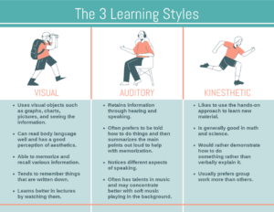
The 3 Learning Styles Infographic
Edit the template
This post is also available in Deutsche, Español, فارسی, Français, English, Bahasa Indonesia, 日本語, Polski, Portuguese, Ру́сский, Việt Nam, 简体中文 and 繁體中文.
