


How to master the ability to visualization of infographic data?
Knowing how to master data visualization is important in creating an infographic. Every infographic design you make should enhance the audience’s experience, not yours. The data is rigorous, then the processed data should be clearly and clearly delivered to the audience’s eyes.
Here are some tips to help you master the ability to visualization of infographic data:
1. Use the right resources
Great stories come from great data. Enterprise internal data is a source of unique and interesting data on large screens. Data large screens are one of the methods that can very effectively assist enterprises in making scientific decisions based on the results of data analysis.
2. Elaborate a story
The true power of data narrative still depends on your ability to extract and shape cohesive narratives from data, find the stories in the data, and formulate effective data narratives; only through excellent design methods can you tell reliable data. Visualize the big-screen story.
3. Choose the right chart
In order to ensure that your data has the strongest impact, you need to choose the correct chart representation for your data; whether you choose static information graphs or dynamic graphics, the goal should be to speak a data visualization story as the center.
4. Application design foundation
Good design is very important, but remember that if you want to separate from the design, you must start with the guide to the most common diagrams we design; understand how to choose the correct diagram content and consider trying Different visual styles, and get inspiration from more technical diagrams, B2B diagrams and interactive diagram examples.
5. Make the most of your content
Obtain larger information resources by reusing data visualization or converting old content into infographics, e-books, animated infographics, reports, micro-content, etc.
About text information
Most of the data analysis results are displayed by graphs, but they are usually used in combination with text to link the relationship between graphs, that is to say-in many data visualizations, infographics, and e-books, we see Data visualization and text interact rather than influence each other.
1. Don’t over-explain
If there are enough data analysis results in the chart, there is no need to repeat the subtitle, label, and chart title.
2. Keep chart titles concise and clear
Any descriptive text above the chart should be kept as short as possible and directly related to the chart below.
Remember: to provide the audience with the fastest way to understand.
3. Choose the correct text label
Text annotations are not used to fill the space of the big screen. They should be used intentionally to highlight relevant information or provide logical relationships between other diagrams.
4. Don’t use distracting fonts or elements
Sometimes the key information may really need to be emphasized. If so, it is best to use bold or italic text to emphasize a point; but be careful not to use them at the same time, as this will make the visual look very messy.
Regarding the use of colors
If used properly, color is a good tool; if used incorrectly, it will not only distract readers but also mislead readers, so you should use it wisely in data visualization design.
1. Use a single color to represent the same type of data
If you want to display the sales data month by month on the bar graph, it is best to use one color uniformly. However, if you want to compare last year’s sales with this year’s sales in a grouping chart, you should use different colors for each year, and you can also use accent colors to highlight important data points.
2. Pay attention to positive and negative numbers
Do not use red for positive numbers or green for negative numbers. These color associations are so strong that they automatically flip the meaning in the viewer’s mind.
3. Make sure there is enough contrast between the colors
If the colors are too similar (light gray vs. light gray, light gray), it may be difficult to distinguish the difference; on the contrary, do not use high-contrast color combinations such as red/green or blue/yellow.
4. Avoidance Pattern
Stripes and dots sound interesting, but they can be distracting; for example, if you want to distinguish the map, use different saturations of the same color; but be aware that it is best to use only solid color lines.
5. Choose the color appropriately
Some colors may be visually more prominent than other colors, which will have unnecessary effects on the data; the more correct way is to use a single color with different shades or a spectrum between two similar colors To show the intensity.
About the labels on the data chart
Markers may be minefields, and large-screen data visualization audiences may rely on tags to interpret data, but either too many or too few tags will interfere with the dissemination of large-screen information.
1. Double-check that everything is labeled
Make sure there is one for everything that needs to be labeled, and there are no duplications or typos.
2. Make sure the label is visible
All labels should be unobstructed and easy to identify with the corresponding data points.
3. Mark the line directly
If possible, include data labels in the data points. This allows readers to quickly identify the line and the corresponding label without having to look for legends or similar points.
4. Do not exceed the label
If the precise value of the data point is important for telling your big-screen story, it is best to choose to add data tags to enhance your comprehension; if the precise value is not important for telling your big-screen story, don’t use data tags.
5. It’s best not to tilt your font
If the axis labels are too crowded, you still need to consider whether to delete all other labels on the axis to present a more appropriate effect in the chart.
Still don’t know how to create a good data visualization infographic? Don’t worry! Try these templates on Visual Paradigm Online:

Covid 19 Horizontal Infographic
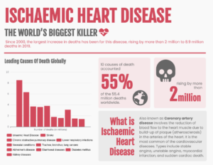
Infographic Of Ischaemic Heart Disease
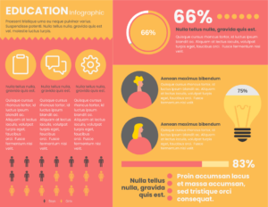
Education Department Horizontal Infographic
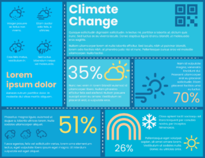
Climate Change Horizontal Infographic
Don’t bury an infographic worthy of being seen by everyone!
This post is also available in Deutsche, Español, فارسی, Français, English, Bahasa Indonesia, 日本語, Polski, Portuguese, Ру́сский, Việt Nam, 简体中文 and 繁體中文.
