


Navigating the Competitive Landscape: Unleashing the Power of Spider Chart Analysis
Introduction
In today’s fiercely competitive business world, staying ahead of the curve is essential for success. Understanding your competitors’ strengths and weaknesses is a fundamental aspect of strategic planning. While traditional methods like SWOT analysis and market research provide valuable insights, Spider Chart Analysis offers a more dynamic and visual approach to compare and contrast your company with competitors. In this article, we will explore the concept of Spider Chart Analysis and how it can help organizations gain a competitive edge.
What Is Spider Chart Analysis?
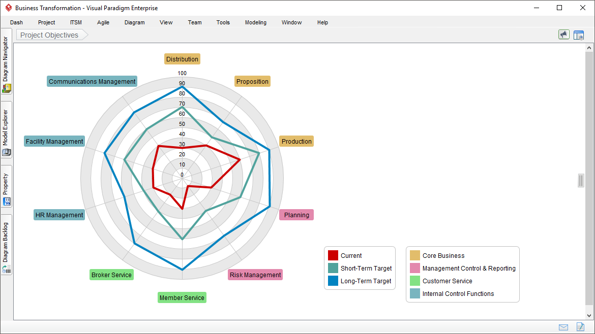
Spider Chart Analysis, also known as Radar Chart Analysis or Spider Web Chart, is a graphical tool that allows businesses to visualize and assess various aspects of their performance in comparison to their competitors. This chart resembles a spider’s web, with multiple axes radiating outward from a central point. Each axis represents a specific performance metric or key performance indicator (KPI). The points where these axes intersect form a polygon, and the shape of this polygon indicates the overall performance profile of a company.
How to Create a Spider Chart
To create a Spider Chart for competitive analysis, follow these steps:
- Identify Key Metrics: Determine the key metrics or KPIs that are relevant to your industry and business goals. Common metrics include market share, revenue, profitability, customer satisfaction, product quality, innovation, and brand reputation.
- Select Competitors: Choose the competitors you want to analyze and gather data on their performance in the selected metrics. This data can be obtained through market research, financial reports, or industry benchmarks.
- Scale Metrics: Normalize the data to a common scale (usually 0 to 100) so that different metrics can be compared directly. For instance, if one metric is revenue and another is customer satisfaction, you might scale revenue based on the highest revenue among the competitors.
- Plot Data: Plot the normalized data on the Spider Chart, with each axis representing a different metric. Connect the data points for each competitor to form a polygon that represents their overall performance profile.
- Interpret Results: Analyze the resulting polygons to identify trends and areas of strength and weakness for each competitor, including your own company.
Benefits of Spider Chart Analysis
- Visual Clarity: Spider Charts offer a visual representation of competitive data, making it easier to grasp complex information quickly. This clarity aids in decision-making and strategy development.
- Benchmarking: By comparing your company’s performance against competitors, Spider Chart Analysis helps identify areas where you excel and where you need improvement. It acts as a benchmarking tool to set realistic goals.
- Strategic Planning: Spider Charts guide strategic planning by highlighting where resources should be allocated and which areas require attention. This ensures that resources are utilized efficiently and effectively.
- Communication: Spider Charts simplify the communication of competitive analysis findings to stakeholders, making it easier to convey your company’s strengths and weaknesses.
- Adaptability: Spider Charts can be customized to include any KPIs relevant to your industry, making them adaptable for various businesses and sectors.
Limitations and Considerations
While Spider Chart Analysis is a powerful tool, it has its limitations:
- Data Quality: The accuracy and reliability of the data used to create the charts are crucial. Inaccurate or incomplete data can lead to misleading conclusions.
- Subjectivity: The choice of metrics and the scaling of data can introduce subjectivity into the analysis. Careful consideration and justification of these choices are essential.
- Limited Metrics: Spider Charts are most effective when comparing a limited number of metrics. Trying to incorporate too many metrics can lead to cluttered and confusing charts.
Example: Coca-Cola vs Pepsi
In this scenario, we will perform a Spider Chart Analysis comparing Coca-Cola and Pepsi, two beverage giants, in several key performance metrics relevant to their industry. We will use a table to document the results of the analysis.
Metrics for Comparison:
- Market Share (%): The percentage of the carbonated soft drink market held by each company.
- Revenue (in billions USD): The annual revenue generated by each company from their beverage business.
- Profit Margin (%): The profitability of each company’s beverage business, calculated as a percentage of revenue.
- Customer Satisfaction (Scale of 1-10): A subjective rating based on customer satisfaction surveys.
- Innovation Index (Scale of 1-5): An assessment of the level of innovation in product offerings and marketing strategies.
- Brand Reputation (Scale of 1-10): A subjective rating based on brand perception and reputation.
Here’s a table documenting the Spider Chart Analysis for Coca-Cola and Pepsi:
| Metric | Coca-Cola (%) | Pepsi (%) |
|---|---|---|
| Market Share (%) | 42 | 31 |
| Revenue (in B USD) | 35 | 30 |
| Profit Margin (%) | 20 | 18 |
| Customer Satisfaction | 8 | 7.5 |
| Innovation Index | 3.5 | 4 |
| Brand Reputation | 8 | 7.8 |
Creating the Spider Chart:
To visualize this data, we’ll plot it on a Spider Chart, where each axis corresponds to one of the metrics above. We’ll normalize the data on a scale of 0 to 100.
Now, let’s calculate and plot the Spider Chart:
- Market Share (%): Coca-Cola scores higher in market share, indicating a larger market presence.
- Revenue (in B USD): Coca-Cola has a slightly higher revenue.
- Profit Margin (%): Coca-Cola also leads in profitability.
- Customer Satisfaction: Both companies have high customer satisfaction, but Coca-Cola is slightly ahead.
- Innovation Index: Pepsi scores higher on innovation.
- Brand Reputation: Coca-Cola has a slightly better brand reputation.
Using these scores, we can create a Spider Chart that visually represents the competitive analysis:
Interpreting the Spider Chart:
- Coca-Cola outperforms Pepsi in market share, revenue, and profit margin.
- Both companies have high customer satisfaction scores, but Coca-Cola is slightly ahead.
- Pepsi leads in innovation, but the difference is not substantial.
- Coca-Cola has a slightly better brand reputation.
This Spider Chart provides a visual representation of the competitive analysis, making it easier to identify areas where each company excels and where they have room for improvement. It can guide strategic decisions, resource allocation, and marketing strategies for both Coca-Cola and Pepsi in the highly competitive beverage industry.
Spider Chart
The example provided used estimated figures for illustrative purposes. Spider Chart Analysis is a versatile tool that can be applied to various problem domains. Here’s a generic template that you can use to perform Spider Chart Analysis in different areas:
Metrics for Comparison:
- Metric 1: A brief description of the first performance metric.
- Metric 2: A brief description of the second performance metric.
- Metric 3: A brief description of the third performance metric.
- Metric 4: A brief description of the fourth performance metric.
- Metric 5: A brief description of the fifth performance metric.
- Metric 6: A brief description of the sixth performance metric.
Here’s a table where you can input your own data:
| Metric | Company A | Company B |
|---|---|---|
| Metric 1 | Value A1 | Value B1 |
| Metric 2 | Value A2 | Value B2 |
| Metric 3 | Value A3 | Value B3 |
| Metric 4 | Value A4 | Value B4 |
| Metric 5 | Value A5 | Value B5 |
| Metric 6 | Value A6 | Value B6 |
After inputting your data, you can normalize it on a scale of 0 to 100 if needed. Then, you can calculate and plot the Spider Chart, similar to the example provided earlier, to visualize the competitive analysis in your specific problem domain. This will help you identify strengths and weaknesses for each entity being compared.
Conclusion
Spider Chart Analysis is a valuable tool for gaining insights into your competitive landscape. It provides a visual representation of how your company measures up against competitors, helping you identify areas of strength and weakness. By harnessing the power of Spider Charts, businesses can make more informed strategic decisions, allocate resources effectively, and stay ahead in an ever-evolving market.
This post is also available in Deutsche, Español, فارسی, Français, English, Bahasa Indonesia, 日本語, Polski, Portuguese, Ру́сский, Việt Nam, 简体中文 and 繁體中文.
