Poster Design Guide: How To Create Perfect Poster
Are you looking for tips for creating a perfect poster? Here are some tips for you that you are looking for! You will probably learn a lot after reading this article! This article will share with you the top tips for creating your poster. Some poster design examples will also be introduced to provide you with some references in poster design. Poster design is part of the graphic design profession in projecting visual communications. We can convey specific messages by creating posters. Poster design can enhance your creativity, innovation, lateral thinking, and decision-making skills. You can transit words to graphics presentation through graphic design. Here are the top tips for poster design:
1. Create a mood board
Before you start to design your poster, you have to come along with the ideas of the design. Creating a mood board can help you to brainstorm the ideas for your design. So what is a mood board? It is a type of visual presentation that consists of collages with texts and images. Creating a mood board helps you generate an overall feeling of your design like the color tone, the overall style, shapes, and sizes for your design. It is a quick tool to present your ideas in an overall view and feeling. Graphic designers, interior designers, photographers always create mood boards before starting their work of art. Therefore, creating a mood board before you start designing a poster is important in presenting your ideas effectively. You can try to mix and match the different components of images when you are working on a mood board.
2. The readability of poster
The clearness for the reader reading the poster is very important for poster design. You have to convey the message clearly to the readers so that they could understand what you are going the say through the design of the poster. The layout of the text has to be organized first before you start working on the design. So, you have to get organized about the content of the poster. There are three elements that you have to be concerned about for poster design, which is the title, details, and smoothness. For title, the title of the poster design has to be bold to catch the reader’s attention immediately. The size of the font has to be big enough to give a strong visual impact to the audience. The audience can understand the main topic of the poster effectively if your designed title is bold and attractive. You may try to use decorative font for the title that matches your design. And for the location of the title, you may consider putting the title either in the middle of the canvas or the top of it.
3. Deliver the message effectively
We all know that delivering messages through posters is the most important part of poster design. For poster design suggestions, you may consider presenting your message in your poster through storytelling. You could guide the reader the understand the message through a storyline with a clear direction. They could receive the message of the poster step by step effectively. Besides, you may consider adding a Call To Action for your poster, it could let the audience react to your poster. Call To Action is the advertising message to promote immediate response to the audience. Adding Call To Action can help for promotion. For example, you may consider putting a QR code on the poster to let the audience scan and read more information. This helps you to interact with the audience effectively. Here are some examples for poster design:
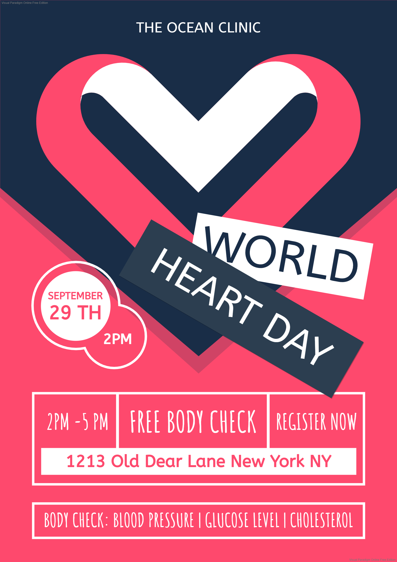
Professional Free Body Check Poster


World Space Week Poster


International Day Of Tolerance Party Poster


This post is also available in Deutsche, Español, فارسی, Français, English, Bahasa Indonesia, 日本語, Polski, Portuguese, Ру́сский, Việt Nam, 简体中文 and 繁體中文.


