


Six precautions for designing infographics
Creating an infographic may sound scary, but don’t be scared. Getting started is easier than you think. In this post, we’ll tell you the six precautions for designing infographics.
1. Text and visual balance
The purpose of creating infographics is to help readers understand the subject, not like reading a novel. When you start, explore your content and analyze what can turn into a visual effect. You can start by converting statistical data into graphs. Or if your topic is about working, you can draw a cartoon of someone sitting at a desk.
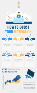
Just like this template on Visual Paradigm Online: How To Boost Your Motivation Infographic
Once you find some ideas, start deleting any information that may not be the most relevant. For text you want to keep, consider using bold fonts or unique styles to help it stand out. Then write down your thoughts.
2. Font and typography
When you want to emphasize some of your text, you want to make sure you haven’t overdone it. There are two basic rules to keep you consistent.
First, only use 2 to 3 different fonts. You don’t need more than 2, if you want to add some flare, just change the shape. Make it bolder, or bigger. The second rule of thumb is not to be crazy about the color of your text. Similarly, just like fonts, no more than 2 to 3 colors are required. It will more beautiful if the text color to be balanced with the icons and illustrations.
3. Even margins
When you create an infographic, it can easily get out of control and look sloppy. Keeping the edge of the infographic even margins is the first step to ensure that the picture is tidy. You can make the spacing on the right should be the same as the spacing on the left, also the spacing between the top and bottom is the same too.
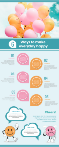
Maintaining an organized image is the key to keeping viewers, you can try to reference this template on Visual Paradigm Online: 6 Ways To Make Everyday Happy Infographic
4. Visual hierarchy
What is visual hierarchy? good question. In essence, it is arranged according to the importance of design elements. Some details are more important than others, and this needs to be clarified.
Headlines always occupy the first place, which is why they are usually the largest font and at the top of the infographic. Maybe after that, you have a headline, so you want to make it a little smaller than your headline but a little bigger than your other text. Your icons and subtitles should be substantial, but not to the point where they competing for attention.
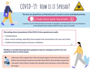
You can try to reference this template on Visual Paradigm Online: COVID Infographic: How is it Spread?
5. The size of the infographic
Don’t assume that size doesn’t matter in the first place. Its function. Depending on where you plan to share your infographic, there are some rules to follow.
If your platform is Instagram, the square format is best. If you want to share on Pinterest, be sure to be vertical. With vertical cropping, you can also crop the square part of the infographic and still post it to Instagram.
Plan ahead and optimize your infographics on the right platform.
6. Image quality
The image in the infographic must all follow the same style. Maybe you decide to break the routine and use photography instead of illustrations. If you are going to do this, you need to make sure that you are using the highest possible resolution image. First of all, don’t use pictures you don’t have permission to use. Moreover, only the use of royalty-free images does not require a license, you can find these on Google, or you can try to use Visual Paradigm Online to help you create your own infographic, millions of stock photos and icons are available for you.
This post is also available in Deutsche, Español, فارسی, Français, English, Bahasa Indonesia, 日本語, Polski, Portuguese, Ру́сский, Việt Nam, 简体中文 and 繁體中文.
