15 Examples of Awesome Sale Posters For You
Sale posters are very common in our daily lives. We may see them in the stores, on the street, and even in out mail box. We usually say goodbye to them and throw them to the rubbish bin if they are not attractive enough to draw our attention. If you are the the business owner of those posters, it is very important to have high quality poster that customers would like to spend their time on your advertisement. In this case, you need more and more idea. Here are 20 examples of sale poster design for you to inspire your ideas.
Elements Representing The Festival
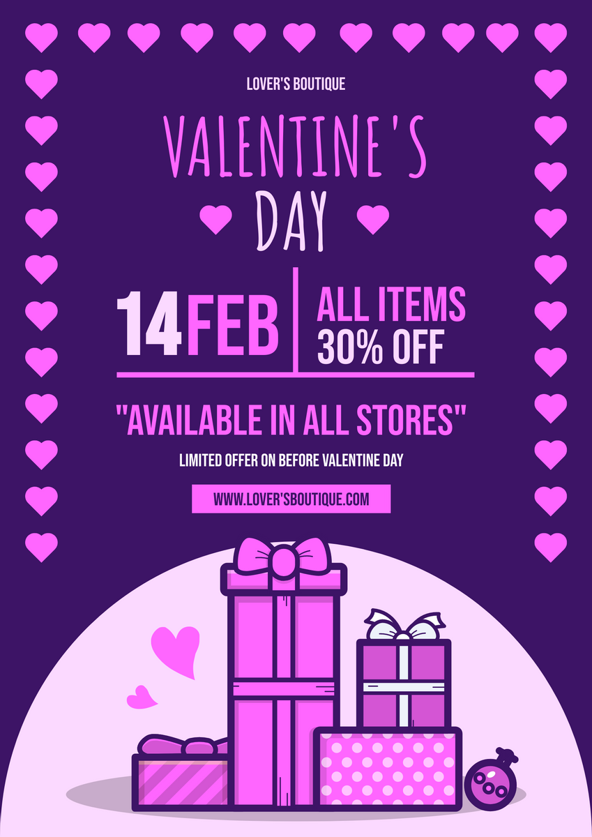
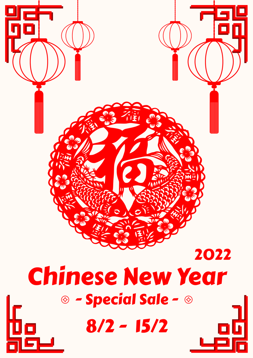
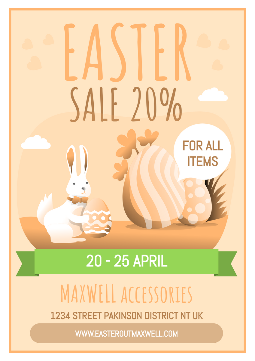
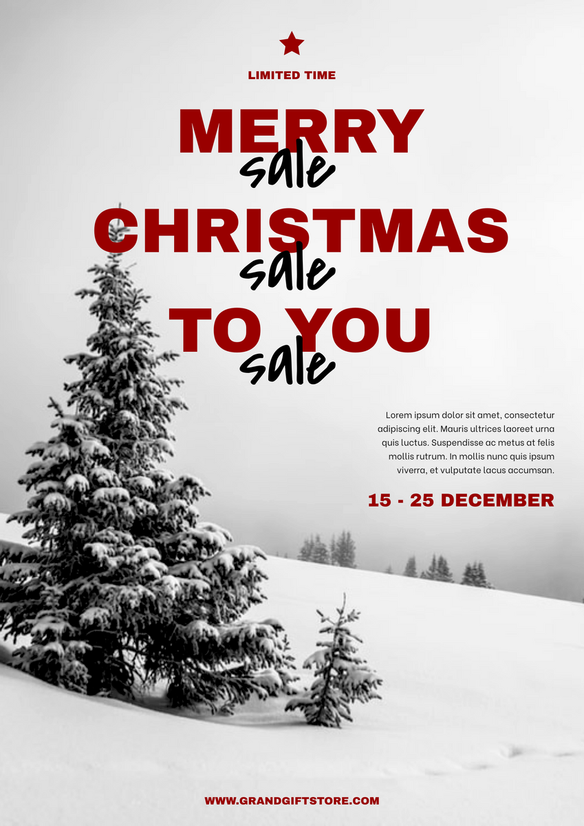
We usually have sales in different festivals, such as Christmas, New Year, Easter, etc. Therefore, the design should be closely related to the days. For poster of Christmas Sale, there may be snow, presents, or Santa Claus. For poster of Easter, cute rabbits and Easter eggs are always included. They are not only used to tell customers that we are providing sales for the festival, we are also spreading the message that ” shop for the festival”. Maybe for buying gifts for your children, or maybe for preparing the celebration party, we all need to consume. In this case, the sale shown in the poster is what we need now.
Highlight The Idea Of SALE
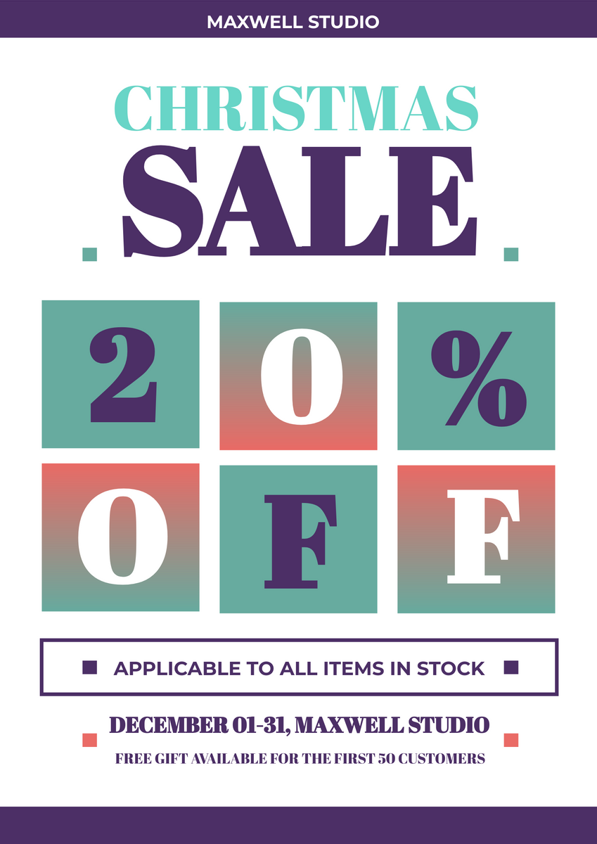
As it is a poster for sale, instead of show other information, highlight the idea of “sale” can better draw people’s attention, while directly show the word “SALE” in large font size and sharp font colour is a good idea. Once the customers get the poster, they can quickly know what you want to talk about and they will then read other information if they are interested in it.

Using Sharp Colours
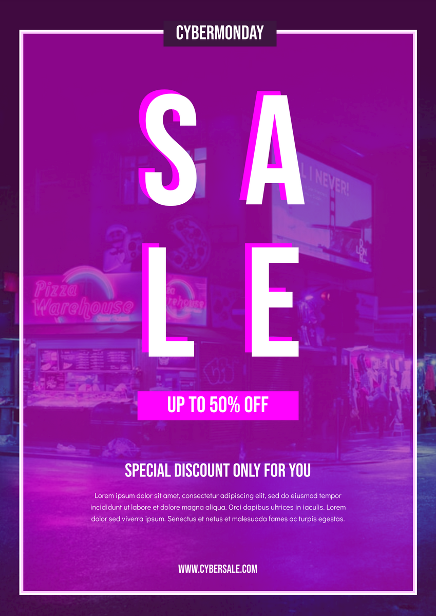
In order to create an eye-catching poster, we can pay more attention on the using of colours. Sharp and bright colours can always draw people’s attention. In this case, we can try to use sharp colours for our title, key vision and other important information. Of course, it does not means that all elements on the poster should be bright and sharp. Contrast is needed to balance the colour tone of the design and point out the important points.
Showing The Products In Your Design
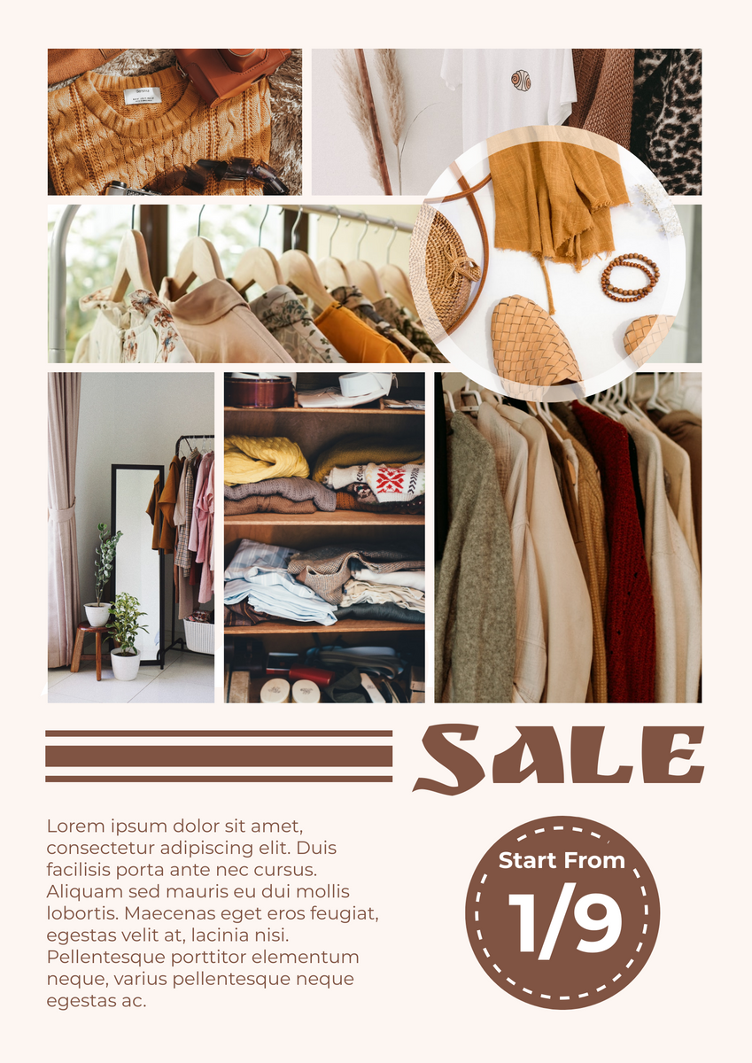
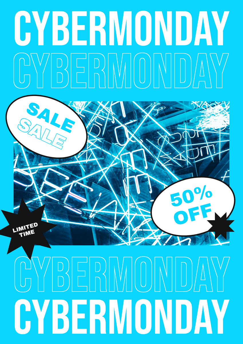
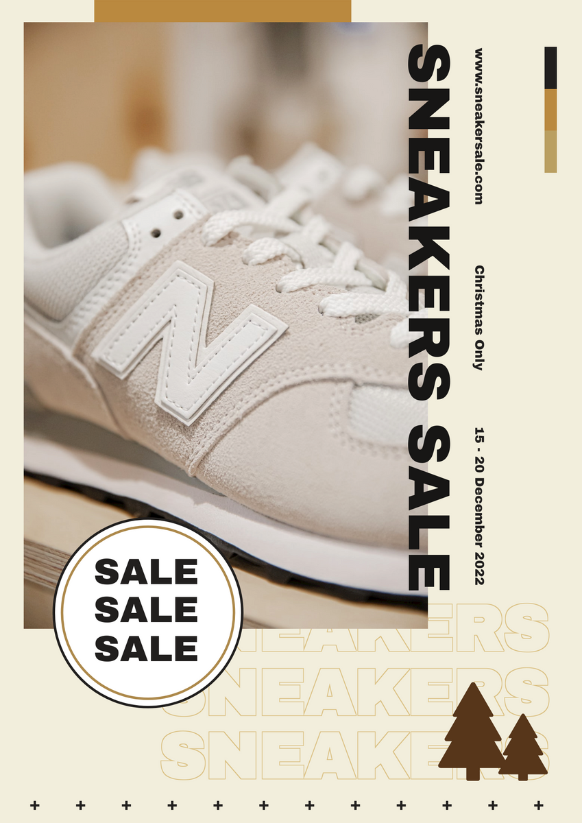
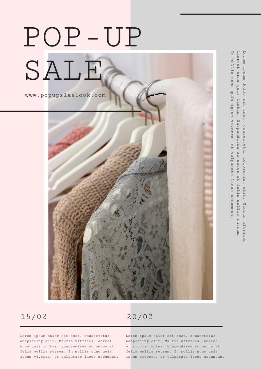
Including the photo of the products in the poster will make the message more credible as customers can really know what it is. After that, listing the details or characteristics of the products on the poster in order to reduce the time for customers to get further information as it is important for the poster to be “convenient”. It will be much better than asking customers to search by themselves.


Using Photo Collage
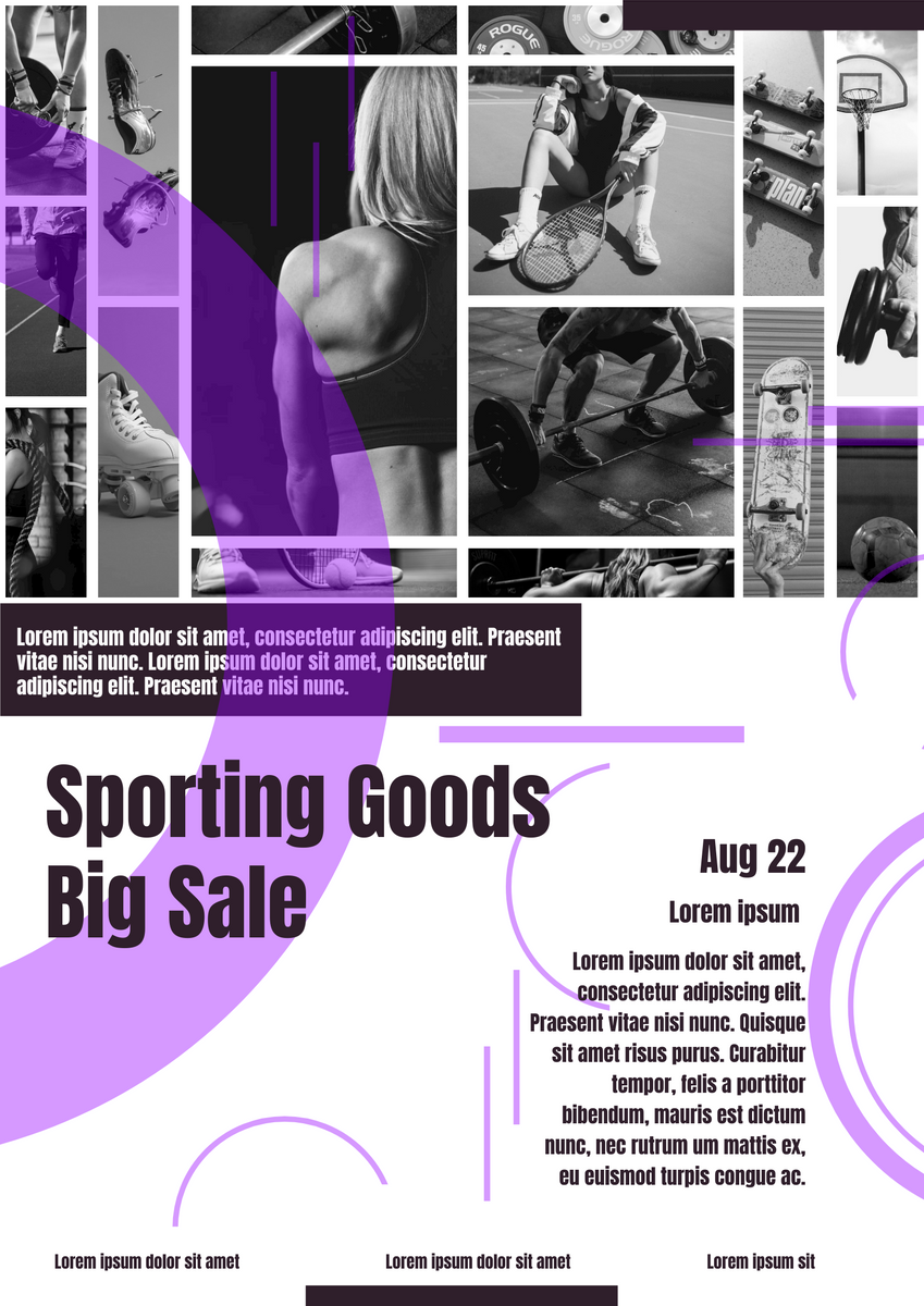
Sometimes if you are not only selling one products, you may need to display more photos in order to tell the customers that your goods are awesome. In this case, you may need to use photo collage. It is recommended to use show the photo in the same style and colour tone so that the whole design of the poster will be more stable.

This post is also available in Deutsche, Español, فارسی, Français, English, Bahasa Indonesia, 日本語, Polski, Portuguese, Ру́сский, Việt Nam, 简体中文 and 繁體中文.


