How to Adjust Annotation’s Font
Adjusting annotation font becomes a crucial aspect of refining your documents, ensuring clarity and visual appeal. In the realm of efficient document editing, Fliplify emerges as a powerful ally, offering an intuitive platform for seamless adjustments. This article will walk you through the process of fine-tuning annotation fonts within VP Online, empowering you to personalize and enhance the visual impact of your documents.
Adding Annotation
While reading, the desire to take notes and highlight keywords is common. This action is seamlessly achievable in the digital realm. Visual Paradigm Online simplifies the process, allowing easy annotation with the tool. It facilitates reading and annotating anywhere, anytime, enhancing the flexibility of the reading experience.
More: Annotate on a Flipbook
Adjust Annotation’s Font
After annotating text within the flipbook, making adjustments to the font and other settings is a straightforward process, requiring just a few simple steps.
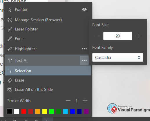
First of all, select the text we would like to edit by Selection.

We can then easily resize the text by resizing the text box, and also rotate it with the dot on top.

We can also edit the Font Size and Font Family in the tool bar, while the font color is also editable.

How to Choose a Suitable Font for Your Annotation
Choosing the right font for your annotations can significantly impact the readability and overall effectiveness of your flipbook. Here are some tips to help you select a suitable font:
- Prioritize Readability: The primary goal of an annotation is to convey information clearly. Opt for fonts that are easy to read, even at smaller sizes. Sans-serif fonts, such as Arial or Helvetica, are often preferred for their clean and modern appearance, making them ideal for annotations.
- Consider the Tone and Purpose: Match the font style to the tone of your content. For formal or professional documents, stick with classic fonts like Times New Roman or Georgia. For a more casual or creative presentation, you might choose a playful or decorative font, but ensure it remains legible and does not overwhelm the text.
- Maintain Consistency: Use a consistent font throughout your annotations to create a cohesive look. This uniformity helps readers quickly identify and understand the annotated sections without being distracted by varying font styles.
- Check for Contrast: Ensure that the font color contrasts well with the background of your flipbook. High contrast between text and background enhances readability. Avoid colors that blend into the background, as they can make your annotations difficult to read.
By carefully selecting a font that aligns with these criteria, you can enhance the clarity and effectiveness of your annotations, making them a valuable addition to your flipbook.
Benefits of Digital Annotation

Embracing the digital frontier, annotations in a flipbook transcend traditional note-taking, offering a spectrum of benefits that redefine the reading and collaboration experience. In the realm of digital content, annotations serve as dynamic tools, allowing users to interact with their materials in ways previously unimaginable.
- Enhanced Interactivity: Annotations in a digital flipbook bring a layer of interactivity, allowing users to engage with content through notes, highlights, and comments.
- Effortless Collaboration: Digital annotations facilitate seamless collaboration by enabling users to share thoughts with their team, feedback, and insights directly on the flipbook, fostering teamwork and communication.
- Dynamic Customization: Annotations offer dynamic customization options, allowing users to adjust fonts, colors, and styles to suit their preferences and enhance the visual appeal of the content.
- Document Personalization: Annotations provide a means for users to personalize their digital flipbooks, transforming them into interactive and tailored resources that cater to individual learning or presentation needs.
This post is also available in Deutsche, Español, فارسی, Français, English, Bahasa Indonesia, 日本語, Polski, Portuguese, Ру́сский, Việt Nam, 简体中文 and 繁體中文.


