


How To Create A Sankey Diagram
What Is A Sankey Diagram
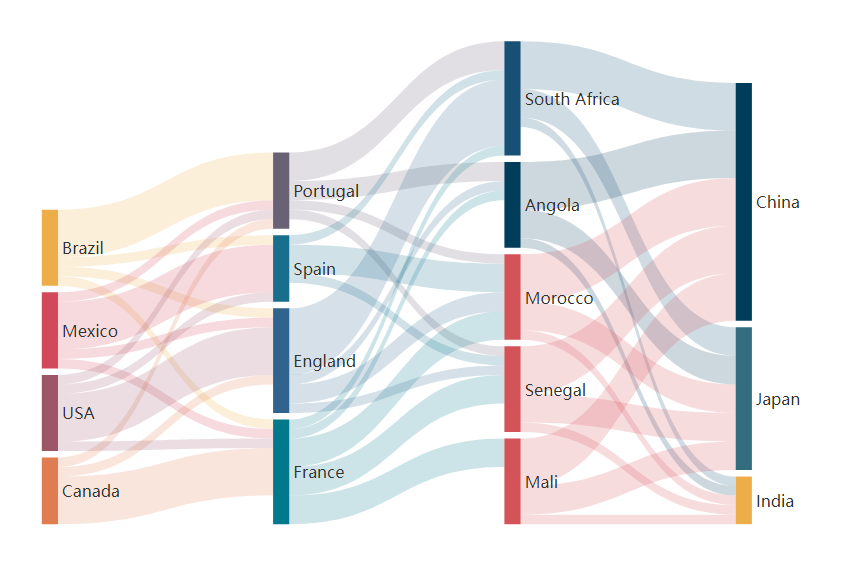
Sankey diagram is a type of data visualization that shows the flow of data or information through a system. It uses a series of arrows or lines of varying widths to represent the amount of data flowing from one point to another. Sankey diagram is usually used to show different data flow. For example, U.S. Energy Information Administration (EIA) use Sankey Diagram to show the production and consumption of energy in the annual report.
How To Create A Sankey Diagram
Create a Sankey Diagram
Awesome Sankey Diagram template can be found in our library:
https://online.visual-paradigm.com/charts/templates/sankey-diagrams/
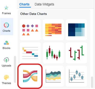
You can also find the Sankey Diagram in the editor under Charts -> Other Data Charts.
Drag and drop the diagram to the editor and start your customization!
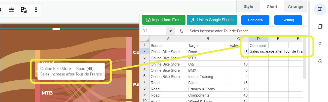
Edit The Data
By the “Edit Data” under Panel-Chart, you can enter your own data.
If you already typed your data in Excel or Google Sheet, you can choose to import the data or link to the sheet directly.
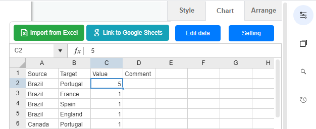
By entering the data, the diagram will automatically group the data of the same category for you and show in arrows in different branches.
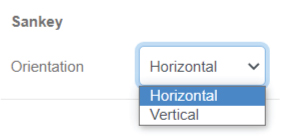
Customize The Diagram
You can change the color of all nodes.
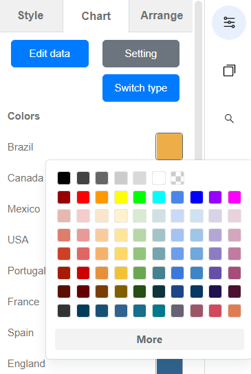
Besides the block, the color of the link in also editable.
You can choose to follow the color of the source node, gradient color of the two sides, and also any color you like.
Comments can be added in the spreadsheet, which will be shown on the links of the diagram.
Read more:
Sankey Diagram: How to Edit Link Comment
Sankey Diagram: How to Change the Tooltips of Links
FAQ

Why it is named Sankey diagram?
The Sankey diagram is named after Irish engineer Matthew Henry Phineas Riall Sankey, who created the first diagram of this type to represent the energy efficiency of a steam engine in 1898. Since then, Sankey diagrams have been adapted and used in a wide range of fields to visualize the flow of data, resources or energy through a system.
What is the advantages and disadvantages of a Sankey diagram?
The advantages of using Sankey diagrams include the ability to efficiently display complex data in an easy-to-understand format. Their versatility is also important as they can be used for a wide range of data types and applications.
Disadvantages of Sankey diagrams include the potential for confusion if they contain too many elements or processes. In this case, we need to design and planning carefully to ensure that the diagram effectively conveys the required information.
When do we use Sankey diagram?
Sankey diagrams are often used to analyze complex data. They are particularly useful when trying to identify inefficiencies or bottlenecks in a system, to visualize the impact of policy decisions, or to explore the relationships between different data elements.
Here are some specific applications of Sankey diagrams:
- Visualizing energy use and efficiency in a building or industrial process
- Analyzing material and waste flows in a supply chain or production system
- Mapping the distribution of government budgets or funding streams
- Representing the flow of website traffic or user behavior in digital analytics
- Show the distribution of water, carbon or other resources in environmental management
Sankey Diagram Templates

This post is also available in Deutsche, Español, فارسی, Français, English, Bahasa Indonesia, 日本語, Polski, Portuguese, Ру́сский, Việt Nam, 简体中文 and 繁體中文.
