3 Tips When Designing Title For Your Poster
Title is always one of the most important elements in poster design. It points out what the poster is talking about. In most cases, it is eye-catching wherever it is placed. You may then say, “Does it mean that all the titles need bold font, sharp colour and large font size?” Of cause the answer is “no”.
A good title should match with the style of the design, there should be no rules or restrictions. Here are some suggestion of how to create a great title.
Font Choices
In some cases, a good font choice can make your title perfectly match with your design. For example, when you are designing poster about marking notes or children’s creation, style of hand-writing like Architects Daughter, Indie Flower and Caveat would be good choices for you. If your design id relatively formal, fonts like Bebas Neue and Montserrat will be your good partners.
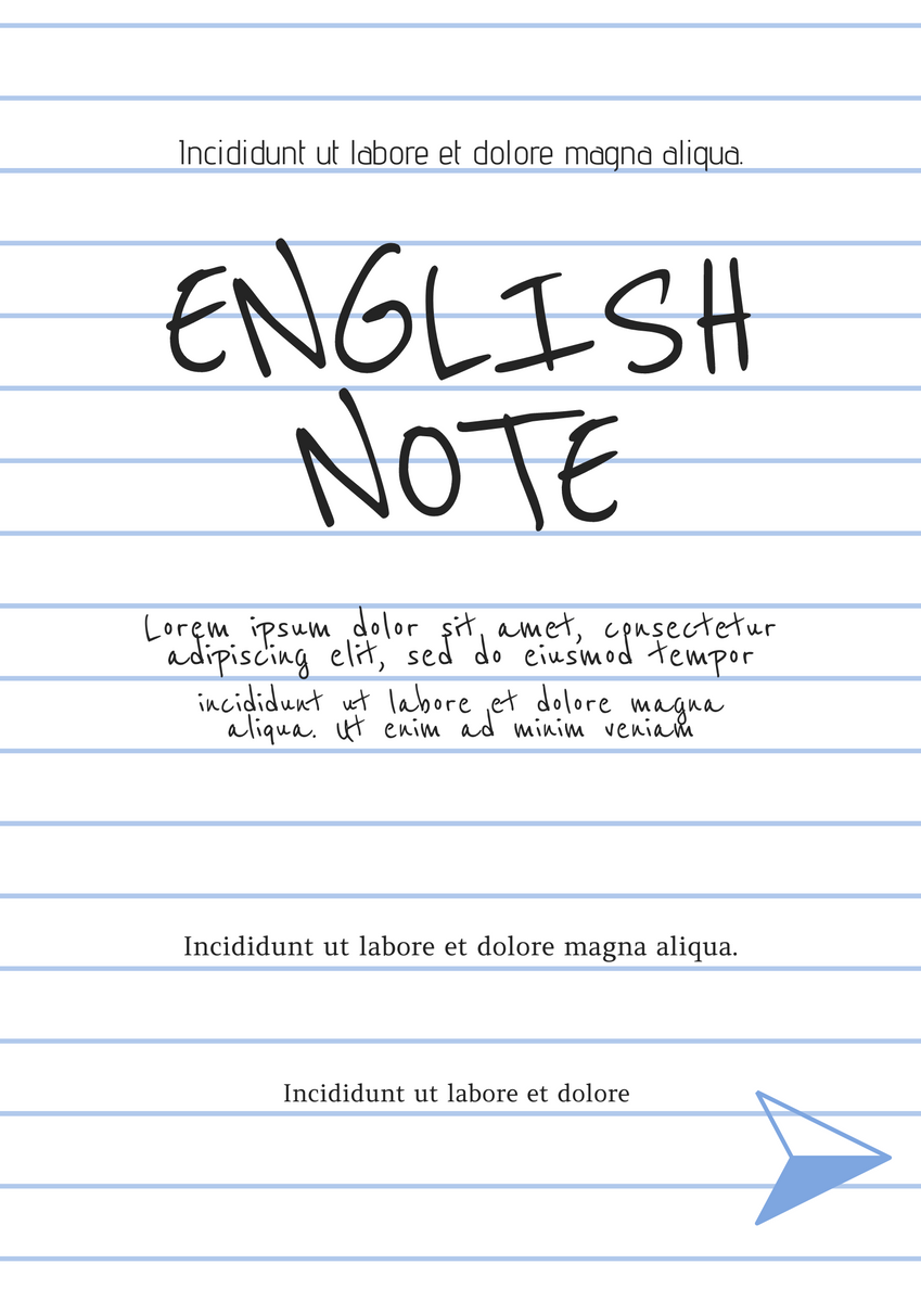

(Notebook Style Poster | Disinfection Cleaning Poster)
Composition of the words
As dividing the design to blocks is a way to design a poster, we can also try to create the title as a “block”. The length of the word are based on number of its characters. One of the common ways to design the title is to change the font size of different words to control their length. In this case, the title looks very tidy and clear.
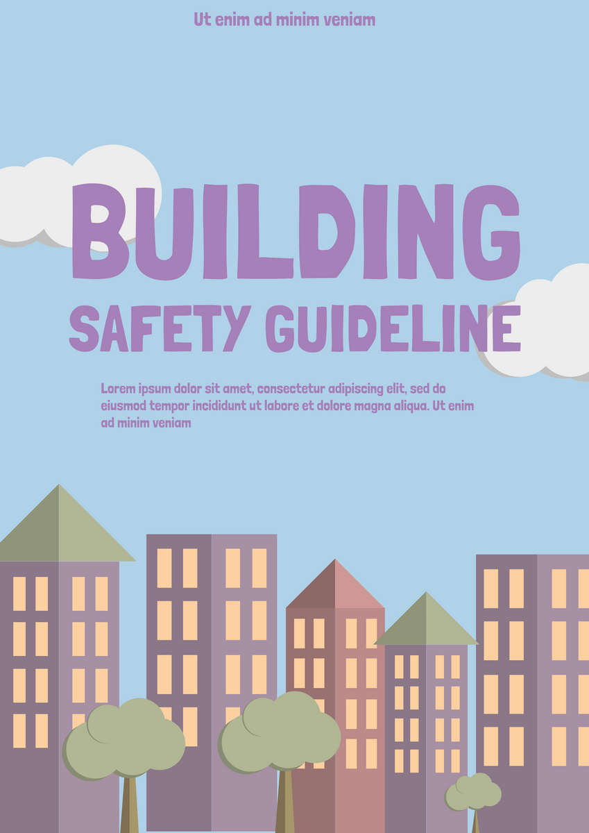
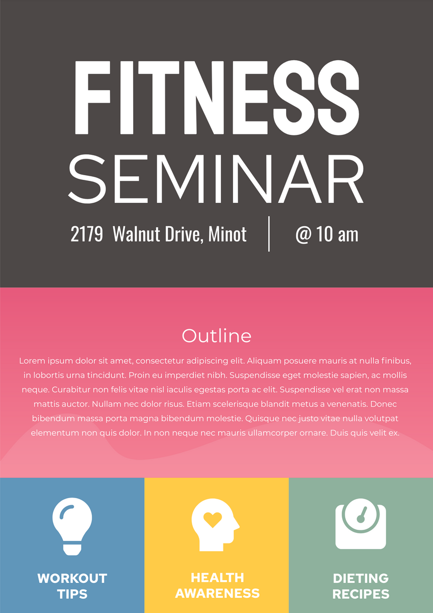
(Building Safe Guide Poster | Fitness Seminar Poster)
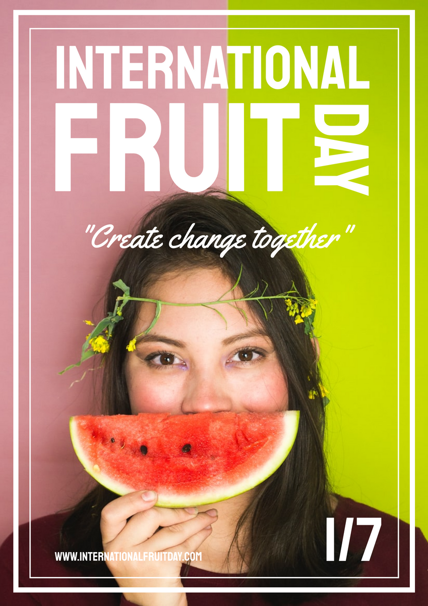
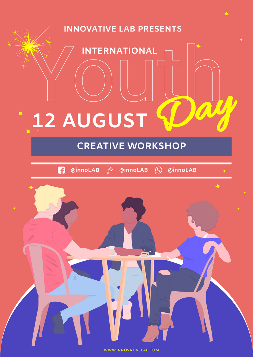
Moreover, you can try to change the degree of the words, it still looks so clear if your font is simple. Including different font in your title is also a good choice to make it more stylish. Remember the balance of the words are still very important. We can edit by changing the size, colour or even the spacing to balance them.
(International Fruit Day 2021 Poster | Special Youth Day Workshop Poster)
Decorations
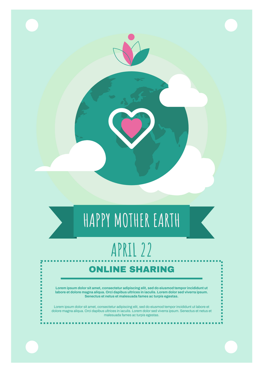
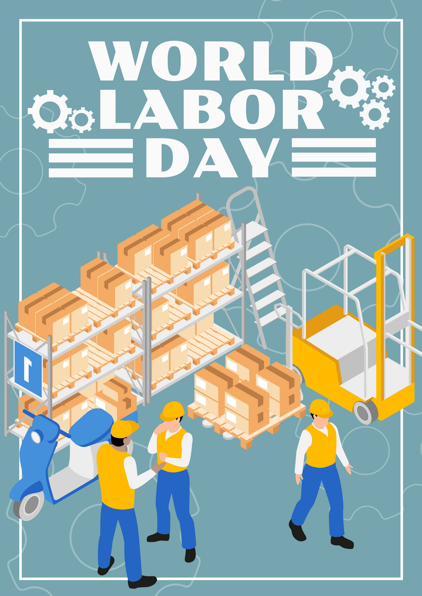
Although title is presented in words, we can add decorations in improve the design. Ribbon is common decorations we use in our design. Moreover, we can choose the decorations according to the theme of the poster. For example, add the wheels in poster of Labour Day, add hearts in poster of Mother’s Day, etc. Sometimes, simple lines or shape can already make your title more awesome.
(Earth Day Online Sharing Poster | Labor Day Graphic Poster)
Sometimes if your title is well designed, your poster is already half-completed. Try to use the skills mentioned above and create your poster now.
This post is also available in Deutsche, Español, فارسی, Français, English, Bahasa Indonesia, 日本語, Polski, Portuguese, Ру́сский, Việt Nam, 简体中文 and 繁體中文.


