Home » Archives for May 2022 » Page 2
Flipbooks are an engaging and interactive way for businesses to present information and showcase their products and services. With the rise of digital media, flipbooks have become an increasingly popular marketing tool that can help businesses stand out in a crowded marketplace. If you're looking to create a flipbook for your business, you need an easy-to-use editor that can help you create professional-quality flipbooks quickly and easily. That's where Fliplify's flipbook editor comes in. https://www.youtube.com/watch?v=Vga9obe7mvw&width=854&height=480 In this blog post, we will show you how to find recently created flipbooks using our editor and…
continue reading →
-
Posted on May 20, 2022
-
/Under Chart
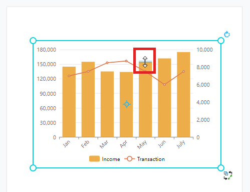
We often record data for a particular use and sometimes we may need to present the data through graphics. In Visual Paradigm Online, you can create various charts freely like bar charts, column charts, pie charts, etc. This chart tool can help you to display any data by using text, symbols, and graphics. You can easily visualize the data that you have collected as graphics and they are presentable. This is a guide for teaching you to create a column and line chart with Visual Paradigm Online. You can watch the attached video…
continue reading →
-
Posted on May 19, 2022
-
/Under Chart
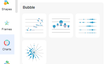
Punch cards allow you to display periodic trends in the data. Create charts easily with Visual Paradigm Online. In this video, you can see how to create create a punch card chart in VP Online.
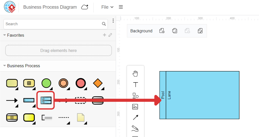
Business Process Model and Notation (BPMN) is a graphical notation for modeling business processes, which is widely adopted by organizations to model, analyze, and communicate their business processes. It provides a standardized approach for modeling the flow of activities within a business process, making it easier for all stakeholders to understand the process and collaborate in its improvement. In BPMN, a pool represents a participant in a business process, while a lane represents a functional decomposition within a participant. Understanding the differences between pools and lanes is essential for effectively modeling business processes…
continue reading →
-
Posted on May 18, 2022
-
/Under Chart
The 100% cumulative bar chart is a type of Excel chart intended to display the relative percentages of multiple data series in a cumulative bar, where the sum (cumulative) of the cumulative bars always equals 100%. A bar chart stacked at 100% can show the ratio of part to total, for a period of time. Create charts easily with Visual Paradigm Online. In this video, you can see how to create a column and line chart in VP Online.
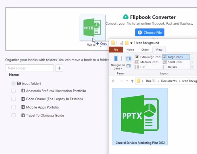
After creating your presentation material in PowerPoint, you can always upload to our flipbook maker for conversion and share your teaching material easily online. Create a flipbook easily with Visual Paradigm Online. In this video, you can see how to upload Microsoft PowerPoint file to become a flipbook in VP Online.
-
Posted on May 18, 2022
-
/Under Chart
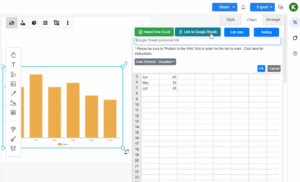
Visual Paradigm support visualizing your data into various charts. This feature gives you valuable insights to your data. The data can be visualized by entering with the build-in spreadsheet tool, uploading of Excel file, or directly linking from Google Sheets. In this article, we will show you how to feed data to your chart by link to Google Sheets. https://www.youtube.com/watch?v=bk44-JOvjpc&width=854&height=480 You can create any chart and link the chart data with Google Sheet when using the Visual Paradigm Online. In Google Sheets, you can go to "Share", and press the "Copy Link" button…
continue reading →
-
Posted on May 18, 2022
-
/Under Chart
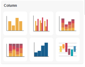
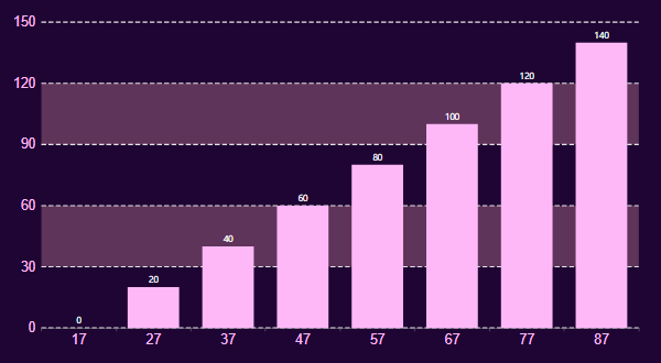
In bar charts and column charts, the length of the bars are changed according to the value. Although we can read the value by the split lines, we sometimes may not get the exact number, while extra time is also needed. In this case, we may choose to show the values on the chart directly. How To Show Values On Bar Charts https://www.youtube.com/watch?v=JUcNMfi2Sc8&width=854&height=480 Under Panel-Chart, there is a option Label. Click it and you will finds that there are numbers on the top of each of the bars. Moreover, we can customize the style…
continue reading →
-
Posted on May 17, 2022
-
/Under Chart
Range splines are very similar to area plots for data visualization. The main difference between them is that the second graph plots the values of the Y axis one by one, while the first is a type graph of the spline area that plots the values of both Y axes over time - low and high. Create charts easily with Visual Paradigm Online. In this video, you can see how to create a range spline area chart in VP Online.
-
Posted on May 17, 2022
-
/Under Chart
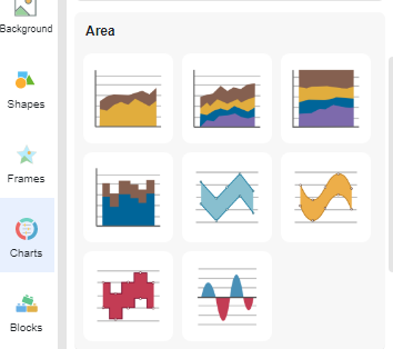
We often record data for a particular use and sometimes we may need to present the data through graphics. In Visual Paradigm Online, you can create various charts freely like bar charts, column charts, pie charts, etc. This chart tool can help you to display any data by using text, symbols, and graphics. You can easily visualize the data that you have collected as graphics and they are presentable. This is a guide for teaching you to create a stepped area chart with Visual Paradigm Online. You can watch the attached video or…
continue reading →


