Home » Archives for May 2022
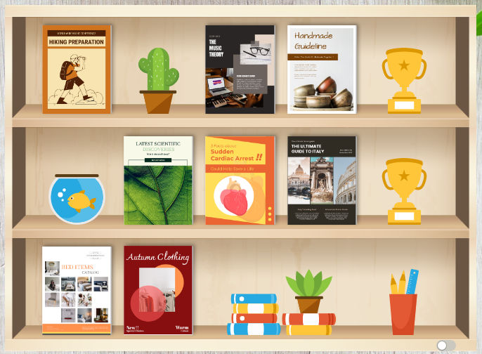
After creating awesome flipbooks, we can display them in bookshelf and share with others. In order to make our bookshelf more attractive, let's add decoration to our bookshelf! https://www.youtube.com/watch?v=wyDiD9sACSQ&width=854&height=480 How To Add Decorations To Bookshelf First, go to My Bookshelf in our workspace and choose the bookshelf we want to edit. Place the books you want to show in the bookshelf. We will then find that there are some space remaining. After that, click the Add Random Shelf Items in the bottom-left, you will then find that all space will be filled by different…
continue reading →
-
Posted on May 27, 2022
-
/Under Chart
Create 100% stacked rose charts in minutes with Visual Paradigm's easy to use online 100% stacked rose chart maker. It features a rich collection of chart type and an intuitive chart maker that helps you in creating stunning charts effortlessly. No design or coding skills required. Would you like to create your own 100% rose chart, click here!!
-
Posted on May 26, 2022
-
/Under Chart
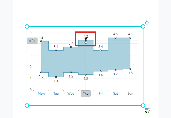
We often record data for a particular use and sometimes we may need to present the data through graphics. In Visual Paradigm Online, you can create various charts freely like bar charts, column charts, pie charts, etc. This chart tool can help you to display any data by using text, symbols, and graphics. You can easily visualize the data that you have collected as graphics and they are presentable. This is a guide for teaching you to create a range step area chart with Visual Paradigm Online. You can watch the attached video…
continue reading →
-
Posted on May 26, 2022
-
/Under IT
What is UML? UML is a standard notation for object-oriented methods, which was created by unifying Object Modeling Techniques. It is used for analysis, design and deployment of systems. The Unified Modeling Language was designed to respond to the needs of businesses to automate the production of software, improve quality and reduce cost and time-to-market. It also provides a formal basis for understanding the modeling language. Why UML? Large enterprise applications must be structured in a way that enables scalability, security, and robust execution under stressful conditions. A well-designed architecture enables code reuse,…
continue reading →
-
Posted on May 26, 2022
-
/Under Chart
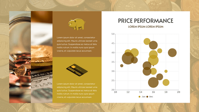
What Is A Bubble Chart Bubble chart shows the data by bubbles in different sizes and position, while colors can be used to represent different categories. As they are drawn in the same scale, we can clearly see the trend of specific issues over time. When To Use Doughnut Chart When there are more than 3 sets of data is going to show in a chart, then bubble chart will be a good choice for you. As they are shown as a bubble instead of a point or column, it will be difficult to…
continue reading →
-
Posted on May 25, 2022
-
/Under Chart
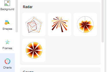
An In-Depth Guide to Editing Radar Charts Radar charts are a powerful visualization tool that allows you to display data in a circular format, making it easy to compare multiple variables at once. When working with radar charts, it's important to have control over various aspects of the chart, such as the maximum value for each discipline. In this article, we will explore how to edit radar charts and specifically focus on specifying the maximum value using the format panel chart. Understanding Radar Charts Before we dive into editing radar charts, let's briefly…
continue reading →
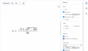
In VP Online, you can enter text in LaTeX, or AsciiMath format, then click on the diagram and select Mathematical typesetting, to turn it into a mathematical formula. In this video, you can see how to write mathematical typesetting in design. https://www.youtube.com/watch?v=xi-bJLJEayA&width=854&height=480 1. First, enter your maths equation using LaTeX or AsciiMath in a text shape. AsciiMath between `, for example: `a^2+b^2 = c^2` LaTeX between $$, for example: $$\sqrt{3×-1}+(1+x)^2$$ Inline LaTeX between \( and \), for example: \(\sqrt{3×-1}+(1+x)^2\)Tips: You can mix inline LaTeX and AsciiMath in the same text 2. After then,…
continue reading →
-
Posted on May 24, 2022
-
/Under Chart
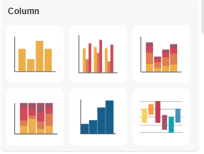
The grouped bar chart is an extension of the bar chart, plotting values for levels of two categorical variables instead of just one. Create charts easily with Visual Paradigm Online. In this video, you can see how to create a grouped column chart in VP Online.
-
Posted on May 24, 2022
-
/Under Chart
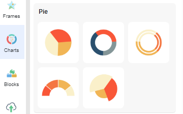
A pie chart (or pie chart) is a circular statistical figure divided into slices to illustrate numerical proportions. In a pie chart, the arc length of each wedge is proportional to the number it represents. Although it is named for its resemblance to a pie that has been cut into slices, there are variations in the way it is presented. Create charts easily with Visual Paradigm Online. In this video, you can see how to create a pie chart in VP Online.
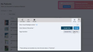
Try to create a flipbook with a new ‘hard’ flipping effect in VP Online. In this video, you can see how to apply a hardflip effect on a flipbook in VP Online. https://www.youtube.com/watch?v=Rq8SYzrXPDY&width=854&height=480 The hardflip effect mimics the reading experience when reading a board book. This effect comes close to flipping through a board book made of highly durable paperboard. It is suitable for you to create a board book or photo book with hard pages. After you create a flipbook, you can find your book in your "Workspace", "My Flipbook". Open the…
continue reading →

