Home » Archives for vpvera » Page 11
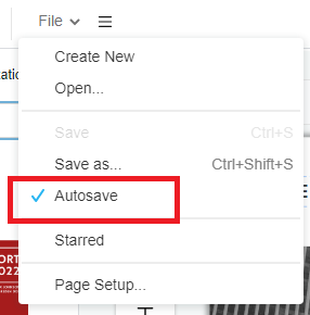
From time to time, accidents happen during our work such as browser crashes or even your laptop run out of battery and that is why InfoART has "AUTOSAVE" function. By enabling the "AUTOSAVE" function your work will be save automatically in no time, without having to worry anything about losing any progress even accident happens! This guide will show you the steps to enable such function that will make your workflow smooth. The steps is as follow: Click on the menu bar of the top of the canva Hover over File and click…
continue reading →
-
Posted on April 19, 2022
-
/Under Chart
Pareto charts are often used to identify early areas of focus in process improvement. A Pareto chart is an ordered frequency count of the values of different levels of a categorical or nominal variable. Learn how to create your own pareto chart in the below video!!! The steps in creating pareto chart: Click on charts panel on the left and select pareto chart Drag the chart into your canvas and adjust the size Click on chart panel on "right" and select edit data Replace the old data with your own data Edit your…
continue reading →
Adding descriptiom to your publication can give your ready a brief ideas of your book's content. In this video, you can see how to specify the description of your flipbook. Find your publication in the "my books" section Hover over your flipbook and click on the "pencil icon" Insert your description in the new pop up After confirm your description content click "OK" The description will add in simultaneously Noted; If you would like to share your publication to the community. Make sure to not insert any private information inside. Here is our…
continue reading →
-
Posted on April 6, 2022
-
/Under Chart
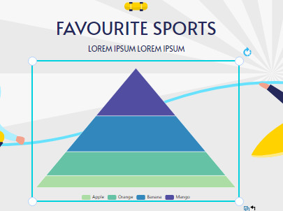
Under different circumstances, you may like to edit the legend of the chart to increase it's readibility. Create charts easily with Visual Paradigm Online. In this video, you can see how to adjust the legend of a chart in VP Online. The steps to edit legend of chart as follow; After editing your data and color of pyramid Scroll down of your right panel to find the legend selection Click on the dropbox to check your ideal font (mostly san serif font) Re-select the legend color to match your chart (mostly dark color)…
continue reading →
-
Posted on April 4, 2022
-
/Under Chart
The 100% stacked bar chart is an Excel chart type designed to show the relative proportions of multiple data sets by stacking bars where the sum (cumulative) of each stacked bar is always 100%. In this video, you will learn to create 100% stacked bar chart in just few steps!!! Would you also like to try out other chart now? Click online visual paradigm!
-
Posted on April 4, 2022
-
/Under Chart
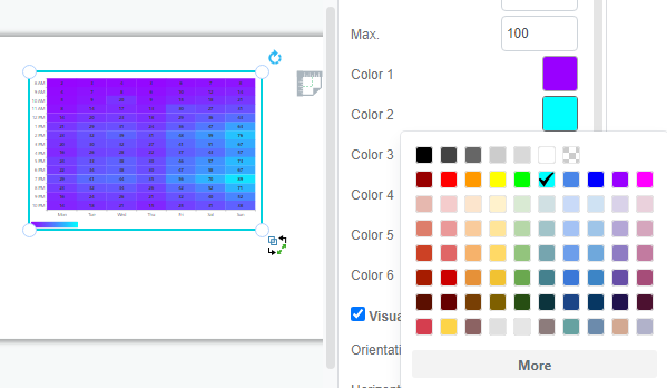
Heat maps are graphical representations of data using colour charts. The main purpose of heat maps is to better visualise the number of locations/events in a dataset and to help guide viewers to the most relevant areas of the data display. In this video, you will understand how to create your own heat map easily. There steps in creating heat map are as follow; Click "Chart" and selection the heat chart from the left panel Drag the chart to canva and select "Edit Data" on right panel Replace the template data with your…
continue reading →
-
Posted on March 31, 2022
-
/Under Chart
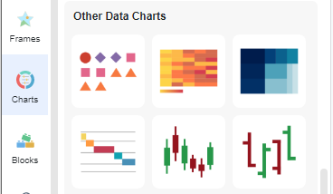
OHLC charts are bar charts that show the open, high, low and close prices for each period. They are used in indicating the four most important data points for each period. In this video, you can see how to create OHLC chart in VP Online. The steps are as follow; Click chart and select the OHLC chart Drag the chart into your canva Select edit data from the chart panel Replace the data template with your own data Upon completion you can edit you chart style (color/font/font size) Would you like to creation…
continue reading →
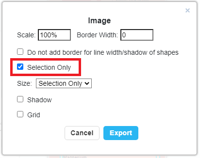
Maybe you have created a big project but sometimes you just want to export partially for your own references. Here is a tutorial video that allows your to understand how to how to do that in few steps!!! The steps are as follow; Select the portion by dragging your mouse of over that area Click export and chose "save as JPEG" Chose the "selection only" tickbox and click export Chose your location to retrieve file and click download Would you like to try out these functions now? They are full with simplicity!!! Below…
continue reading →
-
Posted on March 31, 2022
-
/Under Chart
Variwide charts can also be used to display the second dimension in a bar chart. Each data point, in addition to its value, is given a weight that determines the width of the bar chart. In this video, you can see how to create a variwide chart in VP Online. The steps are as follow; Click chart and select the variwide chart Click edit data in the chart panel Replace the template data to your own data Upon completion you can edit the (style/color/font) of your chart Now you can start creating your…
continue reading →
-
Posted on March 30, 2022
-
/Under Chart
Stacked area table is best for illustrating the relationships between the different parts and helps show how each category contributes to the cumulative total. In this video, you can see how to create a 100% stacked area chart in VP Online. Here is the steps to create your chart; Click charts and select the 100% stacked area chart on the left panel Click chart panel then select "edit data" Edit the data sheet as you desire Customise the chart's style such as color tone and font Would you like to create your own…
continue reading →

