Home » Archives for vpwing » Page 18
-
Posted on May 17, 2022
-
/Under Chart
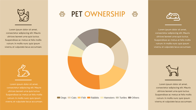
What Is A Doughnut Chart Doughnut chart shows the amount of the data by the percentage of the parts, which is very close to a pie chart. Moreover, we can add more rings on the chart to fit our needs if there are more than one series of data, such as a double doughnut chart. When To Use Doughnut Chart As doughnut chart is used to present the relationship between the part and the whole, it is commonly used when we want to compare the percentages of different parts, and also the case…
continue reading →
-
Posted on May 16, 2022
-
/Under Chart
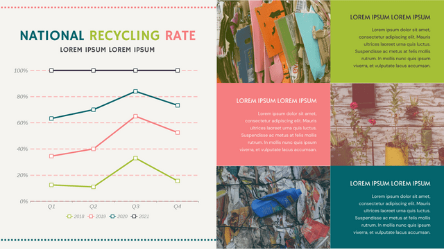
What Is A 100% Stacked Line Chart A 100% stacked line chart is a stacked line chart without any overlapping, as the lines are representing the summarize of data in different level. Each of the points represent the percentages of the data within 100%., while the top line should be a strange line as all of them are in 100%. When To Use 100% Stacked Line Chart When we are having different data column, and we want to add them together and shown the total trend of them, 100 stacked line chart will…
continue reading →
-
Posted on May 3, 2022
-
/Under Diagram
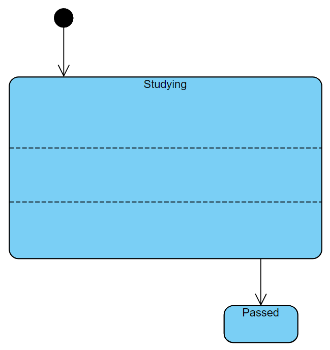
In a UML state machine diagram (aka state diagram), a region is a container inside a state that can hold pseudo states, states, and transitions. Typically, region is used to define nested states and transitions. By using regions, you can include more details about the internal transitions of a particular state. In this article, you will learn how to add states in a region. https://www.youtube.com/watch?v=S0JYoM5QW-8&width=854&height=480 How To Create Regions In State Add A New Region When creating state machine diagram, click on the state and right-click. You will then find 2 buttons: Add…
continue reading →
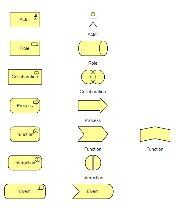
ArchiMate offers a visual language to model enterprise architecture. ArchiMate allows you to visualize relationships within and between different domains. These domains primarily include products/services, processes, organization, data applications, and technical infrastructure. ArchiMate comes with a rich collection of diagram symbols to support different kinds of modeling needs. Some of these symbols have multiple presentations - a regular box-like shape and a symbolic presentation (e.g. a computer shape that represents a device)In this article, you will learn how to switch between different representations by changing the display option of an ArchiMate element In…
continue reading →
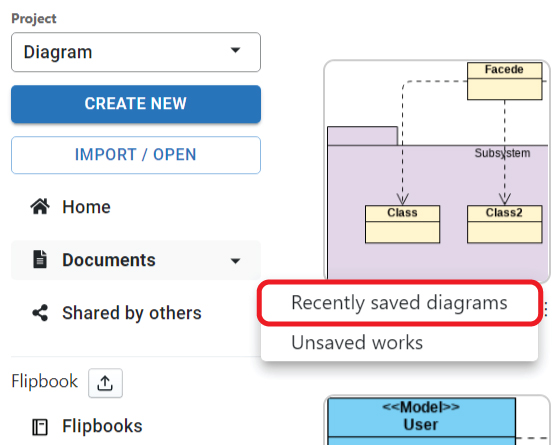
After finishing the design, we can choose to save in the different location, such as VP Online and Google drive. We may sometimes forget where is the file so that we cannot find them out. In this case, the list of "Recent saved diagrams" can have you to define where you place the design file. This article will show you what it is. https://www.youtube.com/watch?v=j4e25Au7DjA&width=854&height=480 How to Find Out the Save History of My Artifacts After click the Recent saved diagrams under My Documents, we have the following table. Storage Storage represent the location…
continue reading →
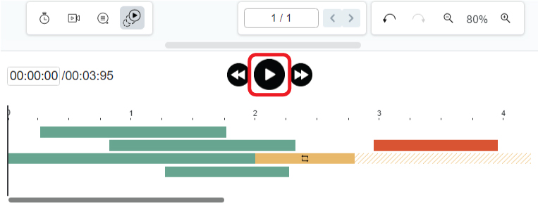
After finishing a flipbook, consider adding animation to make it even more engaging and visually appealing. With Fliplify, you have the ability to animate both the text and objects within your flipbook, creating a dynamic and interactive reading experience for your audience. Animations can help highlight key points, guide readers through your content, and add a layer of excitement to your work. https://www.youtube.com/watch?v=tdBth3umj0U&width=854&height=480 How To Animate The Text And Object Of A Flipbook First of all, open the animation timeline by clicking the icon at the bottom. After that, select the elements you…
continue reading →
After finishing a booklet by the flipbook maker, do you want to make it looks more attractive? Adding animation to photo is a good way to do so. This article will show you how to do so. https://www.youtube.com/watch?v=XQaKM4hK3cA&width=854&height=480 How To Add Animation To Photo First of all, click the icon at the bottom of the editor to open the animation timeline. (Click one more time if you want to close it) After that, select the photo you want to edit, and choose the animation for it. When you place the mouse over the…
continue reading →
-
Posted on April 21, 2022
-
/Under Chart
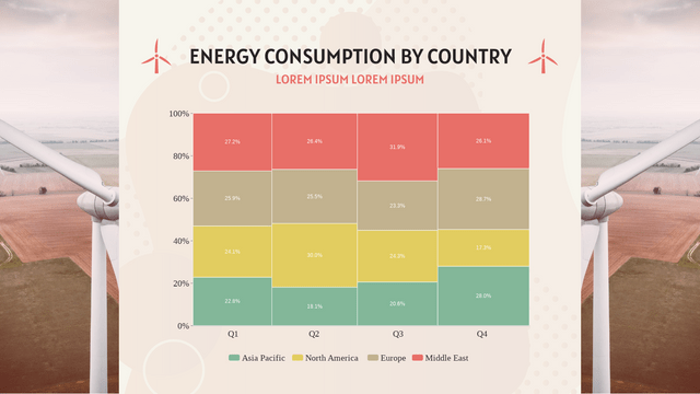
What Is A Marimekko Chart Marimekko chart is shown as a rectangular chart. Both directions represent 100% respectively. It is usually used to show the overview of data by dividing them into different segments and bars. When To Use Marimekko Chart As mentioned above, Marimekko is commonly used to showing the overview of data, especially for the market. The relationship between the company and customers are clearly shown by the Marimekko chart , so that we can find the opportunities in the chart by observing the segments and bars. On the other hand,…
continue reading →
-
Posted on April 21, 2022
-
/Under Chart
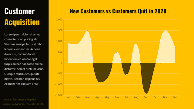
What Is A Difference Chart Unlike the other chart showing the data directly, difference chart show the difference between 2 groups of data. It is divided in to 2 side, the positive side and the negative side. By finding the difference the value of the 2 sides, we get the data to shown in this chart. When To Use Difference Chart As it shows the difference instead of the data, difference chart is not suitable for recording. It is more suitable when doing analysis as the data shown is already a result of…
continue reading →
Blog writing is a way to keep track of what's going on in your life. It's also a way for people to see what you've been up to in the past, and what you're up to now. Fliplify's flipbook maker allows you to create your own ebook, and integrate it into your posts written in Blogger. There are mainly two ways of integration. Other than embedding the flipbook in Blogger, you can also choose to add a popup book in the post. This article will show you how you can do it, and also…
continue reading →

