Home » Archives for vpmiku » Page 3
Ever wondered when it would be best to use PDF instead of Microsoft Word or other formats? PDF has many advantages over other electronic file formats. The PDF file format can encapsulate text, fonts, formats, colors, and graphic images independent of device and resolution in a file. This format file can also contain information such as hypertext links, sound, and gif images. Supports special files, and has high integration and security reliability. PDF files are generally smaller than PostScript files, also easier to transfer and store. The PDF format is ideal when certain…
continue reading →
-
Posted on July 20, 2022
-
/Under Chart
A stacked radial chart can enable you to plot the categorized series on a polar coordinate system. The Y-axis is in a circular manner, like a radar chart making the columns circular. This video will show you how to create a stacked radial chart in Visual Paradigm Online. https://www.youtube.com/watch?v=6mmvD5gYsmE&width=854&height=480 What is a stacked radial chart? A stacked radial chart is a bar chart displayed on a polar coordinate system. The difference between radial column charts is that the base axis of the series is the y-axis of a radar chart making columns circular.…
continue reading →
-
Posted on July 14, 2022
-
/Under Chart
Stacked column charts are a basic Excel chart type that allows comparisons between parts and wholes at different times or in different categories. In a stacked column chart, data series are stacked one on top of the other in vertical columns. This video will show you how to create a stacked column chart in Visual Paradigm Online. https://www.youtube.com/watch?v=eg9kTP9mXi8&width=854&height=480 What is a stacked column chart? A stacked column chart consists of several vertically stacked series of columns, one after the other. The length of each series is determined by the value in each data…
continue reading →
-
Posted on June 24, 2022
-
/Under Chart
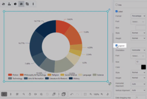
Visual Paradigm Online can help you make beautiful charts online with a free chart maker. Create charts with custom styles in minutes. This video will show you how to hide the legend of a chart in Visual Paradigm Online. https://www.youtube.com/watch?v=Ca3DTYlBxsk&width=854&height=480 Visual Paradigm Online makes it simple to enter in your information and turn it into a stunning chart. You can also easily customize your chart to match your company's brand colors and fonts or choose the color that matches your topic. Customize everything, from the fonts and colors to the position of titles…
continue reading →
-
Posted on June 24, 2022
-
/Under Chart
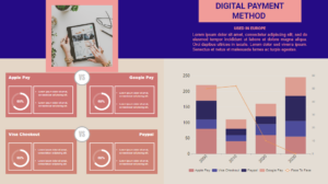
A stacked column and line chart is a combination of a Line Chart and a vertical Stacked Bar chart. This video will show you how to create a stacked column and line chart in Visual Paradigm Online. https://www.youtube.com/watch?v=ir8vhCsumW4&width=854&height=480 What is a stacked column and line chart? A stacked column and line chart is a combination of a Line Chart and a vertical Stacked Bar chart. A stacked column and line chart is similar to a Grouped Bar with Line Chart—the only difference is that in a standard Grouped Bar with Line chart, each…
continue reading →
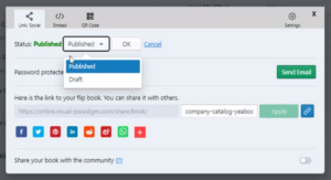
When you publish a flipbook on Visual Paradigm Online, you can easily share your flipbook with others. After you share the flipbook, you can also freely control sharing or stop sharing the flipbook. This video will show you how to uncaring a flipbook in Visual Paradigm. https://www.youtube.com/watch?v=4-DMgo4yqEc&width=854&height=480 You can unshare your flipbook, by pressing the Share button of your book under My Flipbooks. Then change the publish status to Draft, and press OK to confirm the change. Tips When you stop sharing your flipbook, your flipbook will not show in the Visual Paradigm…
continue reading →
-
Posted on June 13, 2022
-
/Under Chart
Control charts are a statistical process control tool used to determine if a manufacturing or business process is in a state of control. This video will show you how to create a control chart in Visual Paradigm Online. https://www.youtube.com/watch?v=IEG6O0eLZrg&width=854&height=480 What is A Control Chart Control charts are a statistical process control tool used to determine if a manufacturing or business process is in a state of control. It is more appropriate to say that the control charts are the graphical device for Statistical Process Monitoring (SPM). Traditional control charts are mostly designed to…
continue reading →
-
Posted on June 10, 2022
-
/Under Chart
The semi-circle chart generally uses half (or more than half) circles, which has the same function as the ordinary circle chart, except that the percentage is displayed in the form of a semi-circle, which is sometimes more in line with the vision. This video will show you how to create a semi-doughnut chart in Visual Paradigm Online. https://www.youtube.com/watch?v=6QrsLD00yUg&width=854&height=480 What is a Semi-Doughnut Chart? A Semi-Doughnut Chart is a 180 degrees graph that represents a composition as a whole. The semi-circle chart generally uses half (or more than half) circles, which has the same…
continue reading →
-
Posted on June 10, 2022
-
/Under Chart
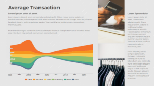
A streamgraph, or stream graph, is a type of stacked area graph which is displaced around a central axis, resulting in a flowing, organic shape. This video will show you how to create a stream chart in Visual Paradigm Online. https://www.youtube.com/watch?v=V5p4UxZEZck&width=854&height=480 What is a Stream Graph? A stream graph, or stream graph, is a type of stacked area graph which is displaced around a central axis, resulting in a flowing, organic shape. Unlike a traditional stacked area graph in which the layers are stacked on top of an axis, in a streamgraph, the…
continue reading →
-
Posted on June 9, 2022
-
/Under Chart
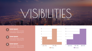
A histogram is an approximate representation of the distribution of numerical data. To construct a histogram, the first step is to "bin" (or "bucket") the range of values—that is, divide the entire range of values into a series of intervals—and then count how many values fall into each interval. This video will show you how to create a Histogram in Visual Paradigm Online. https://www.youtube.com/watch?v=o54-u_G3oBY&width=854&height=480 What is a Histogram? Histograms give a rough sense of the density of the underlying distribution of the data, and often for density estimation: estimating the probability density function…
continue reading →


